
Horizon: A Wide, Heavy Sans for Titles That Need to Shout Quietly
Design style
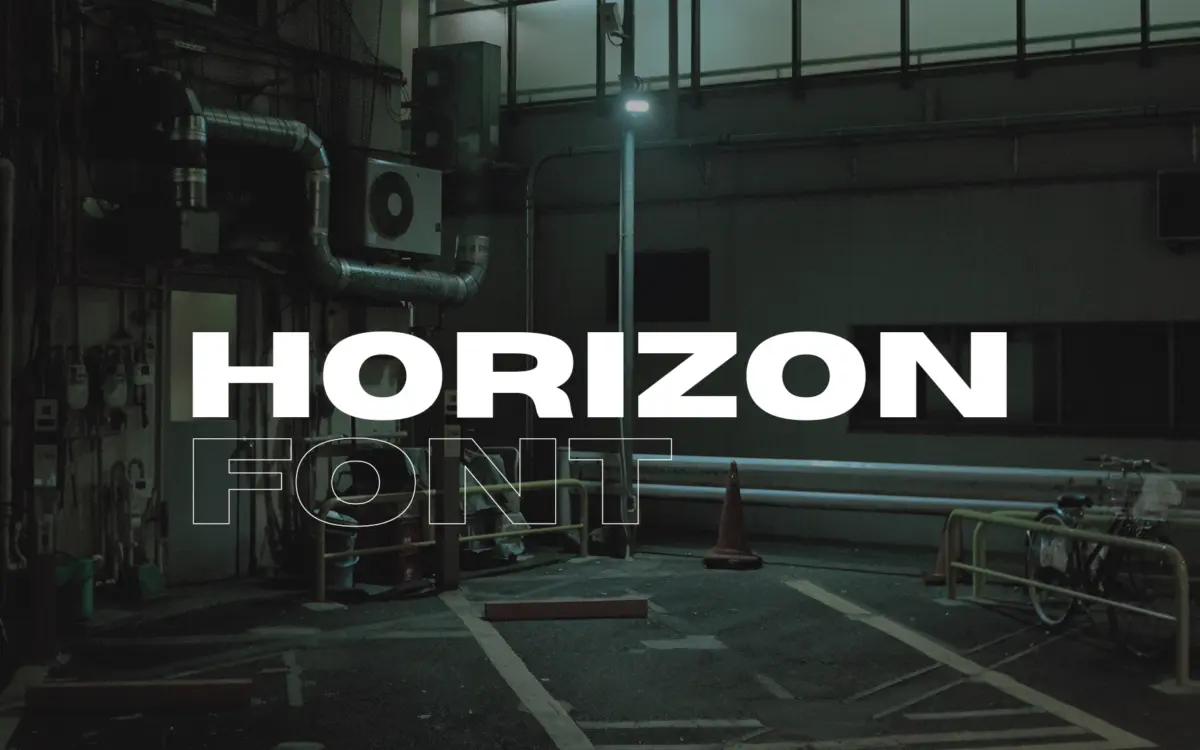
Horizon is a wide, heavy sans built for maximum surface area. The letterforms are extended well past normal proportions and carry a lot of weight, so the counters stay open and boxy rather than squeezed shut, which is where a lot of fat extended sans designs go wrong. Curves are kept simple — circles read as circles, not stretched ovals — and terminals are cut straight across with little flourish. There’s no attempt at personality through swashes or ink traps here; the drawing is confident and plain, which suits the brief of a title face rather than a display face with a story to tell.
The rhythm across a word is even, with generous spacing that keeps the wide letters from clumping into a solid bar of ink. That said, it is unmistakably a one-note design. There is no attempt at contrast between thick and thin strokes, no stress, no calligraphic trace. It is a font built around a single idea — width plus weight — and it executes that idea cleanly without trying to be anything else.
Character set and features
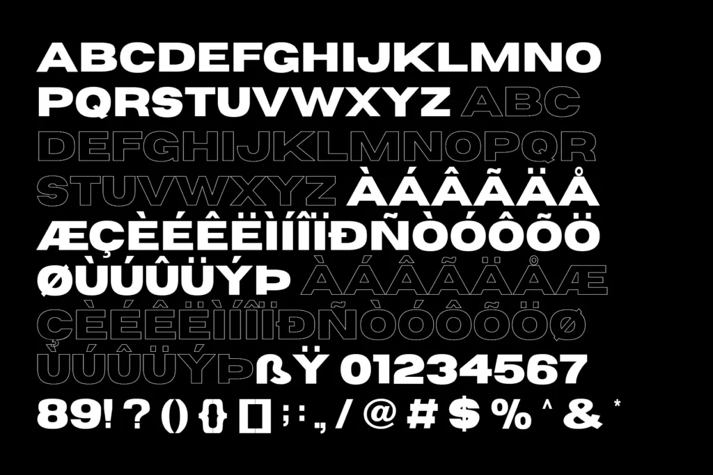
The set covers basic Latin, numerals and symbols, plus Latin-1 Supplement and Latin Extended-A, so it handles most Western and Central European languages without falling back to a substitute font. There’s nothing exotic in the way of alternates, ligatures, or stylistic sets mentioned — this is a single static weight doing one job, not a family with a range of options to explore. That’s not necessarily a flaw for what it’s built for, but buyers expecting OpenType features to play with will be disappointed.
Numerals and symbols follow the same wide, heavy logic as the letters, so tabular data or pricing set in Horizon will look intentional rather than mismatched, though nobody is buying this font to set spreadsheets. At small sizes the width becomes a liability: letters need room to breathe, and cramming Horizon into a paragraph column will produce a dense, hard-to-scan wall of type. This is a face for a handful of words, not a page of them.
Use cases
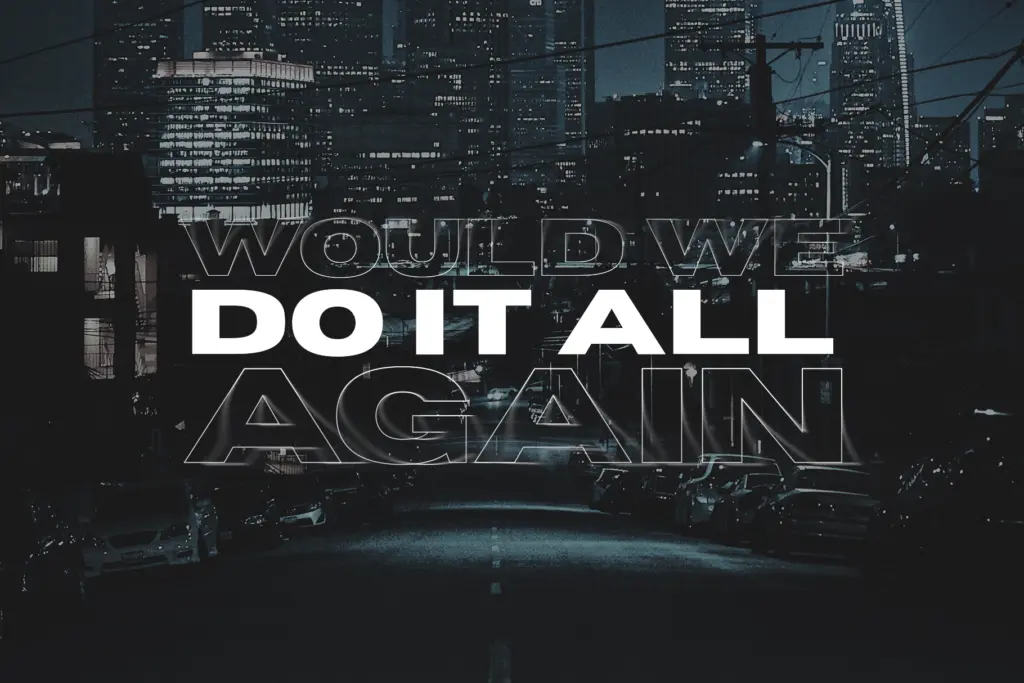
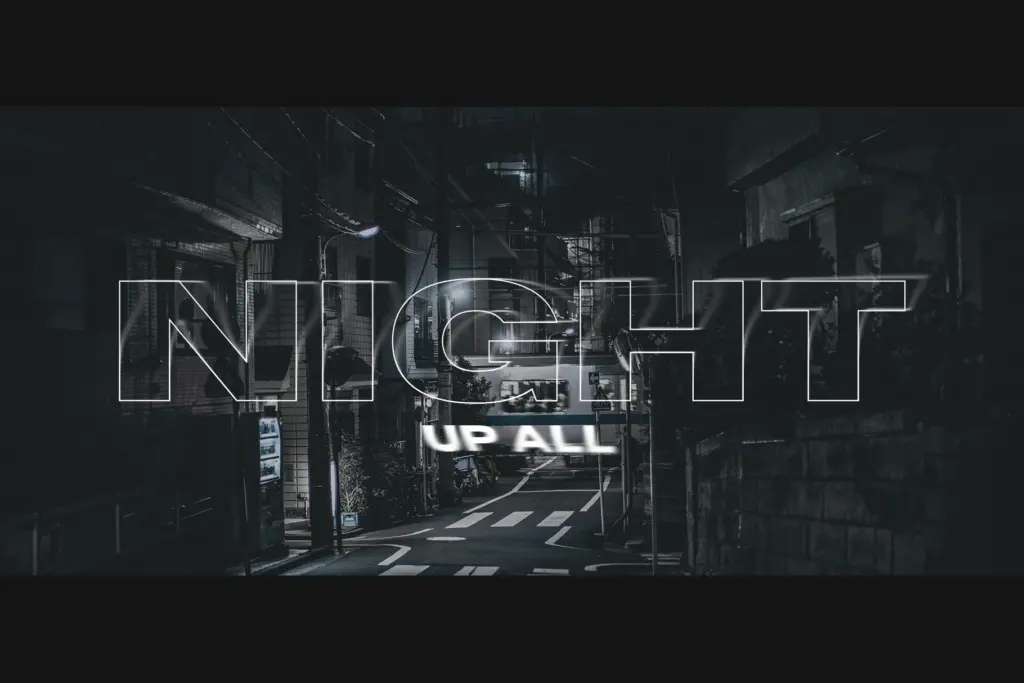
Horizon is built for short-format, high-impact settings — a masthead, a product name, a single line on a poster or a book spine where the type itself carries visual weight. It reads well at large sizes, where the wide stance gives it a confident, planted feel that a normal-width bold sans doesn’t have. It works for logotypes that need to feel solid and stable rather than energetic, and for packaging or signage where the name needs to command a wide horizontal space without shouting through colour or ornament.
It’s less useful anywhere that needs flexibility: body copy, long headlines, or contexts where a lighter companion weight is needed for hierarchy, since none is offered here. Pair it with a plain, narrow sans or a serif for supporting text — Horizon should stay confined to the one or two words it was drawn for.
What we liked, and what we didn’t
Strengths
- Open, boxy counters keep the extended weight from feeling clogged.
- Covers Latin-1 and Latin Extended-A, so it handles most European languages out of the box.
- Reads as confident and stable at large display sizes, well suited to logotypes.
Trade-offs
- Single static weight with no lighter companion for hierarchy.
- Width makes it impractical for anything beyond a few words at a time.
Horizon does one thing — wide, heavy, planted letterforms — and does it cleanly, without the ink-trap gimmicks that clutter a lot of fat sans designs. It's a strong choice for a logotype or a poster's single headline, but the lack of companion weights or alternates limits it to that narrow role.
Verdict

Tantype reviews typefaces in depth — every font is tested in real branding, editorial and screen layouts before a word gets written. 555+ fonts reviewed and counting.