
Happy Club: a chunky, rounded caps sans for playful branding
Design style
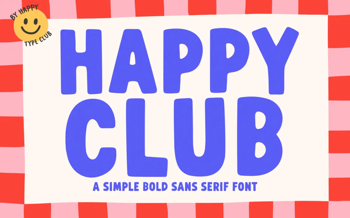
Happy Club is a bold, monoline sans built around rounded terminals and generous, even stroke weight. The letters read as hand-drawn in origin but have been squared up into something closer to a display face than a lettering set — there’s little of the wobble or inconsistency you’d expect from something pitched as “hand lettered”. Curves are soft, joins are simple, and the overall impression is friendly rather than refined.
The x-height sits high and the counters are wide open, which gives the face a stubby, toylike proportion. Nothing here is trying to be elegant. It’s a face built for impact at large sizes rather than nuance, and it commits to that fully — there’s no attempt at contrast or flourish to soften the effect.
Character set and features
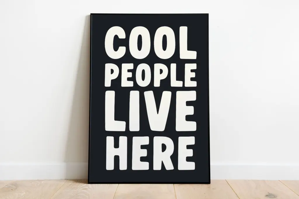
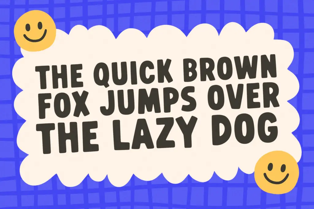
This is a caps-only design, and that’s worth knowing before you commit to it for anything beyond a headline or logotype. Lowercase forms aren’t part of the package, so longer copy needs to be set in capitals, which quickly gets tiring to read and limits how much text you can reasonably put on a page. Basic punctuation and numerals are present, keeping it usable for short lines like dates on invitations or prices on packaging.
Spacing is generous and even, which helps the letterforms breathe at the sizes they’re meant for, but also means tight-set headlines can look gappy if you don’t manually kern them. There’s no sign of alternates, ligatures or extended language support here — this is a single-weight, single-case display font, not a flexible family with a range of registers.
Use cases
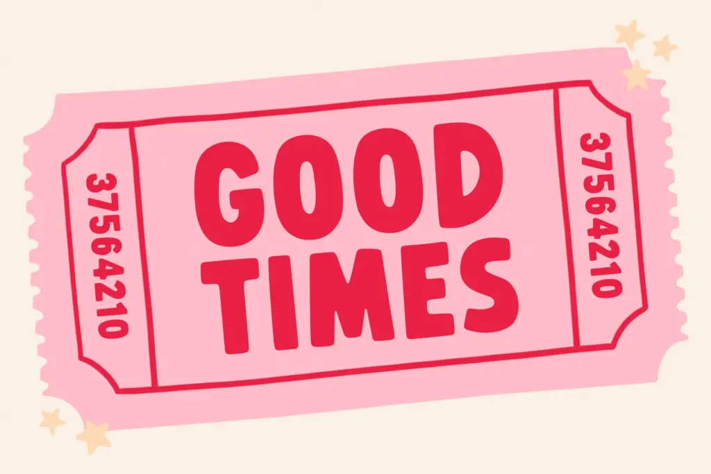
Happy Club does one job well: short, punchy, upbeat headline text. It suits t-shirt graphics, sticker designs, party invitations, and greeting card fronts where you want a handful of bold words to carry the whole message. It also holds up reasonably well as a logotype for casual, kid-friendly or lifestyle brands — the rounded, chunky forms photograph well on packaging and merchandise.
It’s less suited to anything that needs body copy, a lowercase register, or a sense of restraint. Editorial layouts, long-form branding systems, or anything aiming for sophistication rather than cheerfulness will find this font working against them rather than for them. Treat it as a specialist tool for a specific mood — buoyant, informal, a little goofy — and it earns its keep. Ask it to do more than that and the limitations of a single caps-only weight start to show.
What we liked, and what we didn’t
Strengths
- Rounded, high-x-height letterforms give it strong shelf presence at large sizes.
- Even, generous spacing keeps short headlines legible and clean.
- Works well as a casual logotype for kid-focused or lifestyle brands.
Trade-offs
- Caps-only character set rules out body copy or longer passages of text.
- Single weight and no alternates limit its range compared to a fuller family.
Happy Club is a competent, cheerful display face for short bursts of text — invitations, stickers, t-shirt graphics — but its caps-only structure and single weight limit it to headline duty. It does its narrow job well without pretending to be anything more.
Verdict

Tantype reviews typefaces in depth — every font is tested in real branding, editorial and screen layouts before a word gets written. 555+ fonts reviewed and counting.