
First Rodeo: a textured, hand-lettered sans for western-leaning branding
Design style
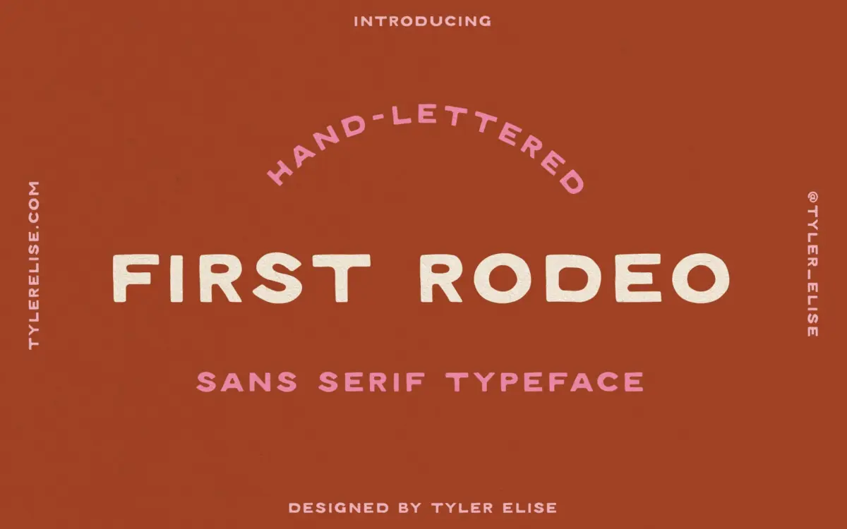
First Rodeo is a hand-lettered sans serif built around a rough, inked texture rather than clean vector edges. The strokes carry visible grain, as if drawn with a dry brush or worn marker, and that texture is doing most of the design work here. Strip it away and the underlying letterforms are fairly plain monoline shapes — it’s the surface treatment that gives the face its identity.
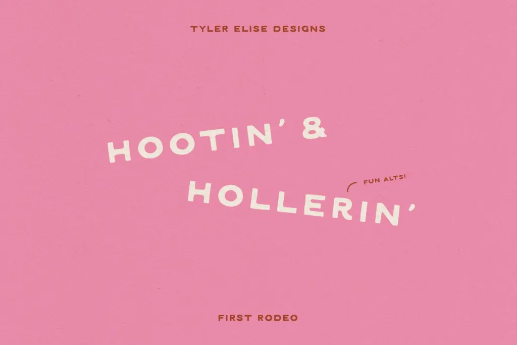
There’s a deliberate wonkiness to the baseline and stroke weights. Letters sit slightly off-kilter from one another, widths shift a little from glyph to glyph, and the overall effect reads as warm and handmade rather than engineered. This fits a southwestern, rustic register — think branding for leather goods, ranch-style signage, or anything trying to evoke worn wood and desert sun rather than polish. It won’t suit anyone chasing a neutral, contemporary sans look; the texture is the whole point, and it commits to it fully.
Character set and features
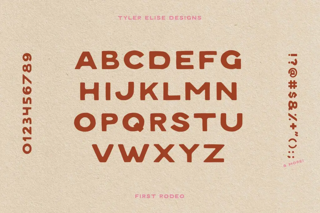
As a hand-lettered display sans, First Rodeo is built for short bursts of text — words and short phrases rather than paragraphs. The texture that reads as charming on a logotype or headline gets busy fast once you’re setting more than a handful of words, since every letter has its own grain pattern and the eye starts hunting for a rhythm that a monoline hand-drawn face isn’t built to provide at length. The rustic finish is also fixed: there’s no suggestion of a clean companion weight or an alternate smooth version within this release, so designers should expect the texture at every size and not plan around toggling it off.
The irregular spacing and stroke width are the font’s main technical trade-off. That handmade quality is attractive in isolation, but it also means kerning pairs can look uneven in longer words, and all-caps lockups need a careful eye to avoid awkward gaps or crowding. This is a font that rewards hand-tuning in a logo program rather than dropping straight into body copy and trusting the defaults.

Use cases
First Rodeo is best suited to logotypes, wordmarks, and short headline treatments where a rustic, handmade feel is the goal — western wear, ranch or farm branding, craft beverage labels, outdoor outfitters, rodeo and county fair signage. It also has a natural home on invitations with a rustic or southwestern theme, where the texture reads as charmingly imperfect rather than inconsistent.
It’s less suited to interface work, body text, or any context where legibility at small sizes matters more than character — the texture that reads as grit on a poster becomes noise at 10pt. Packaging secondary text, long-form editorial, and anything needing a quiet, neutral voice should look elsewhere. Used for what it’s built for — a short, punchy headline or a logo that wants some dirt under its fingernails — it does its job well.
What we liked, and what we didn’t
Strengths
- The dry-brush texture gives it a convincing handmade, worn-wood character.
- The deliberate wonkiness suits western and rustic branding without feeling like a generic script substitute.
- Works well as a standalone wordmark or short headline treatment.
Trade-offs
- Uneven spacing and stroke weight make longer words need manual kerning adjustments.
- The fixed texture limits it to display sizes — it isn't designed for body copy or small print.
First Rodeo is a single-purpose display font that does its rustic, hand-drawn job well in short bursts. It's not built for flexibility or small-size reading, so it rewards designers who know exactly where they'll use it — a logo, a headline, an invitation — and nowhere else.
Verdict

Tantype reviews typefaces in depth — every font is tested in real branding, editorial and screen layouts before a word gets written. 555+ fonts reviewed and counting.