
Modernline: a casual handwritten script for branding and signage work
Design style
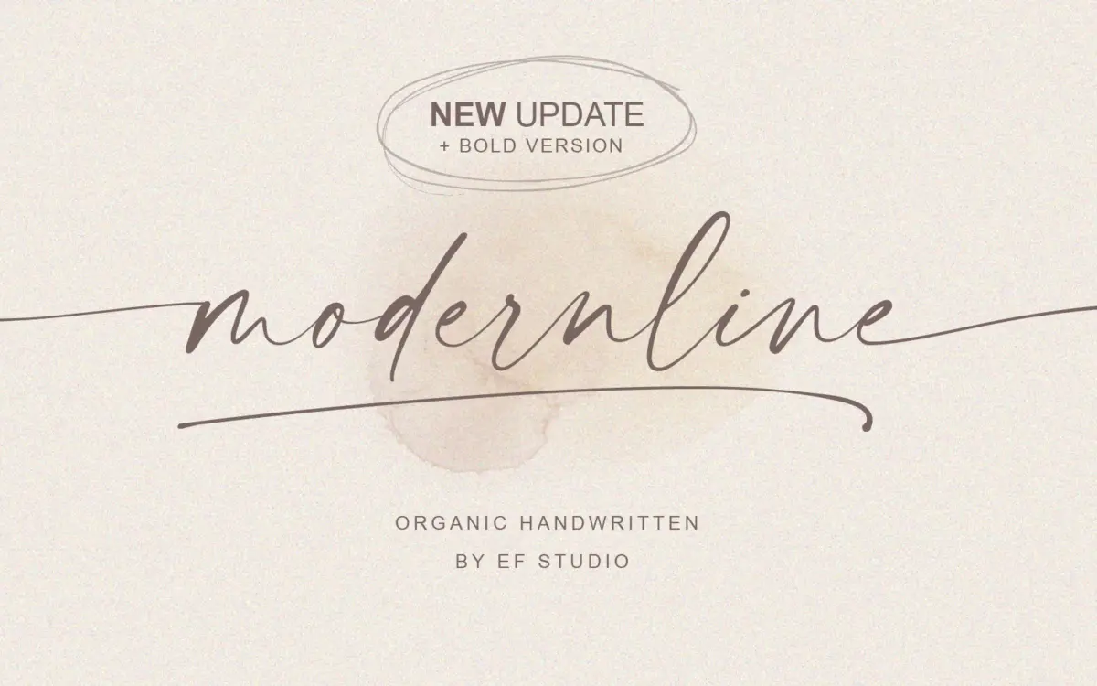
Modernline sits in the loose, monoline end of handwritten script. The strokes keep a near-constant width throughout, with only slight thickening where a pen would naturally slow into a curve, so it reads as biro or felt-tip rather than brush or broad-nib calligraphy. Letters lean slightly forward and connect in a relaxed, uneven rhythm that avoids the stamped-out look you get from scripts where every joint is identical. It’s not trying to be elegant copperplate; it’s closer to a confident everyday signature, which is presumably the point given the name.
The regular weight is light enough to feel casual and a little understated. The bold addition thickens the stroke without changing the skeleton, and it’s the version that actually holds up as a standalone wordmark — the regular can look thin and tentative at small sizes or in a single short word.
Character set and features
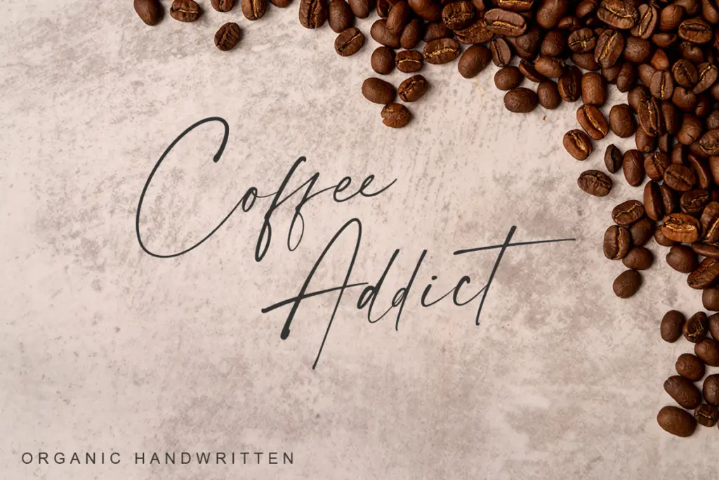
The set covers uppercase and lowercase, numerals, punctuation, and multilingual symbols, so language coverage beyond basic Latin accents is plausible but not something to assume without checking. The more useful part of the package is structural: lowercase beginning and ending swashes, ligatures, and extra swashes, plus a separate “tail” version of both weights that presumably supplies the swash alternates as a distinct font file rather than through OpenType features in every app.
That file-based split is worth knowing before you commit a layout to it. If your software or workflow doesn’t support discretionary ligatures and contextual alternates, you’ll be manually swapping in swash characters from the tail files rather than typing and letting the font decide. It works, but it’s more hands-on than a script with full OpenType substitution built into one file.
Spacing is generous and connections are built for natural reading rather than tight kerning pairs, which means it behaves reasonably well as you type it rather than demanding constant manual adjustment — though long passages will still want a human eye on word-to-word rhythm, as with any connected script.
Use cases
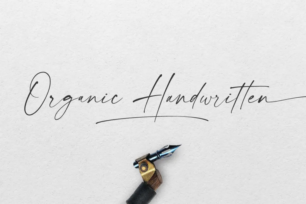
This is a short-phrase font, not a text face. Names, taglines, a single line on an invitation, a product label, a signature-style logotype — that’s its natural habitat. The bold weight is the one to reach for when the type needs to carry visual weight on its own, on packaging or a sign where it’s competing with other elements. The regular weight works better layered over a photograph, paired with a plain sans for supporting text, or used where delicacy is wanted rather than presence.
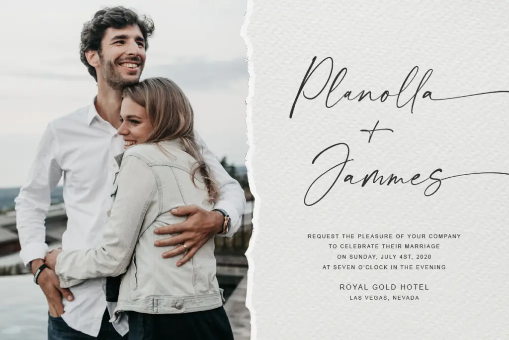
Wedding stationery is an obvious fit given the casual-elegant tone, and it would do fine work on invitation suites, place cards, or monograms where a more rigid calligraphic script would feel too formal. For branding, it suits categories pitching themselves as handmade, approachable, or personal — skincare, small-batch food, lifestyle brands — rather than anything wanting polish or austerity. It’s less convincing for anything masculine-coded or corporate despite how it’s sometimes marketed; the looseness of the strokes reads warm and informal regardless of context.
What we liked, and what we didn’t
Strengths
- Bold weight gives the script enough weight to stand alone on packaging or signage
- Swash and ligature extras add personality without overcomplicating the base letterforms
- Generous natural spacing means it behaves reasonably well straight out of the box
Trade-offs
- Swash alternates are split across separate 'tail' font files rather than built into OpenType substitution
- Regular weight can look thin and tentative at small sizes or in short single words
Modernline is a competent, casual signature-style script best suited to short phrases rather than running text. The bold weight and swash extras give it some flexibility, but the swash handling across separate files is a bit clunky and the regular weight needs careful pairing to avoid looking thin.
Verdict

Tantype reviews typefaces in depth — every font is tested in real branding, editorial and screen layouts before a word gets written. 555+ fonts reviewed and counting.