
FBS Nacho Font Free Download
Is FBS Nacho free to download?
FBS Nacho is a commercial font sold on Creative Market, so the full version needs a paid license. Get it from the official listing: FBS Nacho font download.
Need something free? These sans serif fonts from Google Fonts are free for personal and commercial use:
Design style
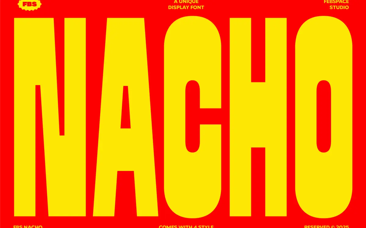
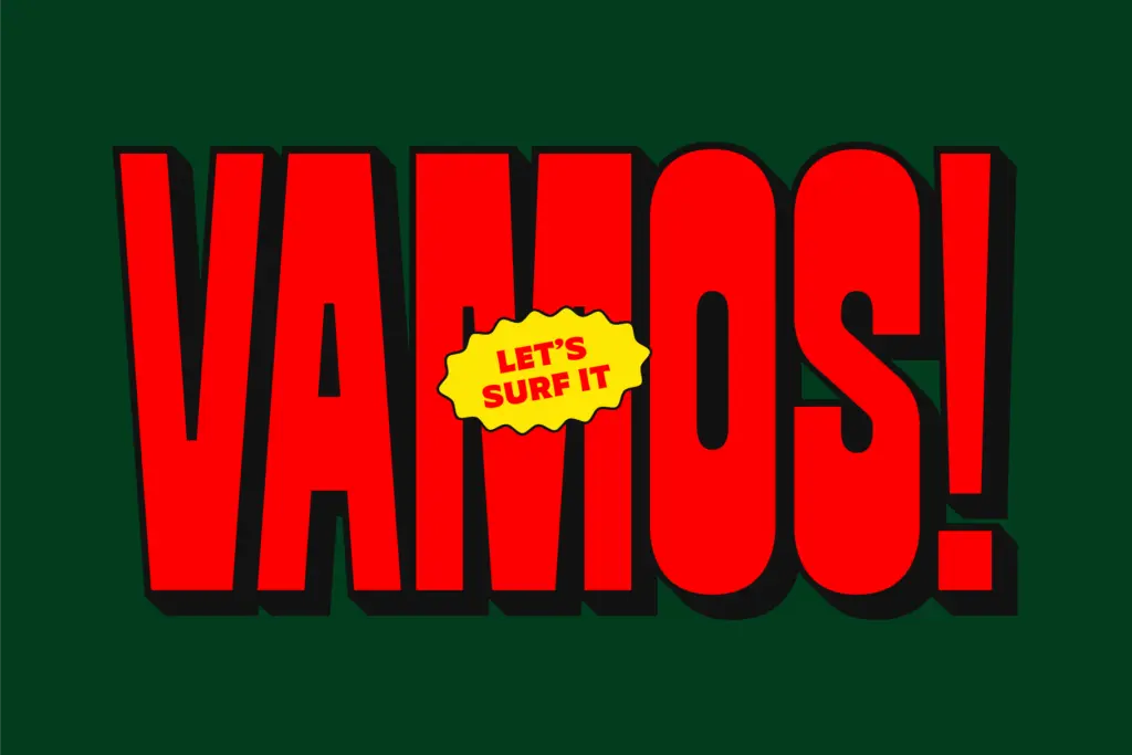
FBS Nacho is a heavyweight display sans with no interest in subtlety. The letterforms are thick, the counters are tight, and the whole alphabet reads as a set of simplified, rounded blocks rather than refined strokes. It comes in four variants: a Regular, a Soft Round with rounded terminals, and shadowed versions of both. The shadow is a simple offset extrusion rather than a drawn dimensional effect, which keeps it fast to use but also means it looks exactly like what it is — a flat shape duplicated and nudged behind itself.
The minimalist angle the brief mentions is fair. There’s no attempt at historical reference or stylistic flourish here — no ink traps, no swash alternates, no contrast in stroke weight. It’s a geometric skeleton inflated to near-maximum thickness, which puts it in the same broad family as the slab-ish, poster-weight sans faces that have been popular on merch and packaging for the last several years. It doesn’t try to distinguish itself through eccentric letter construction; it distinguishes itself through sheer bulk and the shadow option.
Character set and features
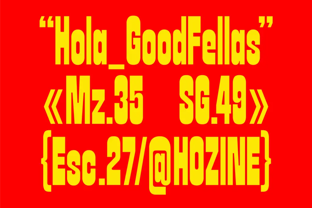
As a headline font, FBS Nacho is built to be looked at in short bursts: a word, a logotype, a number on a jersey. The spacing between characters is generous enough that the thick strokes don’t collide, which is the main technical hurdle a font this heavy has to clear, and it clears it. The Soft Round cut softens the corners just enough to feel friendlier without losing the blockiness that defines the family.
The shadow variants are the more interesting proposition, since they do double duty as a layering system — set the shadow version behind the flat version in a contrasting colour and you get a two-tone effect without hand-building it in illustration software. That’s a genuinely useful shortcut for anyone who doesn’t want to construct drop shadows manually for every headline. The trade-off is that the shadow offset is fixed in the font itself, so you don’t get to dial in the depth or angle; you get what’s drawn.
Don’t expect this to do fine-detail work. At body text sizes the thickness that makes it punchy as a headline turns into a dark, undifferentiated mass, and any lowercase nuance gets lost. This is a display face in the strict sense: it has one register, and that register is loud.
Use cases
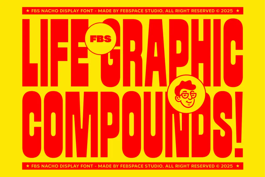
FBS Nacho suits posters, merch graphics, social headers, packaging call-outs, and short branding lockups where the goal is to grab attention fast. The shadow variants are well suited to sticker sheets, badge-style logos, or any layout that wants a retro-pop, slightly toy-like energy. It’s a reasonable pick for a brand that wants to feel playful and sturdy rather than elegant or restrained.
It’s a poor fit for anything that needs a quiet typographic voice — body copy, long-form editorial layouts, or brands aiming for understatement will find it overbearing. Pair it with a plainer workhorse for supporting text, since FBS Nacho isn’t built to share a page quietly.
What we liked, and what we didn’t
Strengths
- Thick, confidently spaced letterforms that stay legible at poster scale
- Built-in shadow variants save manual layering work for two-tone effects
- Soft Round cut gives a friendlier option without redrawing the family
Trade-offs
- Shadow offset is fixed, with no control over depth or angle
- Breaks down quickly at body text sizes due to heavy stroke weight
FBS Nacho does one job — loud, chunky headlines with an easy shadow effect — and does it competently without trying to be more than that. It won't surprise anyone who's seen the current wave of bold poster sans faces, but the built-in shadow layering is a genuine time-saver. Keep it to short text and pair it with something quieter for everything else.

Tantype writes independent reviews of typefaces: what each font does well, where it falls short, what it suits, and where it is sold.