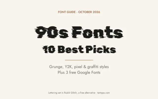
90s Fonts: 10 Best Nineties Fonts for Grunge, Y2K, Pixel and Hip-Hop Designs
The best 90s fonts don’t share one look, because the decade had several: grunge magazine type, photocopied zine lettering, pixel…
 Varun

The best 90s fonts don’t share one look, because the decade had several: grunge magazine type, photocopied zine lettering, pixel…
Varun
A kids font is a typeface drawn to look friendly to children and parents: round shapes, thick strokes, letters that…
Varun
Racing fonts are typefaces that look fast: forward-leaning italics, wide extended capitals, heavy livery numbers and the brush scripts of…
Varun
A good scary font does its job before anyone reads the words: letters that drip, splatter, shake or look scratched…
Varun
An outline font draws each letter as a contour with the inside left open, so the paper, a photo or…
Varun
The best 70s fonts are soft, heavy and round: fat serifs that look poured rather than carved, bubbly scripts from…
Varun
Poster fonts are typefaces that still read when they are big, far away and seen for a few seconds, on…
Varun
The best 80s fonts cover a lot of ground, because the look people call “eighties” mixes neon scripts, chrome logos,…
Varun
The best Christmas fonts look like the season before you read a word: candy-cane stripes, cosy hand-painted letters, card scripts…
Varun