
MANIC: an erratic handwritten face for loud, informal branding
Design style
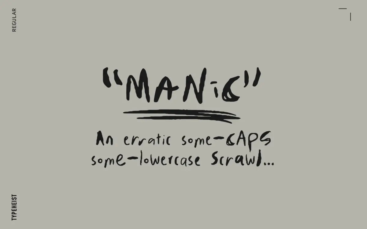
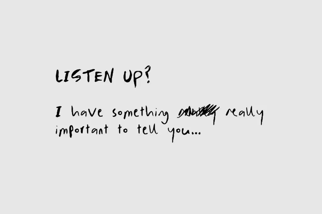
MANIC is a scrawl font in the truest sense: uneven baselines, mixed-case letterforms that jump between capital and lowercase construction, and strokes that look genuinely written rather than traced. Nothing here pretends to be tidy. Letters wobble, terminals stop mid-gesture, and the overall texture reads as fast, slightly agitated handwriting rather than considered lettering. It sits at the messier end of the handwritten category, closer to a marker note scrawled in a hurry than a diary entry.
The four style variants (Regular plus three Alternates, along with a Sketches set) each push the erratic quality in a different direction. Swapping between them changes the personality of a word noticeably — some feel more manic and jagged, others slightly calmer — which gives the font more range than a single-weight scrawl typically offers. The trade-off is that MANIC has no restrained mode. There is no clean version to fall back on if a project needs the handwritten warmth without the chaos.
Character set and features
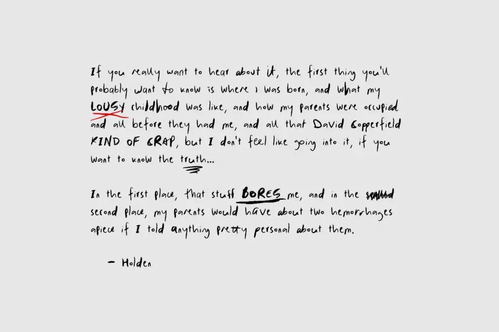
Each letter and numeral has four drawn variations across the style set, so repeated characters in a word don’t stamp out identically — useful for a font whose whole appeal is looking hand-done rather than mechanically repeated. Layered on top of that are more than 100 ligatures, including doubled-letter combinations in both cases, which is where MANIC does its real work: common letter pairs get custom-joined forms instead of two separate glyphs sitting next to each other, closing gaps that would otherwise expose the font’s artificial regularity.
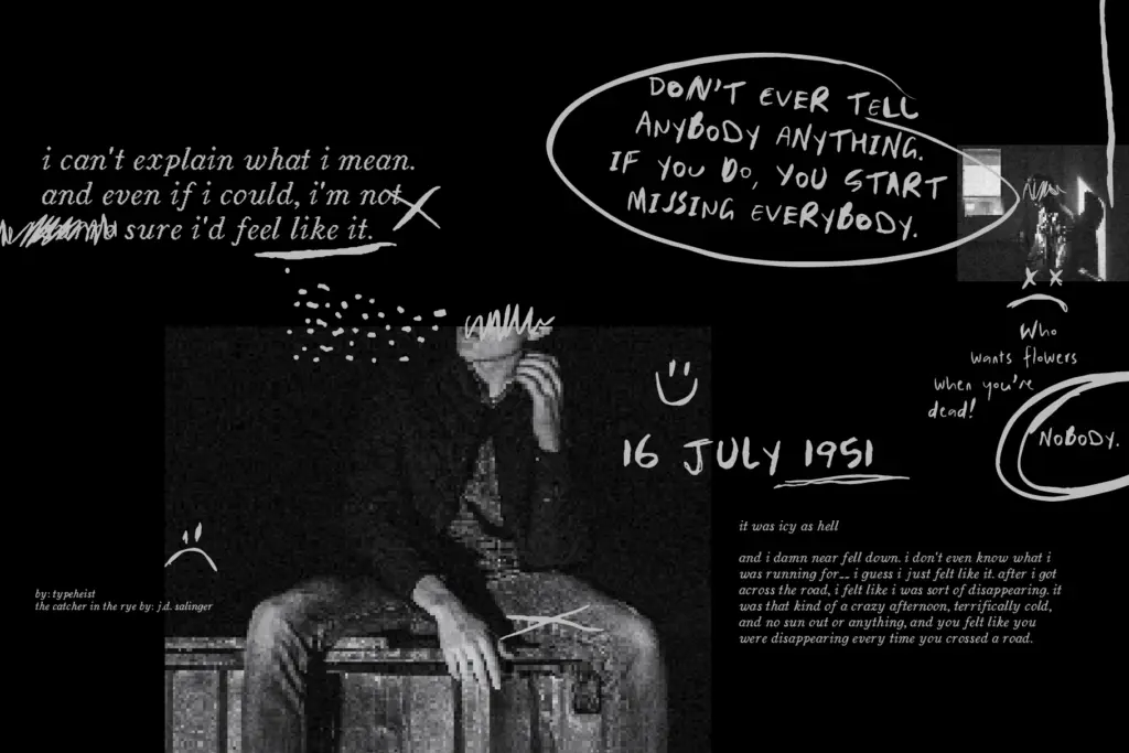
There’s also a Sketches style and a separate set of Embellishments supplied as SVG/PNG assets — scribbles, marks, and flourishes meant to sit around the type rather than in it. Standard English characters are covered, along with accented characters for other Latin-based languages, though this is not a font built for setting long passages in any language; it’s built for short bursts.
Use cases
MANIC belongs on packaging, gig posters, social graphics, and any branding project that wants to look handmade, urgent, or a little unhinged in a good way — skate and streetwear labels, zines, music merchandise, anything trading on energy over polish. The ligatures make short product names and logotypes look genuinely lettered rather than typed, which is the font’s strongest use case.
It is not a body-copy font, and it isn’t meant to be — the mixed-case erratic structure would make paragraph-length text exhausting to read. It also isn’t the right choice for anything that needs to look considered or premium; the scrawl reads as deliberately rough, which works against elegant or luxury contexts. Best used sparingly: a headline, a logotype, a single scrawled word over a clean layout, letting the surrounding design carry the calm that MANIC deliberately withholds.
What we liked, and what we didn’t
Strengths
- Over 100 ligatures, including double-letter combos, genuinely disguise repetition
- Four style variants per letter give it more range than a typical single-weight scrawl font
- Embellishment assets add usable extras beyond the core letterforms
Trade-offs
- No calmer or cleaner variant exists for projects that want handwriting without full chaos
- Mixed-case erratic structure makes it unsuitable for anything beyond short headline-length text
MANIC delivers a convincingly chaotic handwritten scrawl backed by real production effort in its ligatures and multiple style variants. It's a one-trick font, but the trick is well-made and it does the job of looking genuinely hand-scrawled better than most competitors in this niche.
Verdict

Tantype reviews typefaces in depth — every font is tested in real branding, editorial and screen layouts before a word gets written. 555+ fonts reviewed and counting.