
Dark Reborn: a blackletter-serif hybrid for metal, tattoo and occult branding
Design style
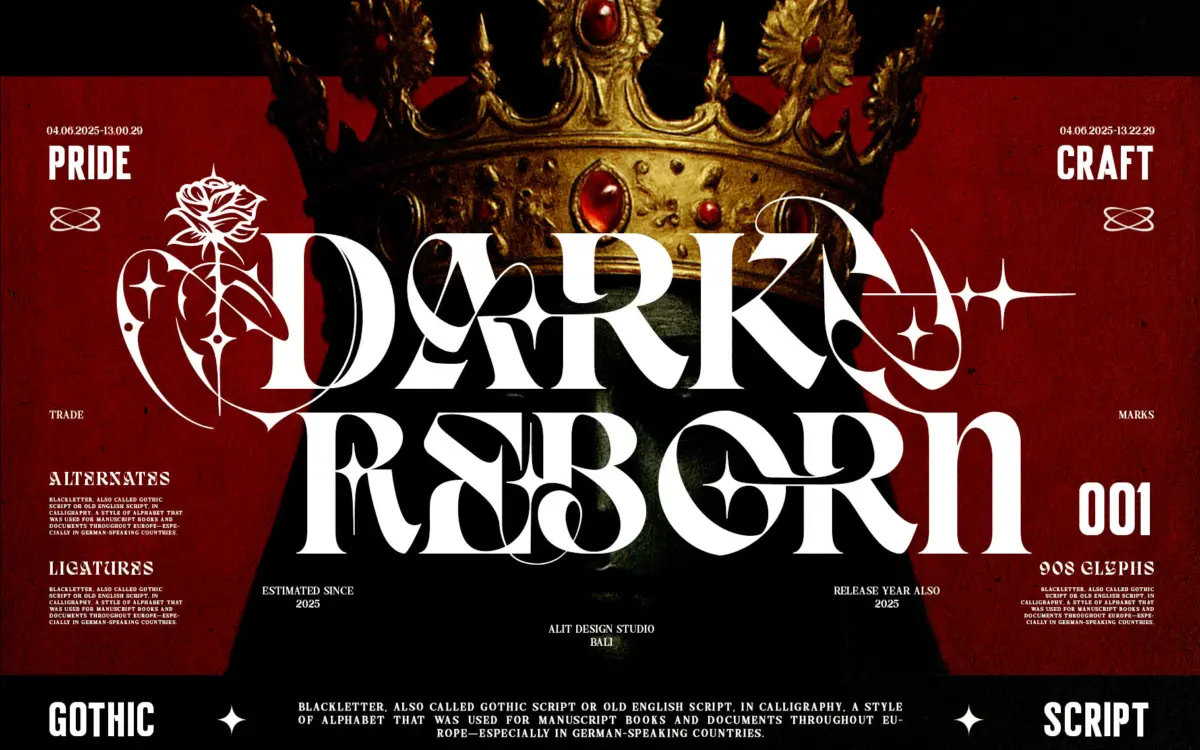
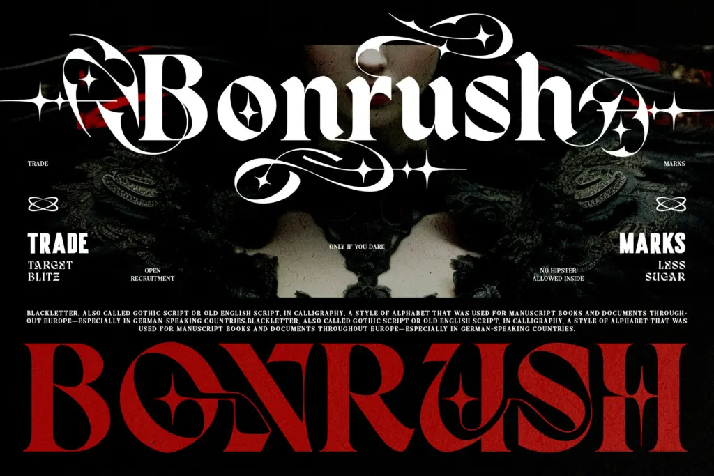
Dark Reborn sits at the crossing point of Blackletter and slab-weight serif, and it doesn’t try to hide the seam. The vertical stress and angular joins of Old English scripts are still there in the bowls and crossbars, but the strokes have been thickened and squared off in a way that reads closer to a modern display serif than a medieval manuscript hand. It’s a deliberate mismatch, and mostly it works — the letters keep enough Gothic bite to feel historic while the added weight gives them the punch a screen or a poster needs.
Where it gets more decorative is in the tribal-style swashes and the rose-inspired alternates worked into some of the capitals. These aren’t subtle. They’re built to be noticed, curling off ascenders and terminals like engraved ornament rather than restrained calligraphic flourish. On a few letters this ornamentation crowds the letterform itself, and the line between ‘Gothic detail’ and ‘clip-art rose’ gets thin. Used sparingly, as accents on a wordmark or a single drop cap, the effect is strong. Used across a whole word, it starts to compete with itself.
Character set and features
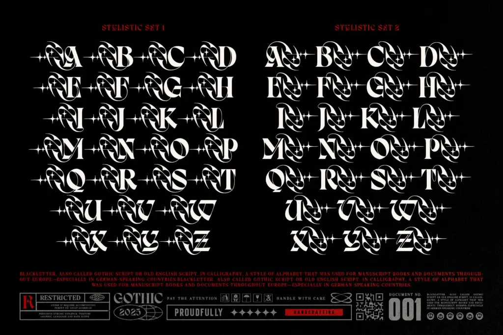
The core alphabet holds the Blackletter-serif fusion consistently — capitals are dense and monumental, built for short words and single lines rather than paragraphs. Alternate glyphs and the tribal/rose swash variants give you a way to dial the ornamentation up or down letter by letter, which is the most practical part of the set: you can set a clean version for legibility and swap in the decorated caps only where you want a focal point.
The high-contrast strokes and the calligraphic terminals mean the typeface photographs and prints well at large sizes — engraving, foil, laser etching, screen print all suit the sharp edges here. But that same contrast is a liability once the type shrinks. Thin hairlines paired with heavy stems is a combination that blurs fast in small print or on low-resolution screens, so this isn’t a font to reach for below display size.
Use cases
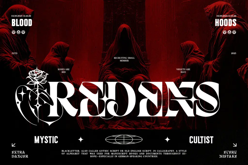
This is a logo and cover typeface, not a body-copy one. It’s built for the jobs its ornamentation is aimed at: metal and rock album art, tattoo flash and studio branding, occult or esoteric packaging, fashion labels chasing a dark-luxury mood. A single word set large — a band name, a product name, a drop cap on a poster — is where the Blackletter-serif fusion and the swash alternates earn their keep.
It’s less suited to anything that needs to stay legible at a distance in low light, or to run more than a few words. Wedding stationery or editorial headlines that want a gothic flavour without the theatrics would be better served by a plainer Blackletter. Dark Reborn wants drama, not restraint, and it should be cast in roles that ask for exactly that.
What we liked, and what we didn’t
Strengths
- Blackletter-serif fusion has real character and reads as intentional rather than decorative overload
- Alternate swash and rose glyphs let you control ornamentation on a letter-by-letter basis
- Sharp, high-contrast strokes suit engraving, foil and screen-print production
Trade-offs
- High stroke contrast makes it fragile at small sizes or low resolution
- Some ornamental alternates crowd the letterform and can tip into clutter when overused
Dark Reborn commits fully to its dark-Gothic-meets-modern-serif concept, and the ornamental swashes give it real presence at large sizes. It's a specialist display face — strong for album art, tattoo and occult branding, weak anywhere legibility or small sizes matter.
Verdict

Tantype reviews typefaces in depth — every font is tested in real branding, editorial and screen layouts before a word gets written. 555+ fonts reviewed and counting.