
VINTAGEST: A Flat-Pen Retro Script for Nostalgic Branding Work
Design style
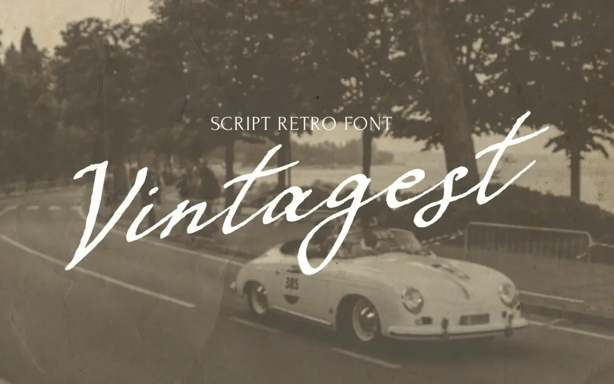
VINTAGEST is a handwritten script built around the mark of a flat, ink-loaded pen rather than a pointed nib. That distinction matters: instead of the swelling thick-to-thin transitions you get from pressure-sensitive calligraphy, the contrast here comes from the angle at which the pen is held, so strokes shift width as the letter turns rather than as it slows down. The result reads as more deliberate than fluid — closer to a careful hand than a fast one, which fits the brief of a grandmother’s letter rather than a florist’s chalkboard.
Letters lean forward at a consistent angle and sit close together, with joins that feel drawn rather than templated. There’s a slight roughness to the stroke edges in places, the kind of texture you’d expect from real ink on paper rather than a vector smoothing tool, and it’s this texture that carries most of the ‘retro’ claim rather than any period-specific letter construction. It’s not a revival of a particular decade’s hand-lettering so much as a general sense of vintage informality.
Character set and features
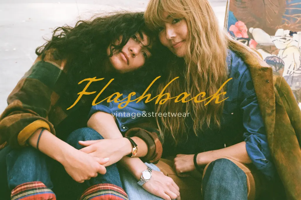
The font leans on ligatures and alternate characters to avoid the repetitive look that plagues a lot of script fonts, swapping in different joins depending on letter combinations so a word doesn’t read as the same three or four glyphs recycled. That’s the right approach for a script this size — without it, longer words would show the seams. Language support extends beyond the Latin basics into Cyrillic, along with the Nordic and Baltic diacritics, which is a genuine point in its favour if your work needs to move between markets.
Where it asks more of the user is in setting: this is not a script you type and walk away from. Getting the ligatures and alternates to fire correctly, and checking that awkward letter pairs don’t collide, takes some manual attention in whichever app you’re using. Buyers used to a fully automatic script should budget time for that.
Use cases
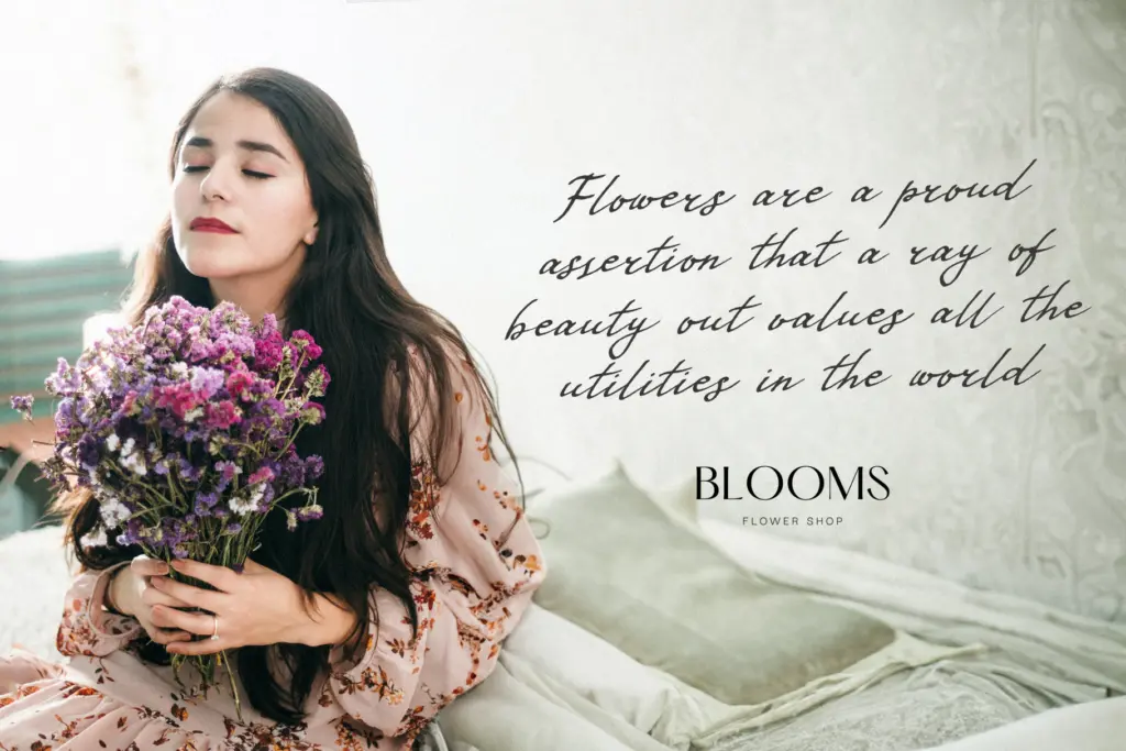
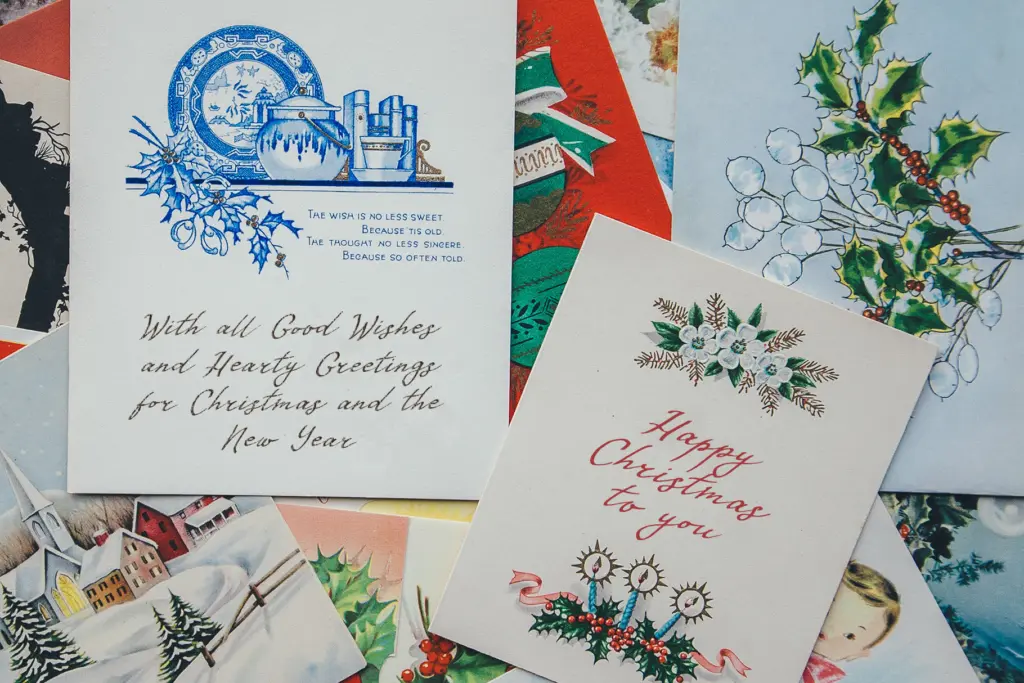
VINTAGEST suits short-form work: a logotype, a signature line, a product label, a greeting card sentiment. Its density and forward lean mean it wants space around it and a generous size — this is not a script built for body copy or dense paragraph setting, and pushing it small will collapse the joins into mush. At display sizes, on packaging or a wordmark, the ink texture and handwritten irregularity do real work, giving a brand a sense of warmth and history rather than manufactured retro.
It also pairs naturally with a plain sans or serif for supporting text, since its personality is strong enough that it shouldn’t be asked to carry a whole layout on its own. For seasonal or nostalgic branding — Christmas cards, heritage packaging, small-batch product labels — it does its job without overreaching, provided the person setting it is willing to fine-tune the ligatures rather than trust autopilot.
What we liked, and what we didn’t
Strengths
- Flat-pen construction gives it a distinct contrast pattern rather than generic calligraphic swash
- Extensive ligatures and alternates prevent obvious letter repetition in longer words
- Cyrillic and broad diacritic support extends its use beyond English-only branding
Trade-offs
- Requires manual attention to ligatures and letter pairs rather than working well on autopilot
- Density and lean make it unsuitable for anything beyond short display text
VINTAGEST is a competently drawn retro script with a real point of view in its flat-pen texture, but it demands manual setup to look its best and only really works at display sizes. Good for logos, labels and short nostalgic lines rather than anything long-form.
Verdict

Tantype reviews typefaces in depth — every font is tested in real branding, editorial and screen layouts before a word gets written. 555+ fonts reviewed and counting.