
Dreamies Retro Script: a bold hand-lettered script with vintage swagger
Design style
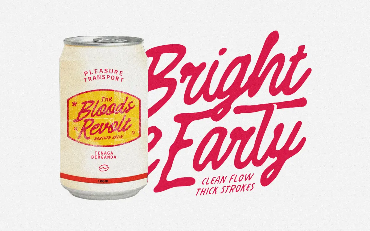
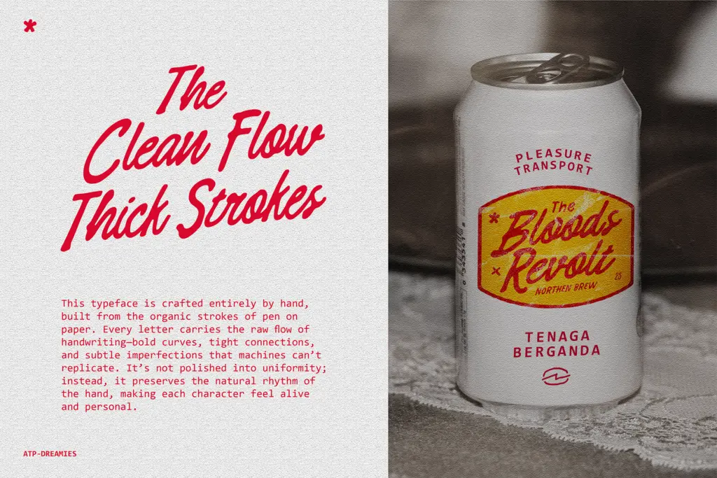
Dreamies Retro Script sits in the thick-nibbed, mid-century family of scripts — the kind of lettering you associate with old soda logos, diner signage and hand-painted matchbooks. The strokes are heavy and confident rather than delicate, with connections between letters kept tight so words read as continuous gestures rather than assembled characters. You can see the pen in it: the pressure changes are irregular, terminals sometimes flare and sometimes just stop, and no two repeated letters look quite identical. That’s the point. It’s built to feel drawn, not vectorised into submission.
The retro label is earned less through period ornament than through weight and attitude. There’s little of the looping, formal calligraphy you’d find in wedding scripts; instead the letterforms lean bold and a bit blunt, closer to hand-painted signage than pointed-pen tradition. The baseline wanders slightly, which reads as intentional rather than sloppy, and gives the face a loose, energetic rhythm across a line of text.
Character set and features
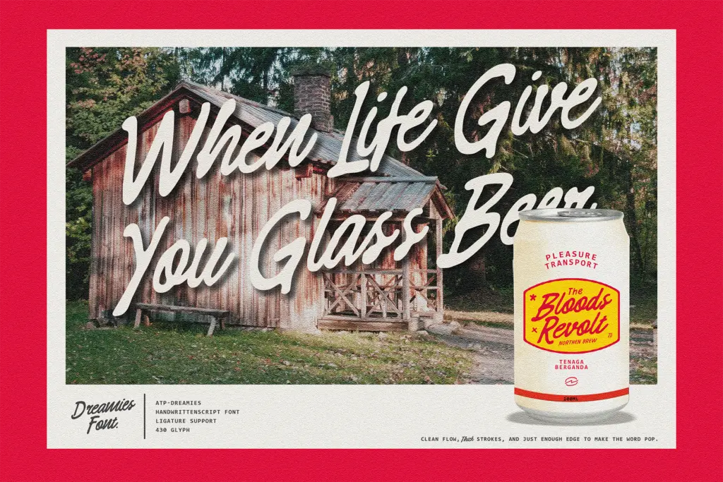
As a script built from handwriting, the connective logic is doing most of the work here. Lowercase letters link at consistent heights so words hold together as single shapes, which is what makes scripts like this legible at all — break that chain and it falls apart. Judging by the letterforms, this is a display script rather than a workhorse text face: it wants space, size and short strings of words, not paragraphs. The imperfections that give it character — inconsistent stroke weight, slightly uneven spacing — are assets in a headline and liabilities in a caption.
The seller doesn’t specify OpenType alternates or ligature sets, so treat the face as a single, fixed alphabet rather than a system with swash variants to swap in. That’s worth knowing before you commit to it for a project that needs flexibility letter by letter — what you see in the specimen is largely what you’ll get.
Use cases
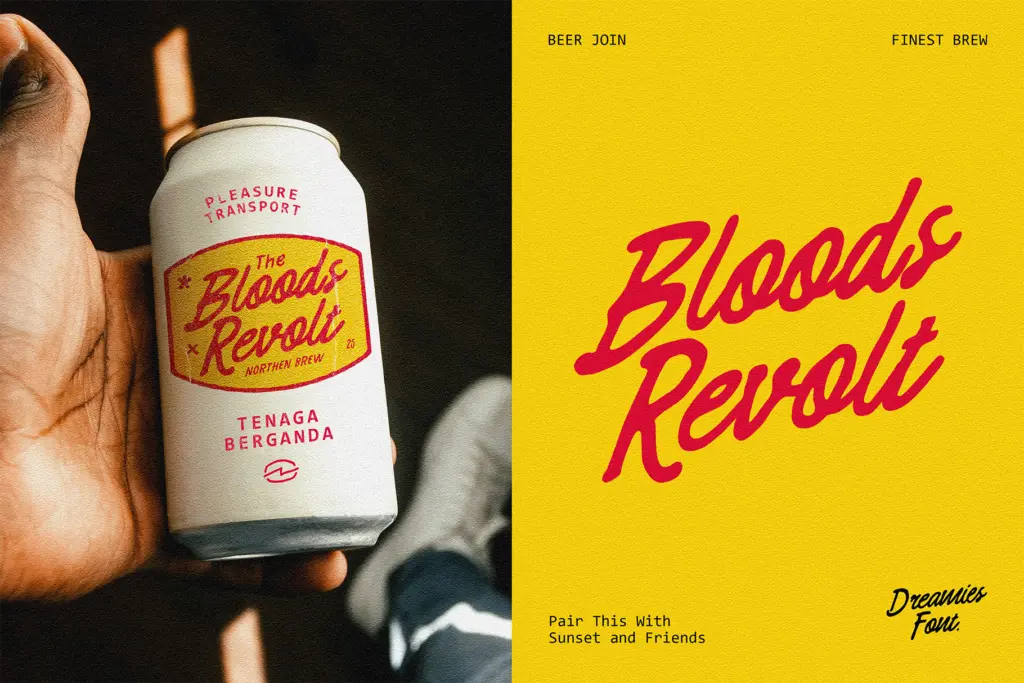
This is a logo and packaging script first. The boldness holds up shrunk onto a bottle label or stamped across a badge in a way that finer, more traditional scripts can’t — thin hairlines are the usual casualty of scaling down, and this typeface mostly avoids having any. It also does well on posters, merchandise, and anywhere a single word or short phrase needs to carry a hand-made, slightly rough-edged personality: think craft beer labels, retro-themed event posters, or apparel graphics rather than fine stationery.
It’s less suited to formal wedding invitations or anything that wants elegance and restraint — the thickness and irregularity read as playful and rustic, not refined. And because it’s a connected script with a loose baseline, it needs generous kerning space and shouldn’t be set small or dense; cramming it into a paragraph or a tight logo lockup will blur the connections that make it legible. Used at display size, with room to breathe, it does the job it was drawn for.
What we liked, and what we didn’t
Strengths
- Heavy, confident strokes stay legible even at small logo or label sizes
- Irregular baseline and stroke weight give it a genuinely hand-made feel rather than a filtered one
- Works well for retro branding, packaging and signage-style graphics
Trade-offs
- No apparent alternate glyphs or ligatures to vary repeated letters
- Not suited to long text or dense paragraph settings
Dreamies Retro Script is a confidently bold, hand-drawn display script built for logos, labels and posters rather than body text or formal stationery. It has real character but limited range — a single fixed alphabet with no alternates means what you see is what you get. Use it for short, punchy, oversized settings and it earns its keep.
Verdict

Tantype reviews typefaces in depth — every font is tested in real branding, editorial and screen layouts before a word gets written. 555+ fonts reviewed and counting.