
Palmer Script & Sans: a vintage-leaning duo built for logo work
Design style
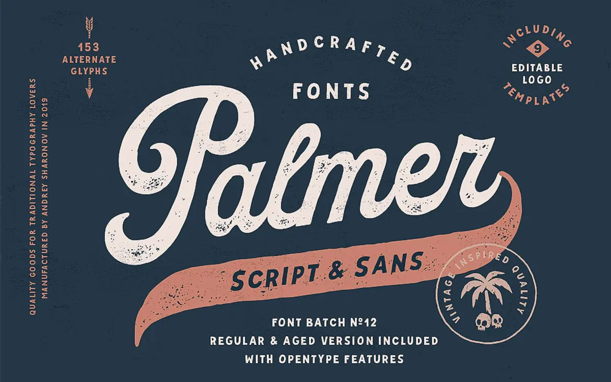
Palmer is a script and sans pairing built around the idea of old-world craft rather than modern polish. The script has a loose, hand-formed quality: strokes swell and taper unevenly, joins are a little irregular, and the overall feel is closer to sign-painting than formal copperplate. It doesn’t try to look machine-perfect, and that’s the point. The Sans companion is plainer and more geometric, there to do the quiet work of setting details and supporting text while the script carries the personality.
Both come in Regular and Aged versions, the latter adding worn edges and broken strokes that push the whole thing toward a distressed, stamped-label look. That’s a useful option, but it’s also a style decision you’re locked into once you commit to it — the Aged versions won’t suit a brand that later wants a cleaner update.
Character set and features
The script’s real depth is in its alternates: 151 stylistic variants plus three end-swashes, each with around ten length options. That’s a genuinely large toolkit for varying letter connections and word endings, and it means two lines set in Palmer needn’t look like they came from the same stamp. The trade-off is that getting the best out of it requires an OpenType-aware app and some manual glyph swapping — this isn’t a font you drop in and walk away from if you want the flourish work to look considered rather than random.
Language support covers a solid range of Northern and Western European languages, including the accented characters for Danish, Finnish, Hungarian and Polish, among others. That widens its use beyond English-only branding jobs without much extra thought from the buyer.
The package also bundles nine editable logo templates, which is a practical inclusion for anyone who wants a starting layout rather than a blank canvas — useful for freelancers doing quick client mockups, less relevant to anyone building a custom identity from scratch.
Use cases
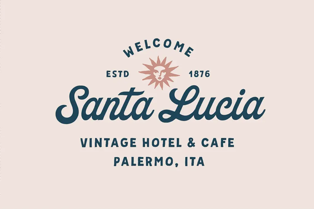
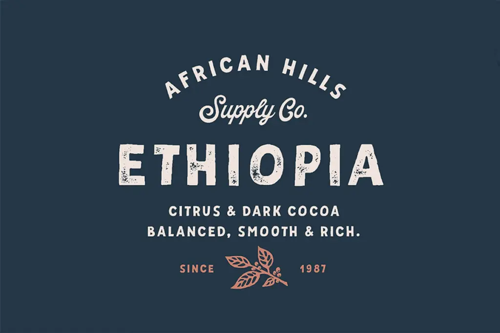
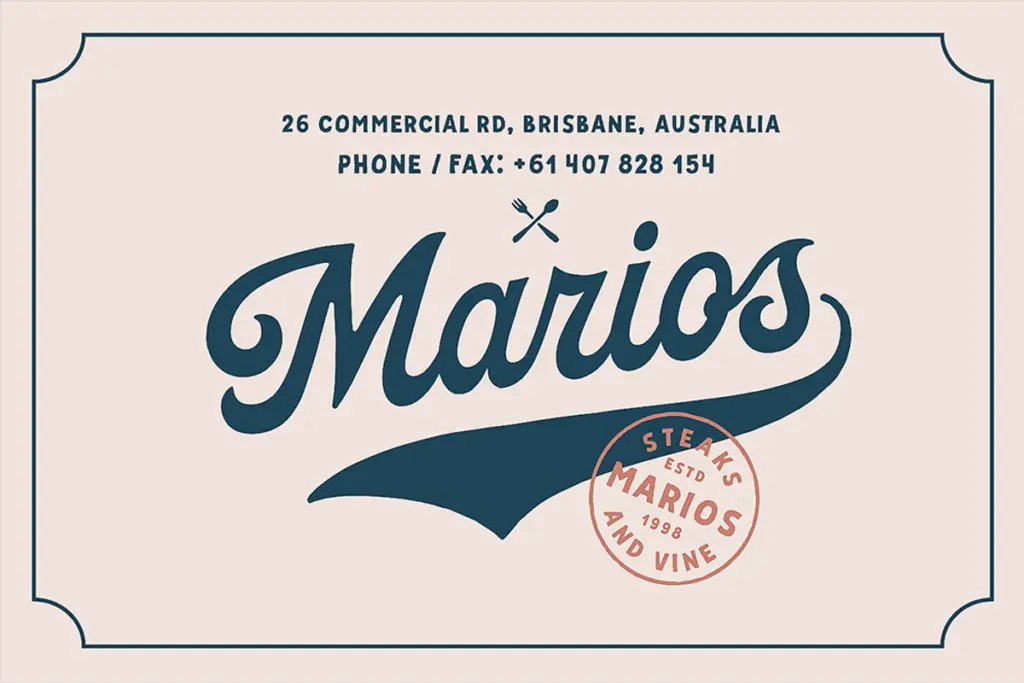
Palmer is suited to work that wants a handmade, slightly worn character: product labels, packaging, café and bakery branding, wedding stationery with a rustic rather than luxury feel, apparel prints, and small-batch retail logos. The Aged versions in particular suit anything leaning into a heritage or craft narrative — think artisanal food packaging or vintage-inspired merchandise.
It’s less at home in body text or long-form editorial work; the script isn’t built for paragraphs, and even the Sans, while cleaner, reads as a support face rather than a text workhorse. At small sizes the script’s texture and swash detail can get lost, so it wants generous point sizes and short lines — headlines, wordmarks, single words on a label — rather than dense information.
Overall, this is a tool for a specific job: giving a brand a warm, handcrafted, slightly imperfect voice, backed by enough alternate glyphs to avoid the repetitive look that cheaper script fonts often fall into.
What we liked, and what we didn’t
Strengths
- 151 stylistic alternates and swash variations give real control over word-ending flourishes
- Aged versions add a distressed option without needing separate distressing work
- Broad European language support beyond the base Latin set
Trade-offs
- Getting good results from the alternates requires manual glyph work, not a quick drop-in setup
- The script loses definition at small sizes, limiting it mostly to display and label use
Palmer Script & Sans is a well-built vintage-style duo with an unusually deep alternate set for its script half. It's strongest at headline and logo scale on craft-and-heritage branding, and weaker anywhere text needs to run long or read small.
Verdict

Tantype reviews typefaces in depth — every font is tested in real branding, editorial and screen layouts before a word gets written. 555+ fonts reviewed and counting.