
Another Danger: a distressed horror caps face for splatter-style branding
Design style
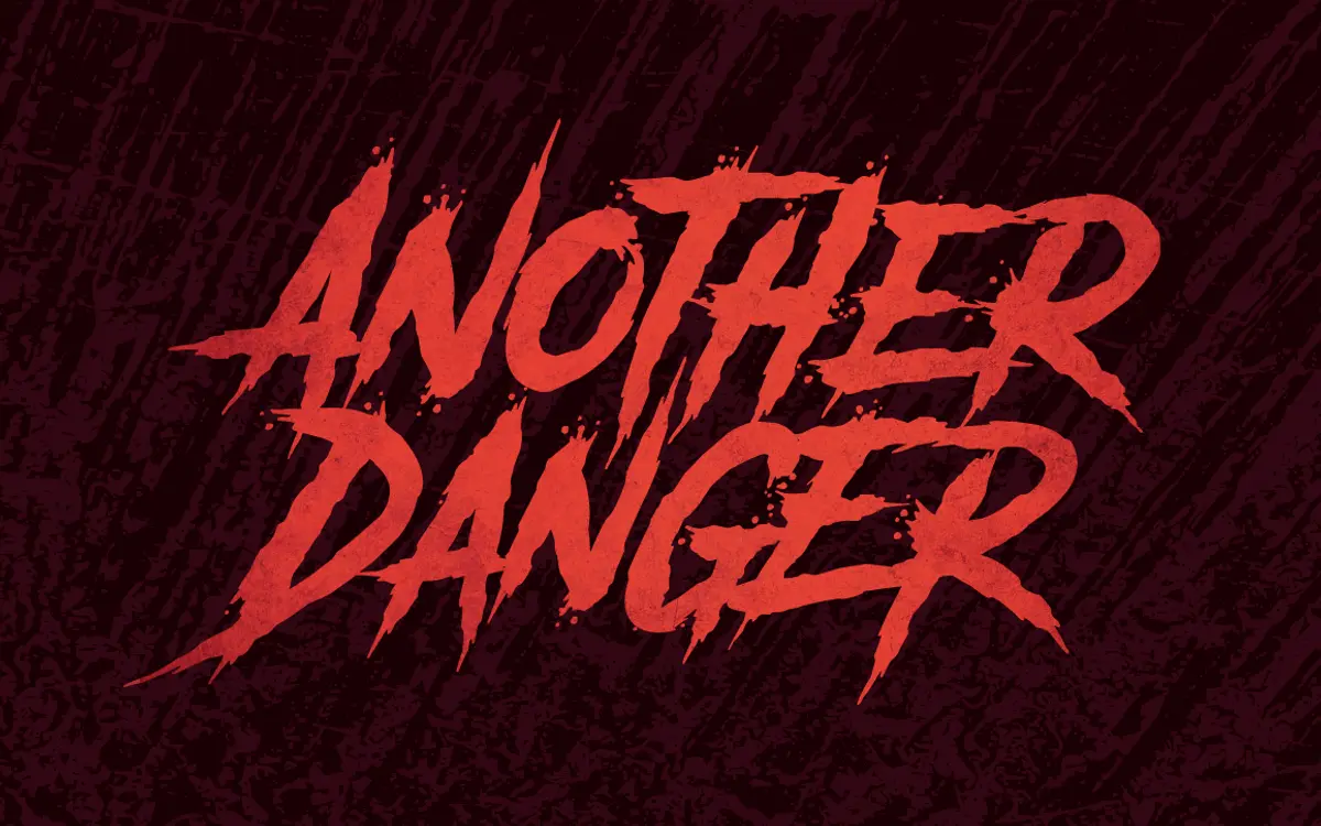
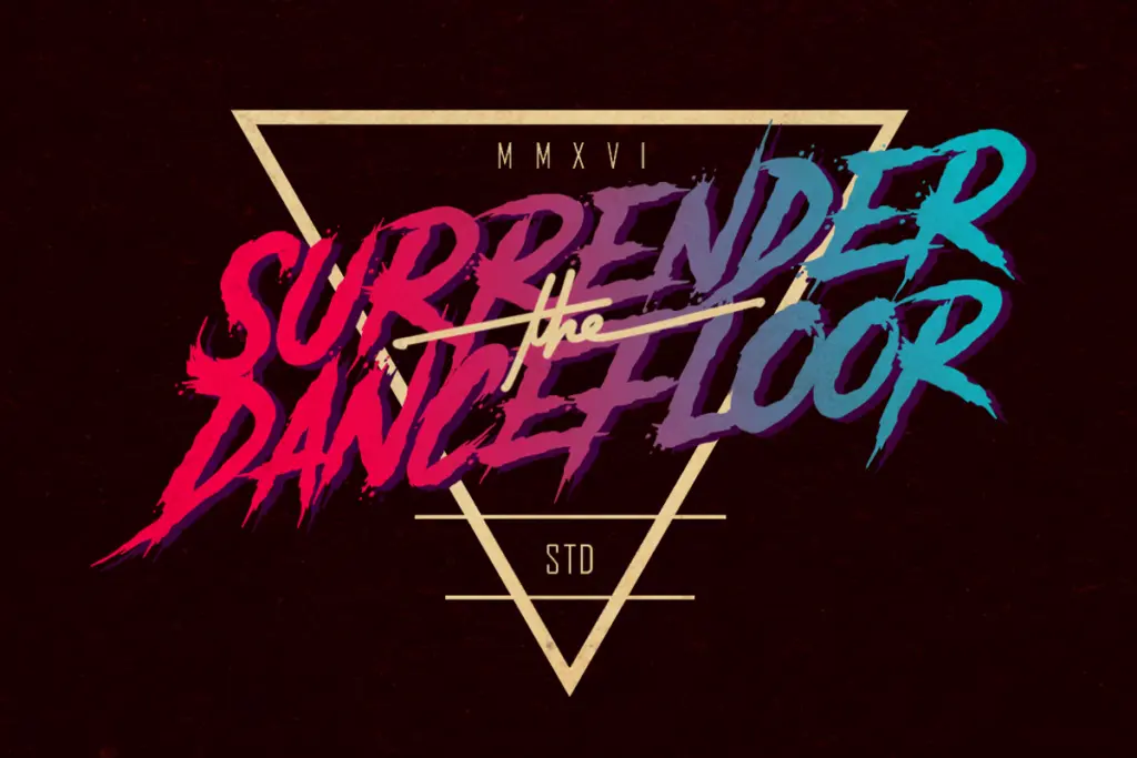
Another Danger is built on a single, blunt idea: take a slab-ish capital skeleton and run it through a rough, inked texture until the edges look torn rather than drawn. The strokes carry heavy, uneven weight, with ink traps and speckled breakup along the stems that read as spray, blood spatter, or worn stencil paint depending on the colour you drop it into. There’s no attempt at restraint here — every letter is meant to look damaged on purpose.
The package includes a slanted companion alongside the upright, which gives you a small amount of range without changing the character of the face. Both versions lean hard into a horror-poster, low-budget-slasher aesthetic: think VHS box art, punk flyers, haunted house signage. It’s a mood font first and a typeface second, and it knows it.
Character set and features
This is capitals-only. There’s no lowercase, which immediately tells you how it’s meant to be used: short words, headlines, single-line lockups, not paragraphs or even long taglines. The texture on each glyph is irregular enough that setting the same letter twice in a word can produce visibly different ink patterns, which adds to the handmade feel but also means kerning and spacing need a human eye rather than default settings.
Both weights are supplied as OTF and TTF, so it’ll drop into most layout and design software without conversion headaches. Beyond that, there isn’t much of a technical feature set to speak of — no extended language support, no alternates system, no ligatures mentioned. It’s a display face with two positions (upright and slanted), and that’s the whole toolkit.
Use cases
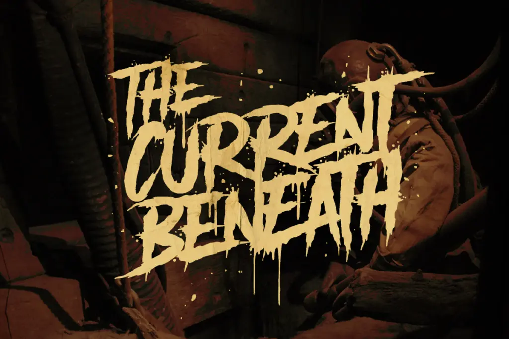
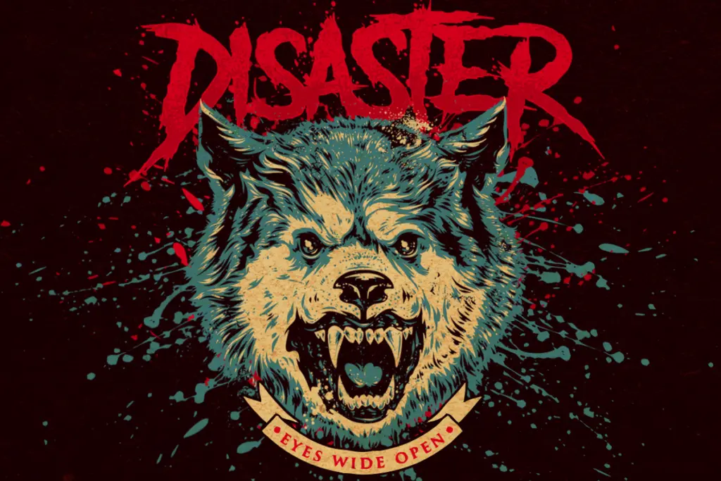
Where this font earns its keep is short, loud, single-purpose type: a horror movie poster title, a band logo, a Halloween event flyer, packaging for a novelty or gag product, merch branding for anything trading on a rough, aggressive look. The slanted version gives you a way to add a bit of motion or urgency to a lockup without switching families.
It’s not a font for body copy, and it’s not really a font for anything that needs to look clean or polished at small sizes — the ink texture that makes it work at headline scale will just look muddy once you shrink it down. It also won’t do quiet or elegant; if a project needs even a hint of subtlety, this isn’t the tool. Treat it as a texture-driven display face for one job — a title, a logo mark, a poster headline — rather than a working font for a whole brand system.
Designers who like to keep grit under control should also budget time for manual kerning on longer words, since the irregular edges mean automatic spacing rarely looks right straight out of the box. Used sparingly, though, it does exactly what it promises: rough, loud, and unmistakably horror.
What we liked, and what we didn’t
Strengths
- Ink-spattered texture gives an immediate horror-poster mood without extra effects work
- Slanted companion adds some variation for logos and lockups
- OTF and TTF formats mean it drops into most software without hassle
Trade-offs
- Capitals-only with no lowercase limits it to short headline-style use
- Irregular texture needs manual kerning and doesn't hold up at small sizes
Another Danger does one job — loud, distressed horror-style headlines — and does it with conviction. It's not built for flexibility or fine typographic control, so treat it as a one-note tool rather than a working family.
Verdict

Tantype reviews typefaces in depth — every font is tested in real branding, editorial and screen layouts before a word gets written. 555+ fonts reviewed and counting.