
VS Grandma’s Recipe: a genuinely imperfect handwritten script for recipe cards and labels
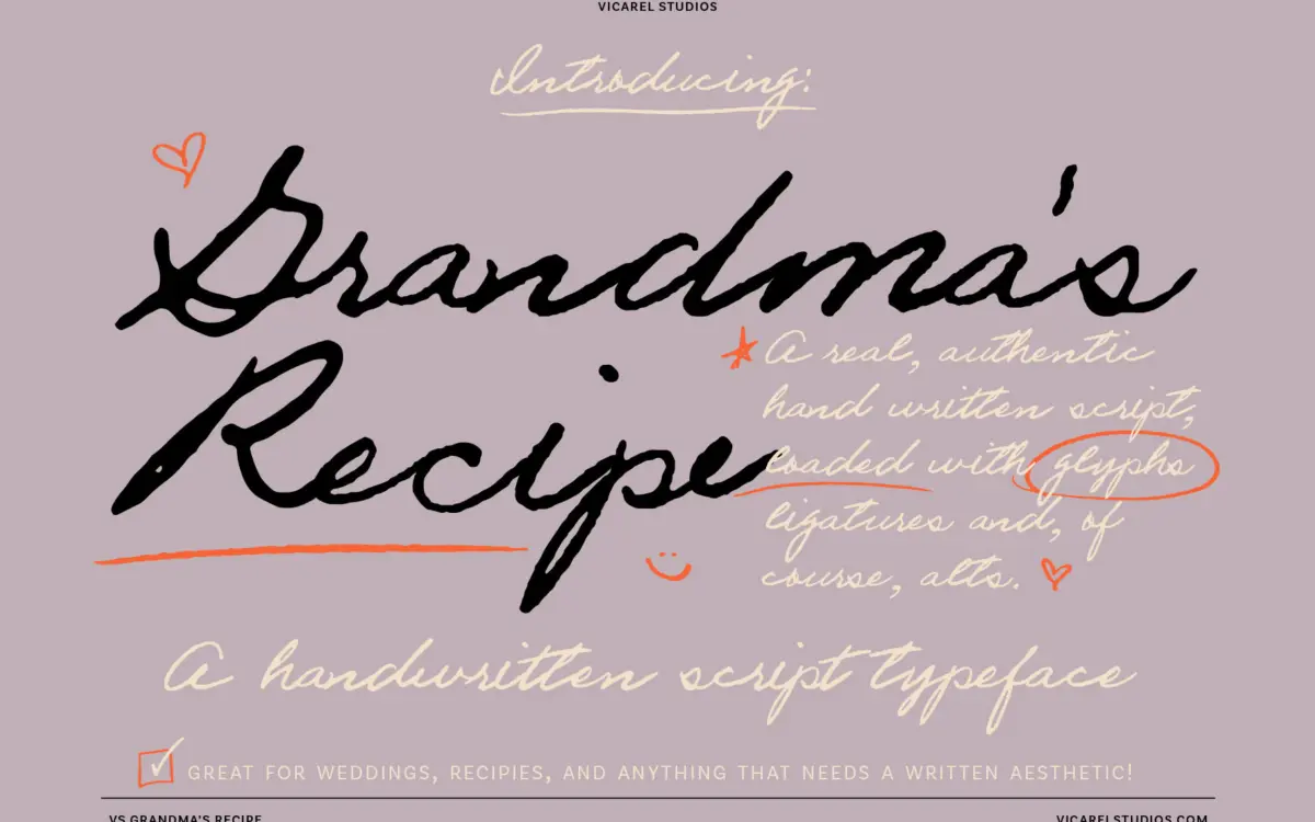
Design style
This is a script built on unevenness rather than polish. It’s modelled directly on one person’s cursive, and it keeps the things most handwriting fonts sand away: angles that drift letter to letter, line weight that thickens and thins without a system, a baseline that wanders slightly rather than sitting on a rail. Where a lot of handwriting fonts fake authenticity by adding a bit of jitter to an otherwise uniform skeleton, this one leans on actual alternate letterforms to do the work, which reads differently up close — less like a script font, more like someone’s actual hand.
The connections between letters are inconsistent by design too. Some entrance and exit strokes link up, others stop short, which is exactly what happens when a person writes quickly and stops thinking about consistency. It won’t suit anyone looking for a clean, repeatable script with predictable joins — that’s not the brief this font is working to.
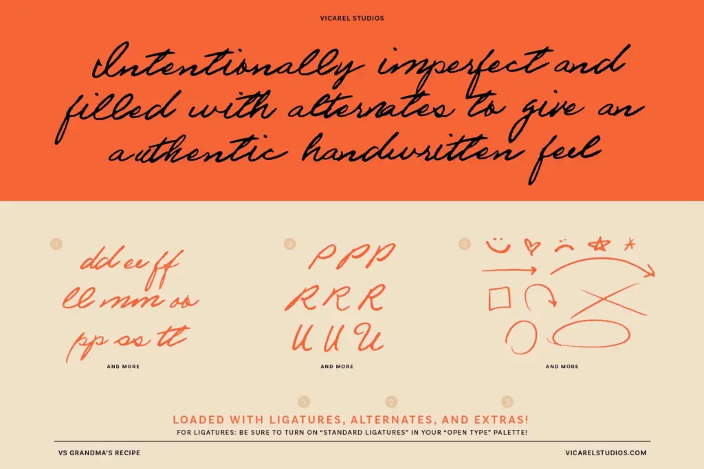
Character set and features
There are 155 glyphs in total, with two to three variants for most letters, numerals and punctuation. In practice that means a word repeating the same letter — the seller uses ‘baseball’ as the example — won’t show identical shapes for each occurrence, assuming the font and software are set up to cycle through alternates (OpenType-aware applications, via ligatures and contextual alternates, rather than something you get automatically in every layout tool). That variation is the font’s whole reason for existing, and it’s worth testing in your actual software before committing to long-form use, since how well it rotates through alternates depends on what you’re setting it in.
Formats are limited to OTF, WOFF and WOFF2, which covers desktop design work and web use without much fuss. There’s no companion sans or serif included — this is a single script, not a pairing system, so pairing decisions are entirely on you.
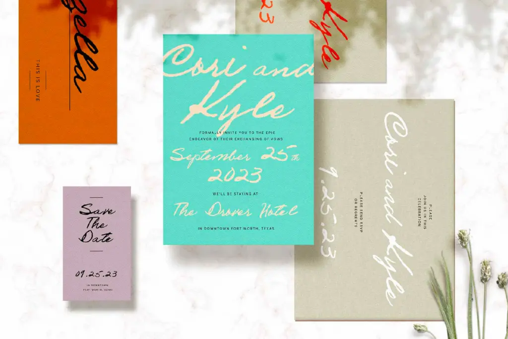
Use cases
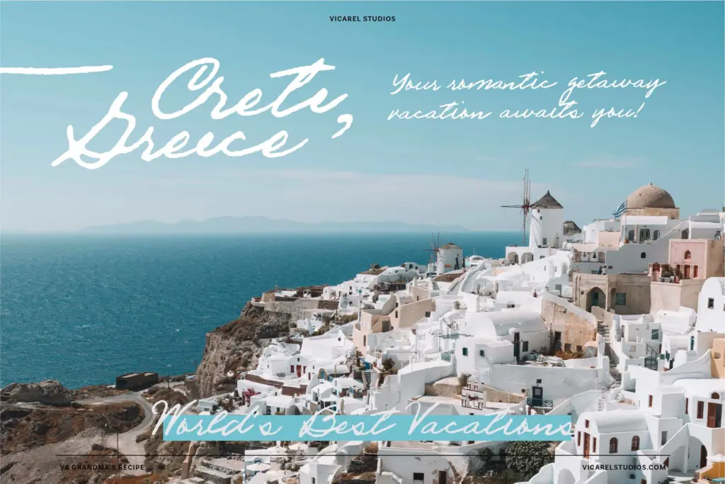
Short-form, personal-feeling copy is where this font is strongest: a recipe card, a handwritten note on packaging, a signature line, a short greeting on a wedding invitation. The imperfection reads as warmth at that scale and that length. It’s well suited to liquor labels, jam jar lids, bakery branding, anything trying to signal
What we liked, and what we didn’t
Strengths
- Letterform alternates genuinely vary repeated letters rather than relying on fake jitter
- Strong fit for packaging and recipe-card style warmth
- Comes with a generous glyph set including numerals and punctuation variants
Trade-offs
- The deliberate unevenness can hurt legibility in long paragraphs or small print
- No companion family or weight, so pairing is left entirely to the user
VS Grandma's Recipe does what most handwriting fonts only pretend to do — it genuinely looks like a person's hand, inconsistencies and all. That makes it excellent for short, warm, personal-feeling text but risky for anything long or that needs to stay crisp at small sizes.
Verdict

Tantype reviews typefaces in depth — every font is tested in real branding, editorial and screen layouts before a word gets written. 555+ fonts reviewed and counting.