
Lucky Fish Fonts: a loud all-caps sans for playful branding and packaging
Design style
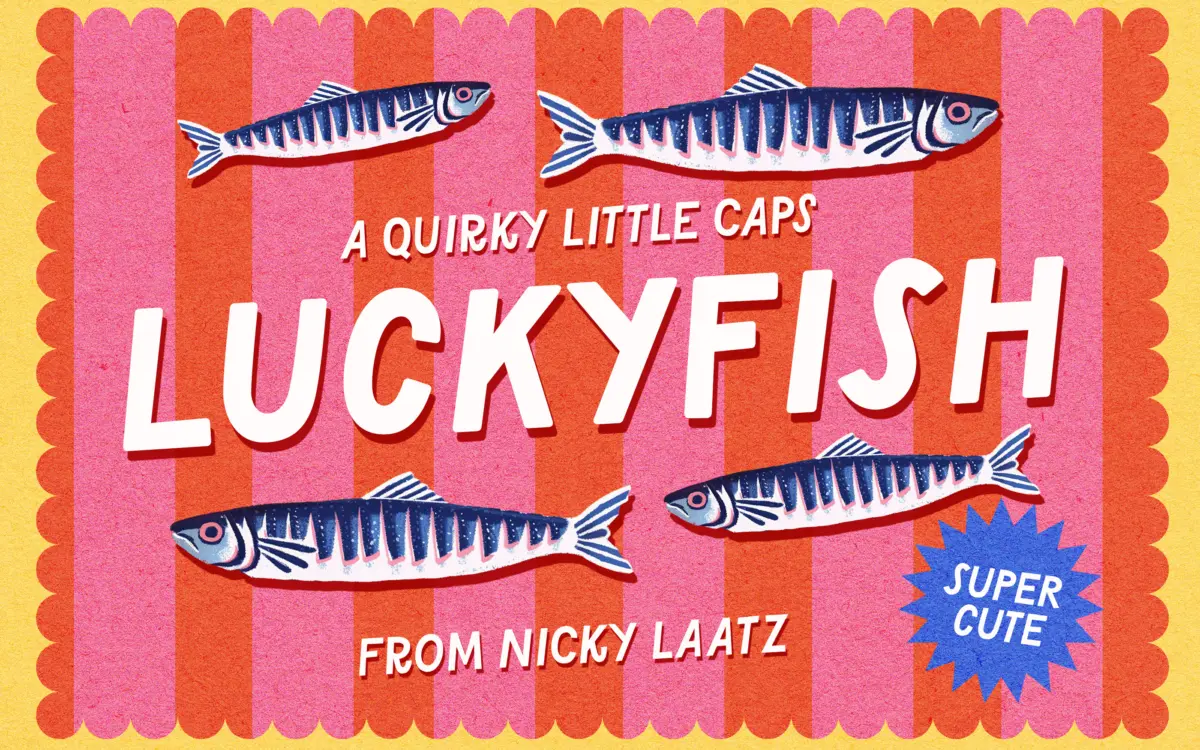
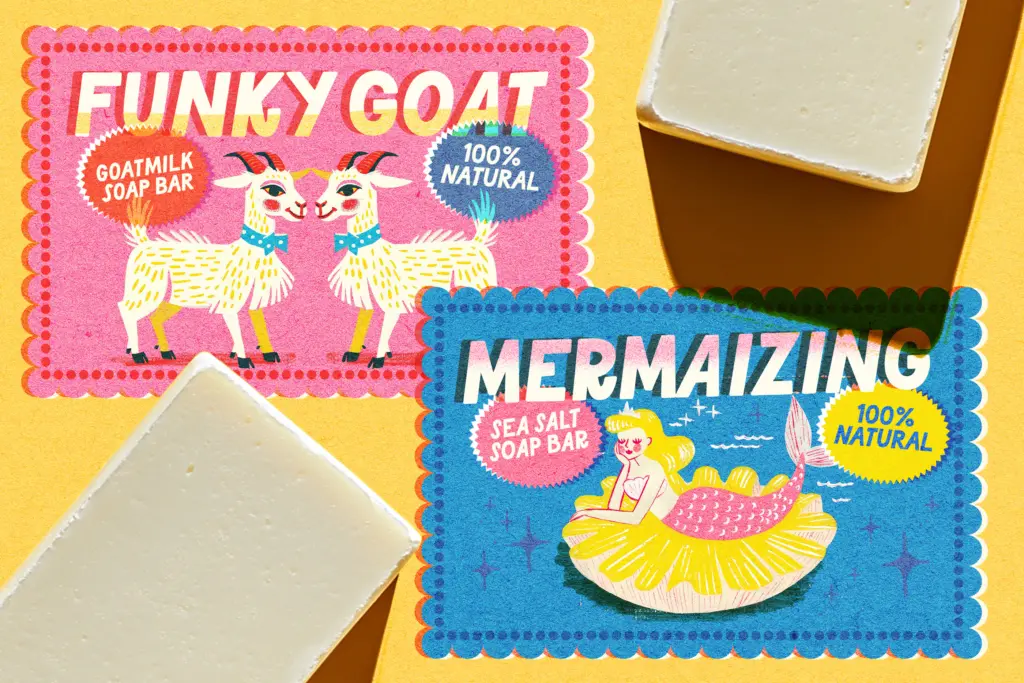
Lucky Fish is an all-caps display sans built for noise, not nuance. The letterforms are chunky and slightly irregular, with wobbles in the stroke that read as hand-cut rather than hand-drawn — there’s a deliberate lack of polish to the curves, as if each letter was trimmed from thick card with scissors. It comes in six styles: Regular, Rounded, Medium, Medium Rounded, Heavy and Heavy Rounded, which gives you a reasonable spread between a leaner, more graphic mark and a soft, bubble-lettered one.
The rounded variants soften every terminal into a pill shape, which pushes the whole family further into novelty territory — think sticker sheets and party favours rather than anything that needs to look considered. The non-rounded weights are squarer and a touch more grown-up, though ‘grown-up’ here is relative; this is not a typeface that wants to disappear into a layout. It wants to be the loudest thing on the page, and in that job it’s reasonably well drawn — the counters stay open even in the Heavy weight, and the spacing has enough air that letters don’t clot together when set tight.
Character set and features
Being all-caps only, there’s no upper/lowercase contrast to lean on for hierarchy — any emphasis has to come from weight change, colour, or scale instead. Language support covers several European markets (Danish, French, German, Portuguese, Spanish, Swedish, Norwegian and others), so diacritics are accounted for if your copy needs them, though the brief doesn’t specify ligatures, alternates or other glyph-level extras beyond the six base styles.
Six styles across two stroke terminals (square and rounded) at three weights is a sensible way to build out a single display idea without overpromising. It means you can hold a consistent voice across a birthday card, a sticker, and a product label just by switching styles, rather than reaching for a second typeface. That’s the main practical strength of a family like this — internal versatility rather than range.
Use cases
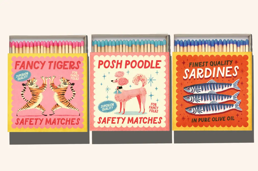
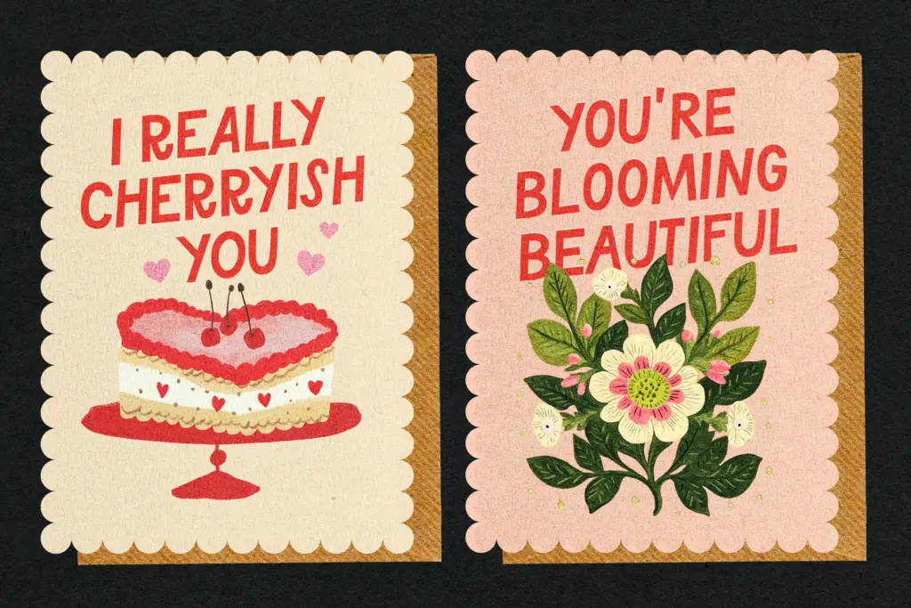
This is a typeface for things that are meant to be fun and a little disposable: birthday invitations, baby shower cards, packaging for a cheerful snack brand, greeting cards, kids’ book covers, party signage. It works best big — headlines, logotypes, single words on a label — where the irregularity in the strokes reads as character rather than noise. Set it small or in long runs of text and that same irregularity starts to work against legibility; this was clearly never meant to carry a paragraph.
It also leans hard into one mood. There’s no serious register hiding in the heavier weights, and no way to dial the quirkiness down for a client who wants ‘playful but credible.’ If your project needs even a little restraint, look elsewhere; if it needs to look like a kids’ party in font form, Lucky Fish does that job without fuss.
What we liked, and what we didn’t
Strengths
- Six styles give a usable range of weight and softness without leaving the family's core idea
- Open counters keep even the Heavy weight from clogging at larger sizes
- Rounded and square terminal options cover both bubbly and slightly more graphic moods
Trade-offs
- All-caps only, so hierarchy depends entirely on weight and scale, not case contrast
- The intentional irregularity in the strokes hurts legibility at small sizes or in long copy
Lucky Fish is a competent, cheerful display face that knows exactly what it's for: loud, playful branding and greeting-card work. It won't flex into anything serious or run well at text sizes, but within its lane of six related styles it delivers a consistent, easy-to-use voice.
Verdict

Tantype reviews typefaces in depth — every font is tested in real branding, editorial and screen layouts before a word gets written. 555+ fonts reviewed and counting.