
Rouge and Blush: a textured script duo for casual, handmade branding
Design style
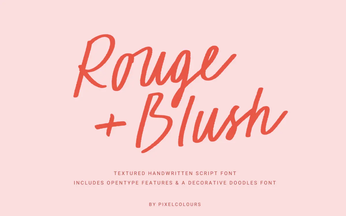
Rouge and Blush is a casual cursive with a deliberately rough edge. Instead of the glassy, uniform stroke you get from most brush scripts, the letters carry a dry, textured line that suggests a real marker or worn brush tip dragged across paper. That texture is the whole personality of the font — it reads as handmade rather than digitally smoothed, and it avoids the slightly plastic look that a lot of script fonts have when blown up large.
The joins between letters are loose and a little uneven, which suits the brief: this isn’t a formal calligraphic script aiming for wedding-invitation elegance, it’s a friendlier, more offhand style of handwriting. Letterforms lean forward slightly with inconsistent baseline bounce, giving it the feel of something scrawled quickly rather than plotted out. That inconsistency is intentional and works in short bursts, but it means the font has a ceiling on how formal a job it can convincingly do.
Character set and features
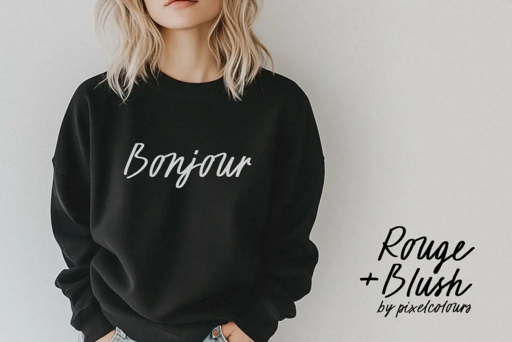
The family covers uppercase, lowercase, numerals and standard punctuation, and it leans on OpenType ligatures to keep letter connections looking continuous rather than mechanically joined. Where the ligature system does its job, cursive pairs flow reasonably naturally; where it doesn’t, you’ll notice occasional clashes and the odd letterform that reads a bit disconnected from its neighbours, particularly with round letters that need generous overlap to look convincing. It’s worth testing your actual words before committing to a layout, since scripts like this live or die on a handful of tricky letter pairs.
The companion Doodles font is the more useful surprise here. Seventy hand-drawn marks — hearts, arrows, dividers, small flourishes — sit on the same textured register as the script, so they don’t look bolted on when used alongside it. That’s a genuinely practical extra: most script purchases leave you hunting for compatible ornaments elsewhere, and having a matched set saves that step.
Use cases
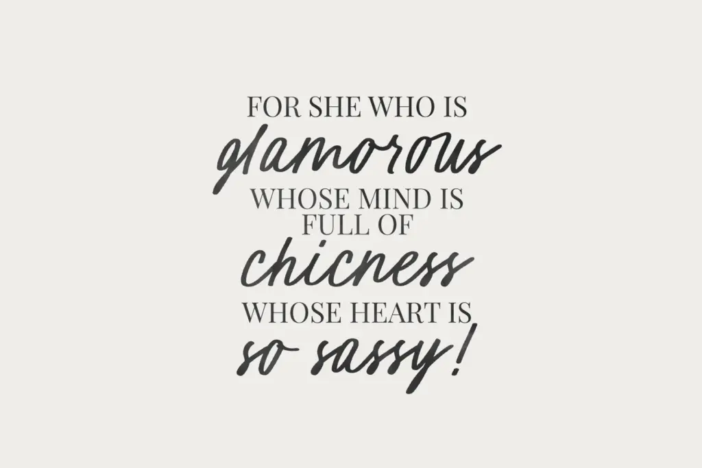
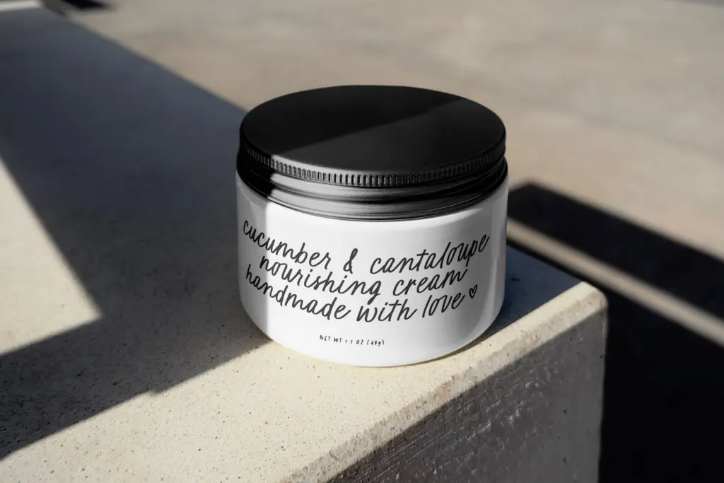
This font suits short, expressive text: a quote graphic, a logotype, a greeting card sentiment, a product label flourish. It’s built for moments where the handwriting itself is doing decorative work, not for paragraphs. At body-copy sizes the texture starts working against legibility — the roughened stroke edges and variable spacing that read as charming in a five-word headline become fatiguing across a sentence or two.
For branding, it fits craft-adjacent, DIY-leaning identities — bakeries, small batch goods, handmade stationery, apparel print runs — better than anything aiming at polish or luxury. Wedding use is plausible for casual or rustic-themed stationery, but couples wanting a more refined script should look elsewhere; this one reads playful before it reads elegant. Social graphics and blog headers are a comfortable fit, where its texture actually helps a design feel less templated.
Overall, it’s a font that knows what mood it’s going for and commits to it. The trade-off is a narrow lane: it does casual, hand-drawn warmth well, and everything outside that lane — formality, long-form reading, tight technical layouts — is not what it’s for.
What we liked, and what we didn’t
Strengths
- The textured, hand-drawn stroke avoids the glassy uniformity common in digital scripts
- The matching 70-piece doodle set is stylistically consistent and genuinely useful
- Works well for short, expressive text like quotes, logos and card sentiments
Trade-offs
- Ligature joins occasionally look disconnected on tricky letter pairings
- Legibility drops quickly once used for anything longer than a line or two
Rouge and Blush is a charming, textured cursive best used in short, decorative doses rather than for body text. The matching doodle set is a genuine practical bonus that most script duos skip. It's a niche, casual-brand tool rather than an all-purpose script.
Verdict

Tantype reviews typefaces in depth — every font is tested in real branding, editorial and screen layouts before a word gets written. 555+ fonts reviewed and counting.