
Buchaner Vagancy: A Modern Script for Weddings and Packaging Accents
Design style
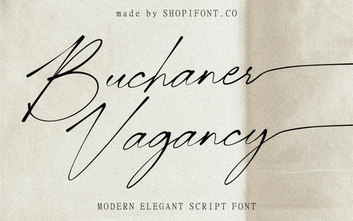
Buchaner Vagancy sits in the crowded field of modern script faces that lean on brush-like flourish rather than formal copperplate structure. The letters carry a loose, slanted rhythm with connecting strokes that suggest a felt-tip or fine brush rather than a pointed pen. Contrast is moderate rather than dramatic — there’s no sharp hairline-to-thick swing that defines classic calligraphic scripts, which gives the face a softer, more casual temperament.
The lowercase forms lean forward at a fairly consistent angle, and the connections between letters are tight, which helps words read as single flowing units rather than a string of separate glyphs. Where the design shows its point of view is in the swash capitals: several of them extend well beyond the baseline and x-height, looping back into the word in ways that ask for careful kerning by the person setting the type. Used well, this gives headlines a handwritten looseness. Used carelessly, at small sizes or in tight compositions, it can collide with neighbouring words.
Character set and features
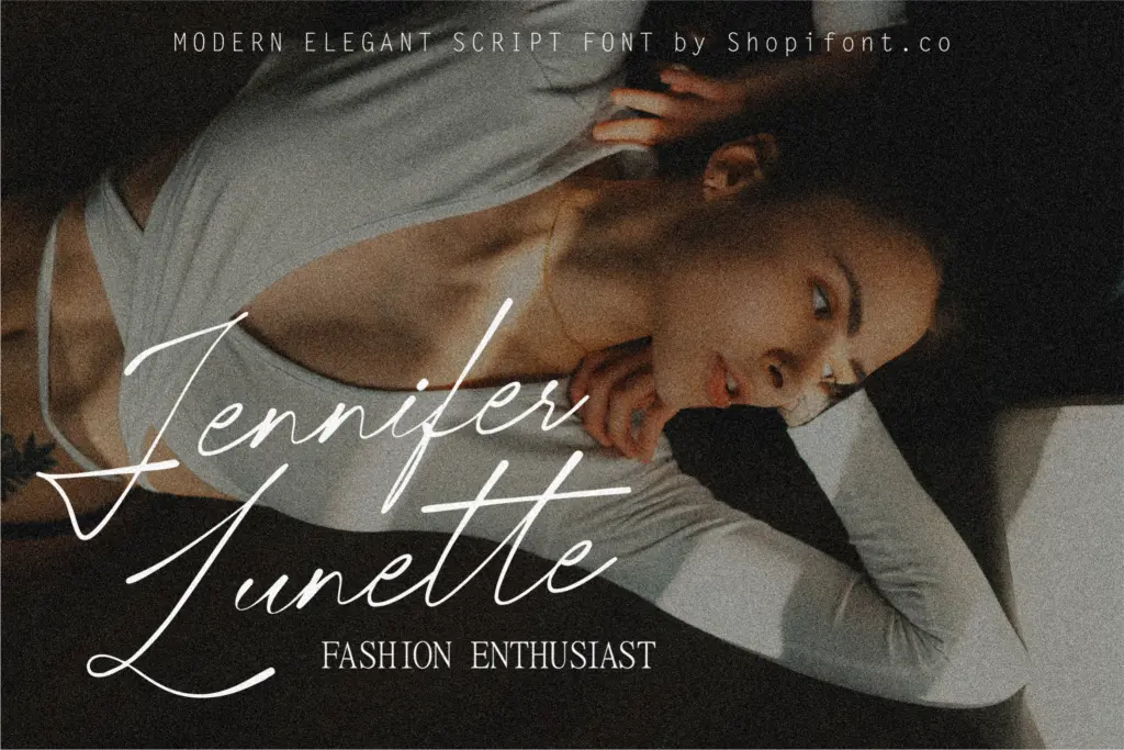
The font comes in both OTF and TTF formats, and the seller notes multilingual support, which extends its reach beyond a basic Latin set for anyone setting text in languages with accented characters. Beyond that, no ligature set, alternate character count, or stylistic set is specified, so treat the working character set as a standard one rather than a deep OpenType feature package. That’s worth knowing before committing a layout to it — if a project depends on swash alternates or contextual substitution to avoid awkward collisions, this may not deliver that flexibility out of the box.
What is legible here is legible within a fairly narrow size range. This is a script built for short lines — a name, a product title, a headline — not for paragraphs. At small point sizes the joins between letters compress and some of the extended swashes start to fight with ascenders and descenders on adjacent lines. Give it generous leading and line breaks and it holds together fine.
Use cases
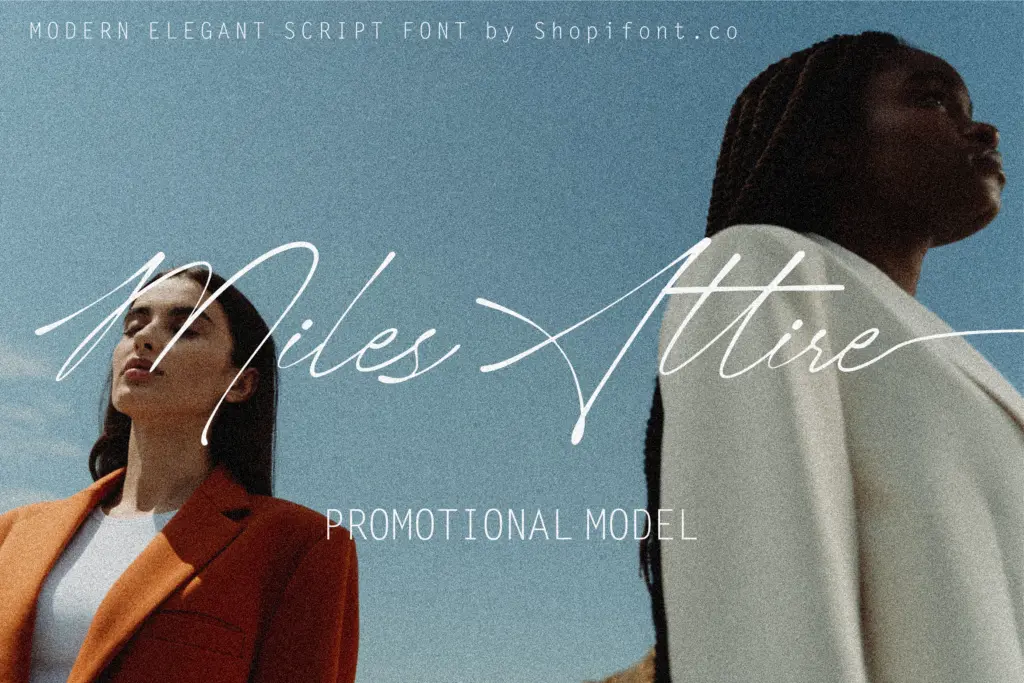
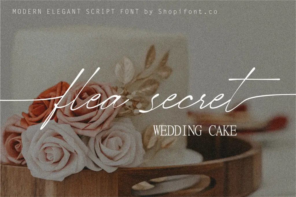
Wedding stationery is the obvious fit: invitation headers, save-the-dates, a couple’s monogram line. The casual brush quality also works for packaging accents — a product name on a label, a tagline on a box, anywhere a single short phrase needs a handwritten touch without formal wedding-invite stiffness. Logotypes are plausible if the brand wants a warm, informal signature-style mark, though the swash capitals mean testing at the actual logo size before locking anything in.
It’s less suited to body copy, dense editorial layouts, or any context requiring predictable letter spacing across long passages. Pair it with a plain sans or serif for supporting text, and reserve Buchaner Vagancy itself for the moment that needs a personal touch — a single word, a name, a short line set large.
What we liked, and what we didn’t
Strengths
- Tight, flowing letter connections give short phrases a natural handwritten feel
- Swash capitals add a distinctive, personal touch to headlines and monograms
- Multilingual support extends its use beyond basic Latin text
Trade-offs
- Extended swashes can collide with neighbouring words if not kerned carefully
- No documented alternate characters or ligature set to manage those collisions
Buchaner Vagancy is a competent casual script suited to short-form work — headlines, monograms, packaging accents. Its swash capitals give it personality but demand careful spacing, and it isn't built for anything longer than a line or two.
Verdict

Tantype reviews typefaces in depth — every font is tested in real branding, editorial and screen layouts before a word gets written. 555+ fonts reviewed and counting.