
Everything’s Peachy: a cheerful handwritten duo for cards and packaging
Design style
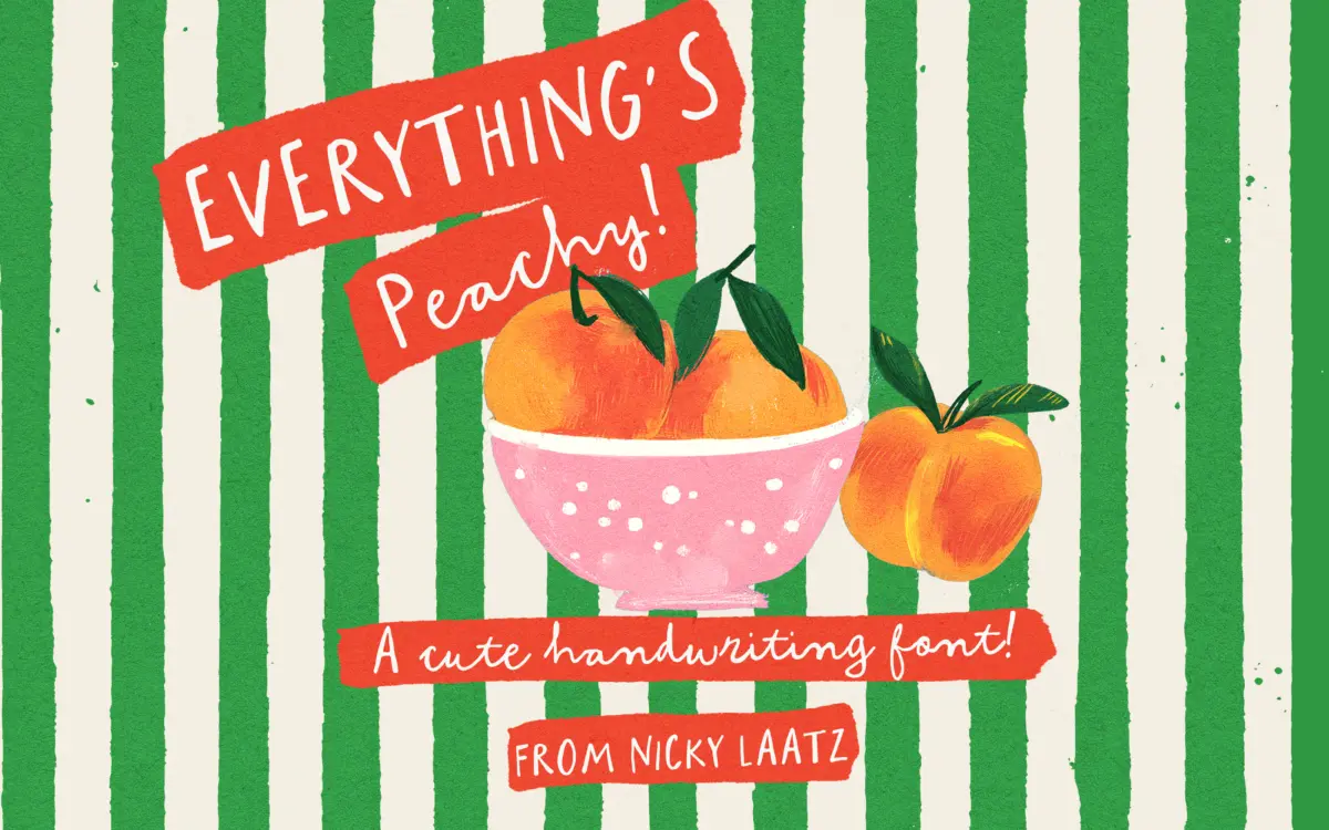
Everything’s Peachy is built on a simple trick: type the uppercase and you get an all-caps marker-style display face, type the lowercase and you get a looser, connected script. Both live in the same font file, which is the real idea here rather than a separate companion family. The strokes are rounded, slightly uneven, with the kind of wobble that reads as a hand holding a brush pen rather than a ruler. Nothing about it is precise, and it isn’t trying to be.
The caps version is the sturdier of the two. Letters sit upright, stroke weight stays fairly consistent, and the forms are wide enough to read clearly on a label or a title line. The lowercase script is where the personality lives — looping ascenders, small ink traps at the joins, and a rhythm that leans childlike rather than elegant. It won’t be mistaken for a calligraphic script; it’s closer to a kid’s felt-tip handwriting cleaned up just enough to typeset.
Character set and features
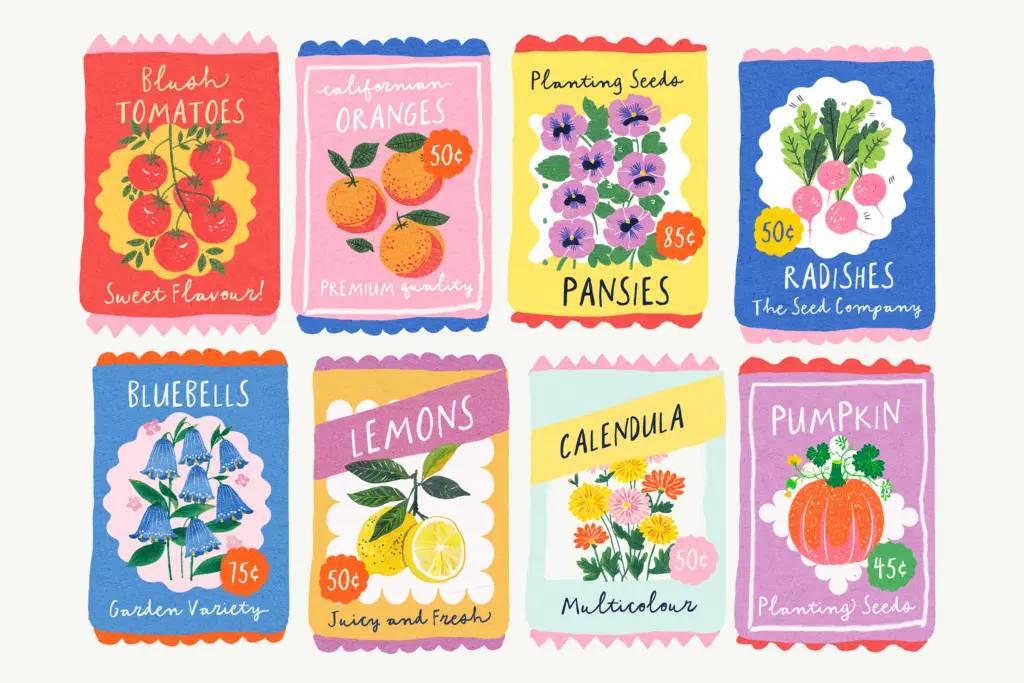
The duo structure means you’re choosing a mode by case rather than switching fonts, which is convenient but also a constraint — you can’t easily mix caps-style and script-style letters in the same word without stepping outside the intended system. Swash variants and beginning/end characters are included for the lowercase, along with some standard ligatures, and these do a reasonable job of smoothing over the repetition that handwritten fonts are prone to at word length. The swashes are PUA-encoded, which matters in practice: it means they’re accessible in apps like Canva that don’t support OpenType stylistic alternates through a glyph panel, though it also means anyone typing directly rather than through a character map needs to know the PUA codes exist.
Language support covers a handful of Western European languages, so accented characters for French, German, Spanish and the Scandinavian languages are present rather than something you’d need to fake. There’s no indication of extended Central or Eastern European coverage, so check your specific diacritics if you’re working outside that list.
Use cases
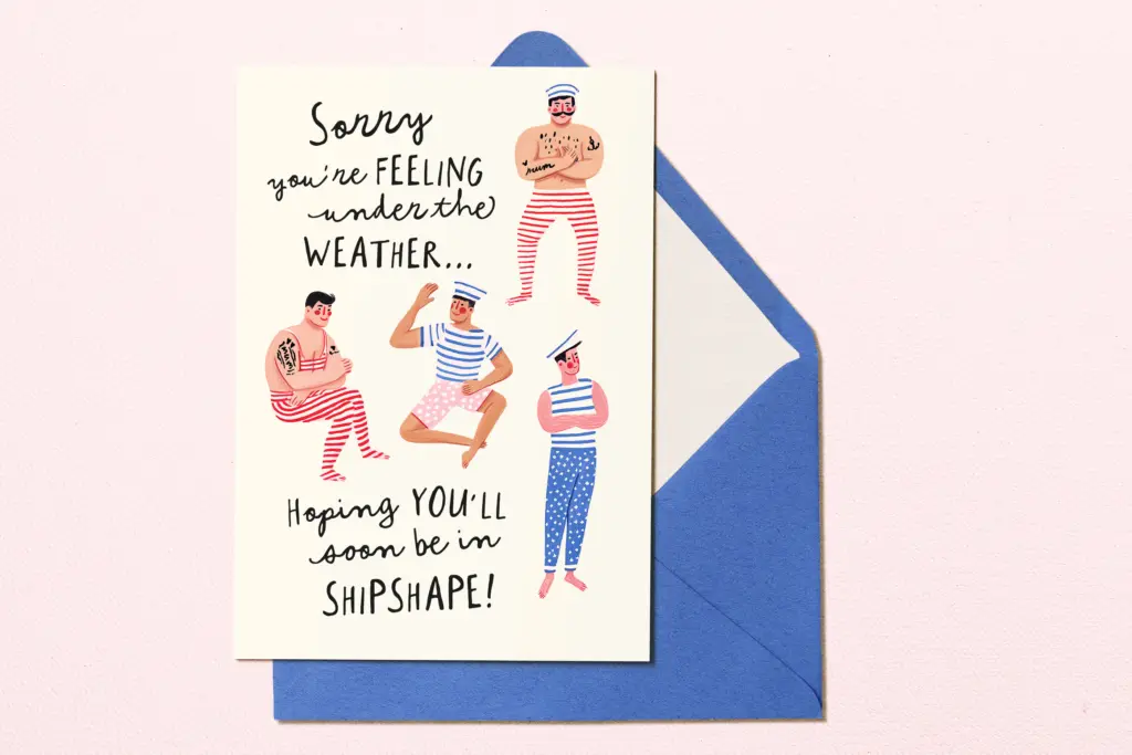
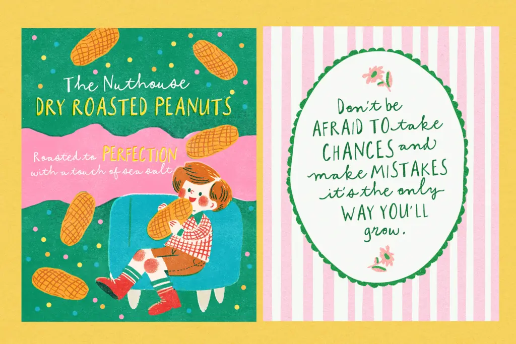
This is a font for short bursts of text, not paragraphs. Greeting cards, invitation headers, product labels, packaging call-outs, nursery and kids’ branding — anywhere a line or two of warm, informal type needs to carry the whole mood. The caps mode works well as a standalone display line on its own; the script mode is nicer used sparingly, as a signature-style flourish under a cleaner caps headline, which is really what the duo structure is built for.
It’s not a working-text face — don’t reach for it at body copy sizes or for anything that needs to read as serious or corporate. And because the handwritten wobble is baked into every letter, dense-set lowercase passages start to feel busy rather than charming. Used the way it’s clearly intended — a word or two, generous spacing, paired with a plain layout around it — it does its job without fuss.
What we liked, and what we didn’t
Strengths
- The caps/lowercase duo structure is genuinely useful, not just a marketing gimmick.
- Swashes and ligatures help break up repetition in short handwritten lines.
- PUA encoding means the extra characters are usable in apps like Canva that skip OpenType features.
Trade-offs
- Dense-set lowercase passages start to feel busy rather than charming.
- Limited to a handful of Western European languages, so check diacritic coverage before committing.
Everything's Peachy delivers a likeable, informal duo built around a neat caps/lowercase switch rather than two separate fonts. It's best used in short, loosely set lines where its handmade wobble reads as charm rather than clutter. Not a font for body text or formal branding, but a solid pick for cards, labels and playful packaging.
Verdict

Tantype reviews typefaces in depth — every font is tested in real branding, editorial and screen layouts before a word gets written. 555+ fonts reviewed and counting.