
TAN Aegean: a display serif with classic bones and a wink of attitude
Design style
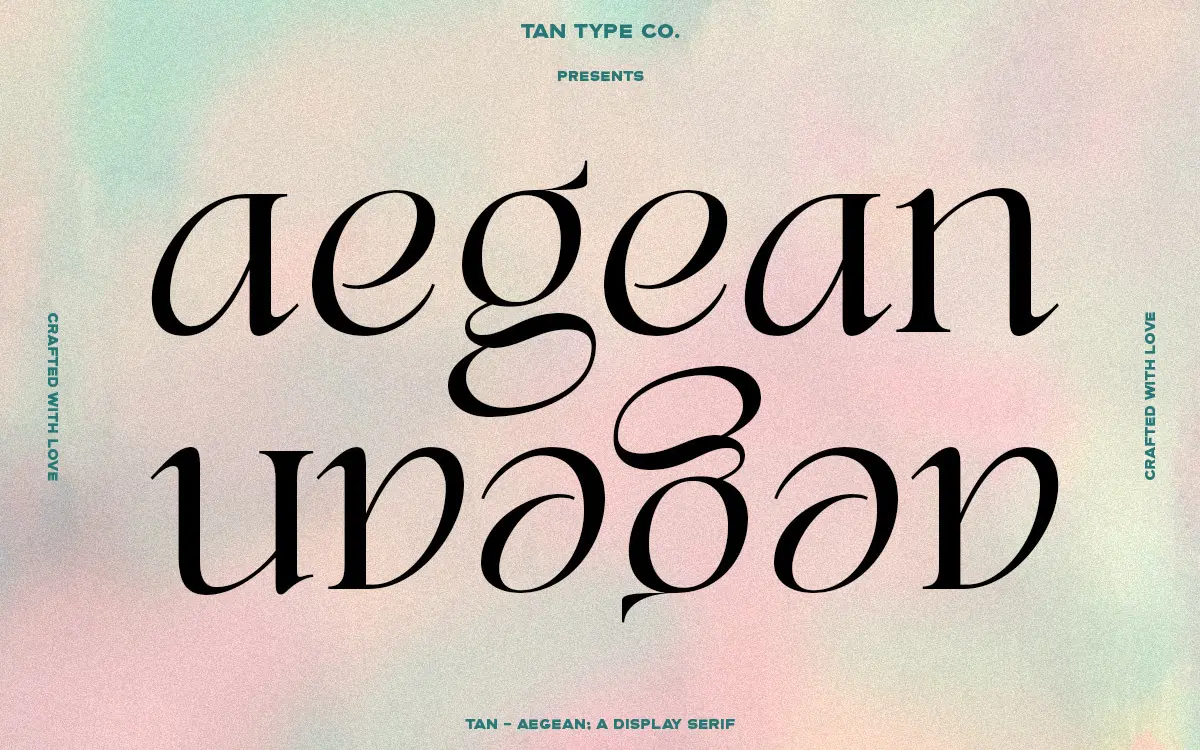
TAN Aegean sits in that familiar territory of high-contrast display serifs built on classical proportions, but it doesn’t play it entirely straight. The stroke contrast is pronounced — thick verticals against hairline-thin horizontals and serifs — which gives it the bearing of a fashion headline face rather than a text serif. Where it departs from strict revival territory is in small asymmetries: a serif that flares a touch wider than its neighbour, a curve that tightens unevenly. These aren’t flaws so much as a deliberate hand-finished quality, the kind of detail that keeps a display serif from reading as a stock template. It’s confident rather than fussy, and it doesn’t overload the letterforms with ornament to prove a point.
The overall rhythm favours width over compactness. Letters breathe, counters stay open even in the tighter shapes, and the x-height sits moderately low, which pushes the ascenders and descenders into doing a lot of the visual work. That’s a common trait of editorial display serifs and it pays off here — set a headline in Aegean and the ascender flourishes carry more presence than the body text they sit above.
Character set and features
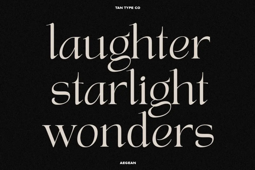
The seller notes multilingual support, which matters for anyone working across markets beyond a basic Latin set — worth checking the language list against your specific project needs rather than assuming full coverage. Beyond that, the brief doesn’t detail alternate characters, ligatures, or a full weight range, so treat this as a single-cut display face until you’ve opened the character map yourself and confirmed what’s actually there.
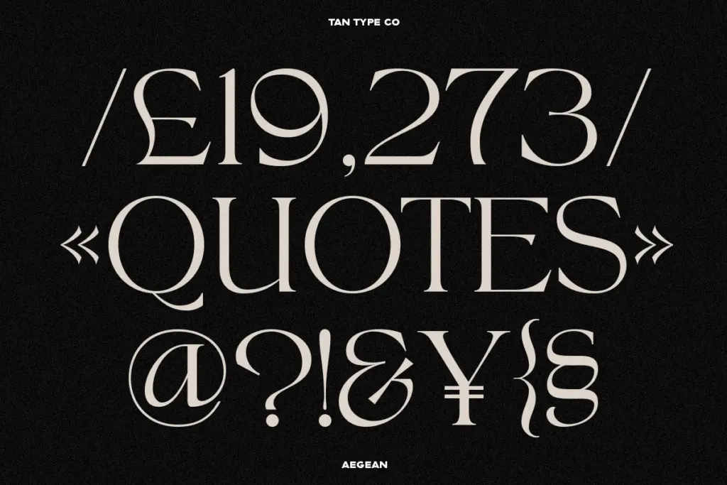
What is evident from the letterforms is a fairly complete standard punctuation and figure set typical of a display serif built for headline use — enough to set a masthead, a product name, or a short line of editorial copy without hunting for missing glyphs. If your project depends on small caps, extensive ligatures, or a broad set of numeral styles, verify those exist before committing a layout to them.
Use cases
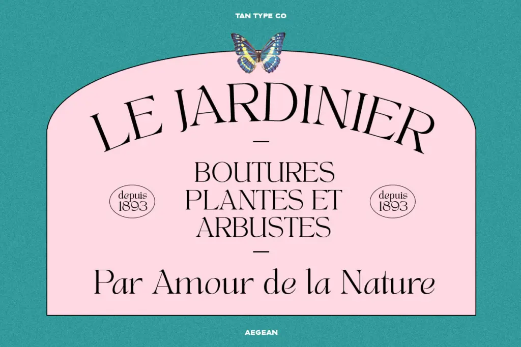
This is a headline font, not a paragraph font, and it should be used accordingly. The high contrast that gives it personality at 60pt starts to fight itself well below 18pt — hairlines thin out, and on screen especially they can flicker or drop out entirely at small sizes. Reserve it for titles, logotypes, packaging hero type, and short editorial statements rather than running text.
Within that lane it’s genuinely useful. The fashion-adjacent, slightly hipster edge suits branding for boutique retail, beauty, and lifestyle products where a serif needs to feel current rather than inherited from a museum. It also reads well on wedding stationery and invitation suites, where a display serif carries the formality of the occasion but shouldn’t feel stiff. Pair it with a plain, well-spaced sans for body copy and supporting information — Aegean should stay in the spotlight roles it’s built for, not get stretched into jobs that ask for a workhorse.
What we liked, and what we didn’t
Strengths
- Pronounced stroke contrast gives headlines real presence at large sizes
- Slightly irregular serifs and curves keep it from reading as a generic revival
- Open counters and generous width suit branding and packaging hero type
Trade-offs
- Hairline strokes thin out and can drop on screen well below 18pt
- Character set details beyond basic punctuation aren't confirmed, so verify glyph coverage before layout
TAN Aegean is a confident, slightly irregular display serif built for headlines rather than paragraphs. It has real character in the flared serifs and open counters, but the high contrast means it needs to stay large. Good for branding and short editorial lines, not for body text.
Verdict

Tantype reviews typefaces in depth — every font is tested in real branding, editorial and screen layouts before a word gets written. 555+ fonts reviewed and counting.