
True Fate: a roundhand script and headline serif built as a pre-matched pair
Design style
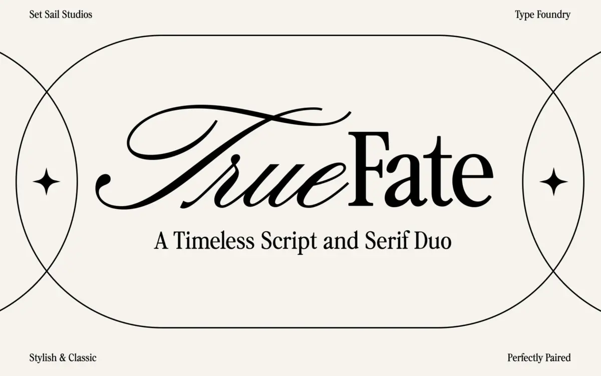
True Fate arrives as two fonts asked to do one job together. The script half is a roundhand cursive, low-contrast enough to stay legible, with the connecting strokes kept fairly consistent so words read as continuous lines rather than a chain of separately drawn letters. There’s a slight extra flourish on capitals and some terminal swashes, but it’s restrained next to the more theatrical calligraphy scripts on the market. The serif half reads as a nostalgic headline face: moderate stroke contrast, slightly bracketed serifs, a warmth that leans more mid-century poster than stone-cut classical. Neither half is trying to be radical. The point of the duo is that they were drawn to sit next to each other, matching x-height logic and a shared sense of weight, so you’re not hunting for a serif that won’t fight the script.
Character set and features
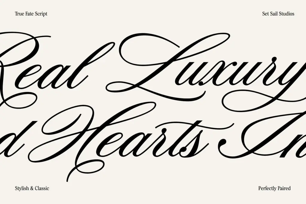
Both fonts include full upper and lowercase sets, and the script leans on alternate glyphs and ligatures to break up repeated letter combinations — the usual toolkit for making a connecting script feel less mechanical. The serif is more of a workhorse: it doesn’t need alternates to function, and its job is really to be the quiet counterweight to the script’s motion. Language support runs across most of the standard Western and Central European diacritics, so the duo should hold up in French, German, Polish or Turkish setting without obvious gaps. What’s less clear from the files themselves is how deep the alternate set goes on the script — worth checking swash coverage before committing to a long headline where repeated letters would otherwise look identical. On screen at small sizes, the script’s flourishes and thinner joining strokes will soften first; it’s built for display use, not body copy.
Use cases
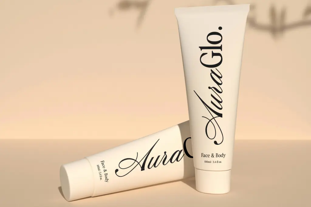
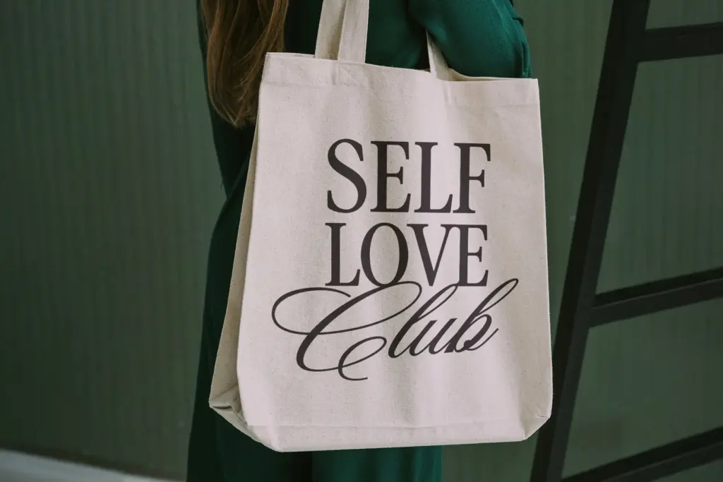
This is a pairing built for the branding-and-stationery bracket: a script for a signature logotype or a wedding invitation’s leading line, a serif for the address, the date, the supporting copy underneath. That’s the honest use case, and it’s a genuine convenience — a lot of projects burn time hunting for a serif that doesn’t undercut a script’s personality, and here that decision is already made. It’ll suit boutique packaging, editorial mastheads that want a bit of period warmth, or logo lockups where a brand wants handwritten charm on top and something sturdier underneath for legal-line or tagline duty. It’s less suited to anything needing genuine typographic range — long-form setting, dense information design, or a brand system that needs more than two moods. And because the pairing is designed to look pre-matched, using both fonts together can read a little templated if you’ve seen this particular script-plus-serif formula before, which by now is a crowded corner of the market. Used with some restraint — maybe just the script for a wordmark, the serif kept for a single supporting line — it earns its keep. Used exactly as demoed, edge to edge, it can look like exactly what it is: a bundle built to be recognisable at a glance.
What we liked, and what we didn’t
Strengths
- Script and serif share matched proportions, so pairing them takes no extra work
- Serif half is versatile enough to carry supporting text without competing with the script
- Broad diacritic coverage makes it usable across most European-language branding work
Trade-offs
- The script-plus-nostalgic-serif format is common in the marketplace, so the pairing can look templated if used exactly as demoed
- Script's thinner joins and flourishes lose crispness at small sizes, limiting it to display use
True Fate does one thing efficiently: it removes the pairing decision from a script-plus-serif branding job. The drawing is competent rather than distinctive, and the combination is common enough in the market that restraint in how you use it matters more than usual.
Verdict

Tantype reviews typefaces in depth — every font is tested in real branding, editorial and screen layouts before a word gets written. 555+ fonts reviewed and counting.