
Stylish Aesthetic: a nine-weight sans for editorial and branding work
Design style
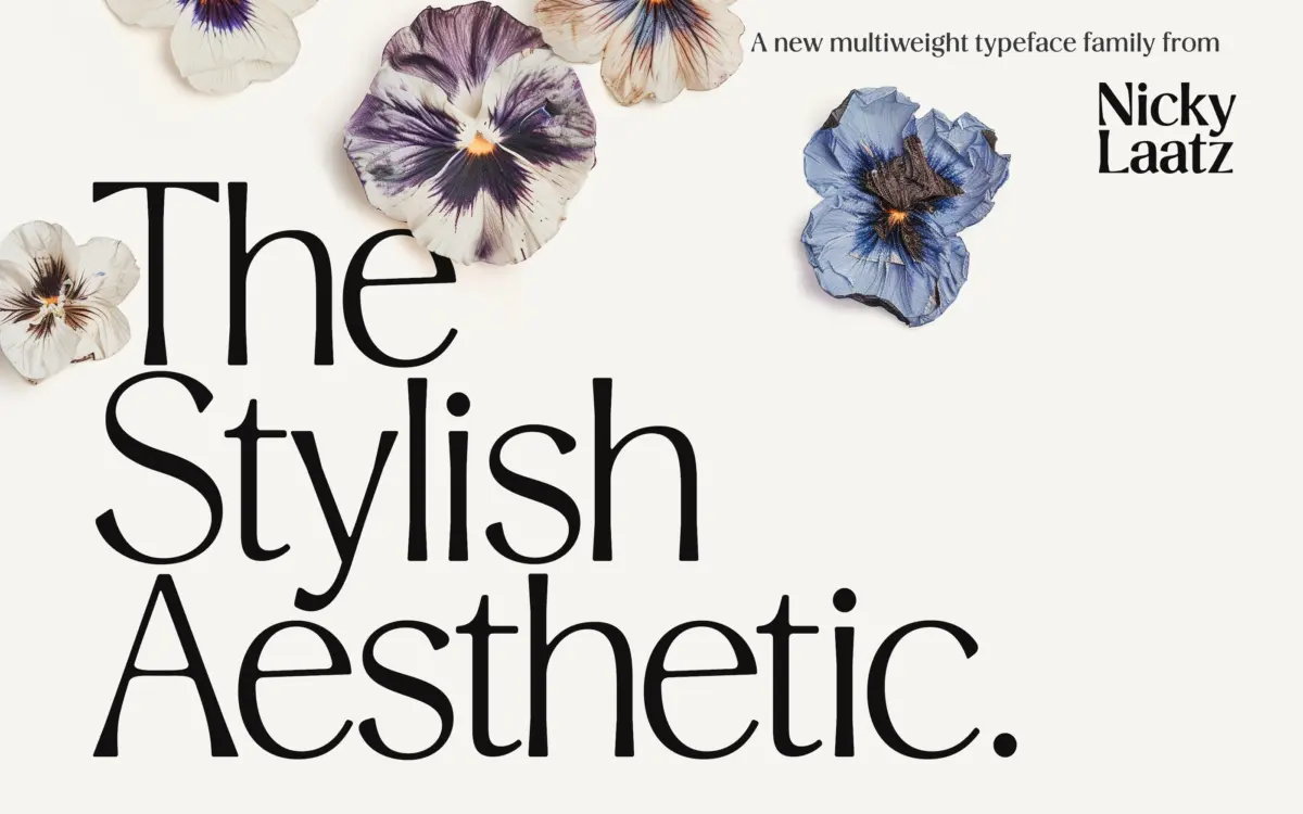
Stylish Aesthetic is a sans serif family built on a high-contrast skeleton, which is a slightly unusual choice for a sans. Most of the letters read as clean geometric shapes, but the stroke modulation gives it a drawn quality that plain grotesques don’t have. Nicky Laatz has kept the contrast consistent across the range, so the lighter weights come off as refined and slightly editorial, while the heavier weights turn that same contrast into something closer to a display face — angular, a bit theatrical, with thick stems that taper hard into thin joins.
The letterforms sit somewhere between a fashion-magazine sans and a hand-finished logotype face. Curves are smooth rather than mechanical, and terminals are cut cleanly rather than rounded off, which keeps the family from tipping into softness even at the lightest weight. It’s a font with a point of view rather than a neutral workhorse, and that shows most clearly in the black weight, where the contrast becomes the whole personality of the letter rather than a subtle detail.
Character set and features
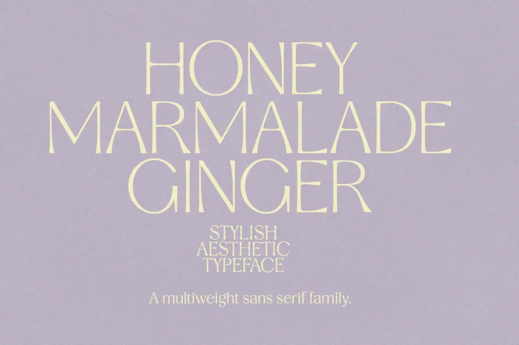
Nine weights is a genuinely useful range, running from an extra light through to black, and the seller notes support for a solid spread of European languages including Danish, French, German, Portuguese, Spanish, Swedish and several Nordic and Baltic variants. That’s enough coverage for most western European branding and editorial jobs without needing a fallback font for diacritics.
What isn’t clear from the brief is how deep the feature set goes beyond the weight axis — no mention of alternates, ligatures or small caps, so treat this as a straightforward weight family rather than a font with a large stylistic toolkit. That’s not a flaw so much as a limit worth knowing before you buy: if you need swash caps or contextual alternates, look elsewhere in the range of things this foundry sells.
Use cases
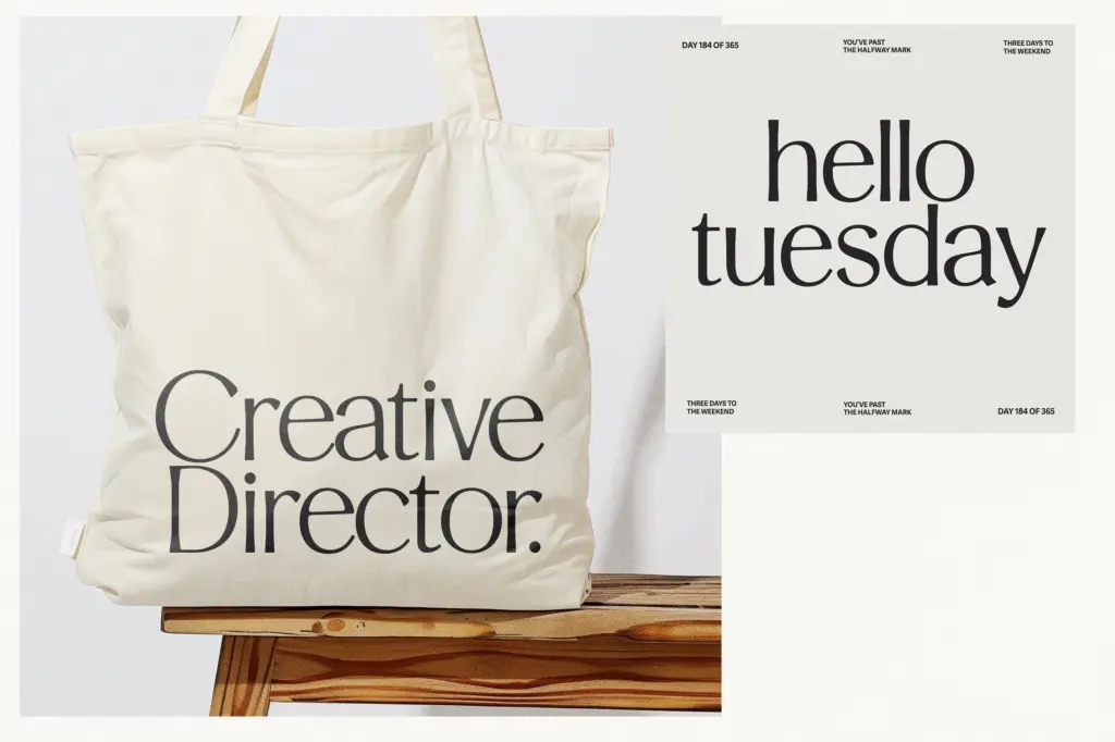
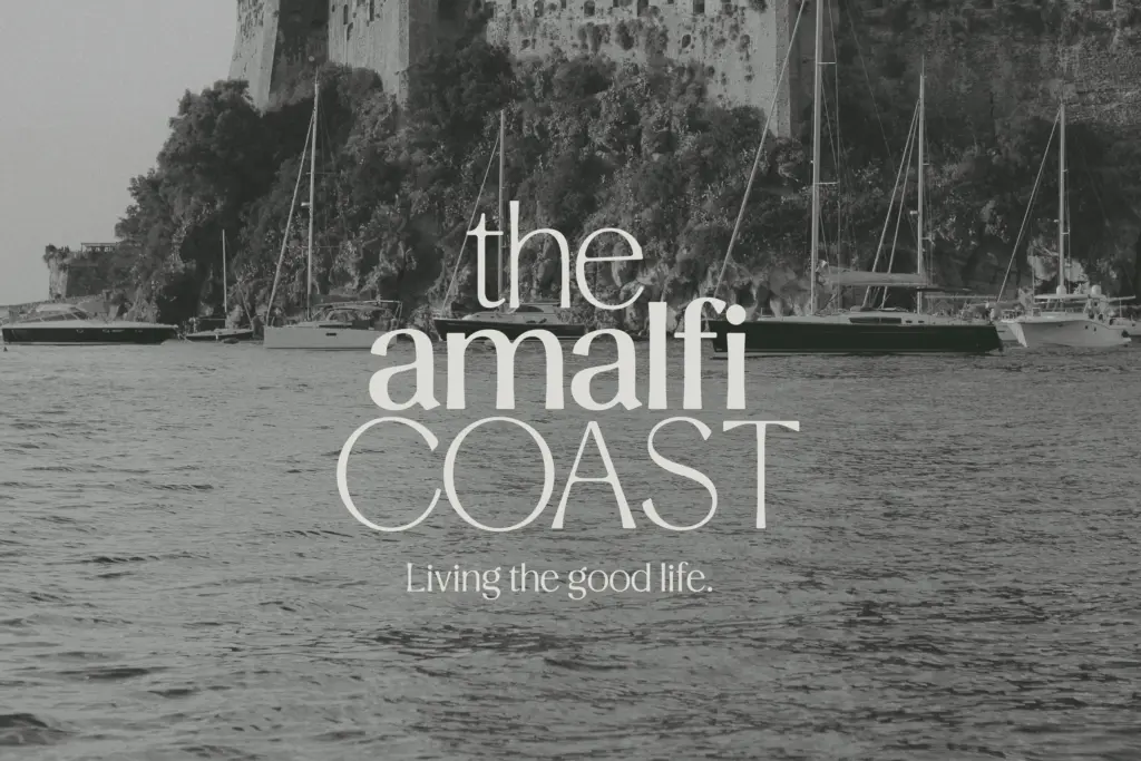
The lighter weights are well suited to editorial layouts — magazine intros, pull quotes, subheads where the contrast reads as sophistication rather than fragility. The middle weights are comfortable for branding work: business cards, packaging copy, anywhere a sans needs to feel considered rather than default. The heavier weights are built for display use — headlines, posters, wordmarks — where the angularity and stroke contrast can actually be seen.
Because of that contrast, this isn’t a family to push down to body-copy sizes, especially in the lighter weights, where hairlines will thin out and lose definition on lower-resolution screens or cheap print stock. It also isn’t the right choice if you want a neutral, get-out-of-the-way sans for long-form text; it has too much character for that job. Wedding stationery and invitation work — which the seller flags as an intended use — makes sense for the lighter-to-mid weights, where the contrast reads as elegant rather than loud. For anyone building a brand system that needs one family to cover a logo, a headline and some supporting text, the nine weights give enough range to do that without switching typefaces, provided you keep body text comfortably sized.
What we liked, and what we didn’t
Strengths
- Nine weights give a genuinely useful range from light editorial use to bold display work
- Consistent stroke contrast gives the family a distinct, drawn-looking character rather than generic geometric sans neutrality
- Solid European language coverage makes it usable across a range of branding and editorial markets
Trade-offs
- High contrast strokes thin out and lose definition at small sizes or on lower-quality print and screens
- Brief gives no indication of alternates or extended OpenType features, so treat it as a weight family rather than a feature-rich toolkit
Stylish Aesthetic is a well-built weight family with a distinctive high-contrast sans structure that works better as a branding and display tool than as a body-text solution. The nine weights give real range from editorial-light to poster-black, though the contrast that gives it character also limits how small it can go. Good for logos, headlines and invitation work; not the font to reach for when you need a neutral text face.
Verdict

Tantype reviews typefaces in depth — every font is tested in real branding, editorial and screen layouts before a word gets written. 555+ fonts reviewed and counting.