
LiebeHeide: a bitmap color font that fakes real ballpoint handwriting
Design style
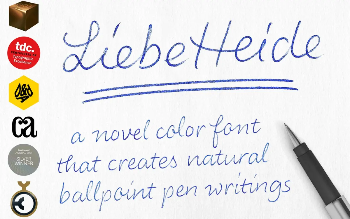
LiebeHeide is not a script font in the usual sense. It is a color font built from digitized bitmap scans of actual ballpoint pen writing, which is a very different production method from the vector script fonts that dominate this category. The result reads less like a typeface designed to imitate handwriting and more like handwriting that has been captured whole. You can see the pen pressure change within a stroke, the slight wobble at the end of a downstroke, the way ink pools at a stopping point. None of that is faked with layered vector shading — it is photographic, in effect.
That production method is also the font’s defining limitation. Because it is bitmap-based, the color is baked into the glyph and cannot be recolored in a text editor the way you would recolor any other font. Adobe Photoshop filters are the workaround the designer suggests, which tells you this is a font built for image compositing rather than live text layout. It is also worth noting it only renders correctly in Creative Cloud apps and native Mac OS apps — older Creative Suite versions and many standard word processors won’t display it as intended.
Character set and features
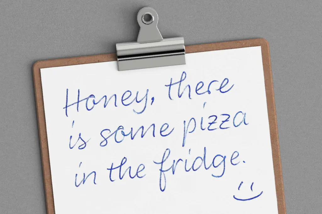
Where LiebeHeide earns its keep is in the extras. Almost 500 glyphs are packed in, with a heavy emphasis on the incidental marks that make handwriting look unrehearsed: doodles, underlines (single and double), strikethroughs, and small symbols that assemble themselves from ordinary keystrokes. Type ﹤3 and you get a heart; type a colon-dash-parenthesis and you get a smiley; two hyphens and a bracket give you an arrow. These are OpenType ligature substitutions doing the work, and they’re genuinely useful because they save you hunting through a glyph panel for a doodle that would otherwise sit unused.
Alternate letterforms are generously supplied too, so repeated letters within a word don’t stamp out identically, which is one of the main things that gives digital script fonts away. Language support covers Latin, Western European and Central European character sets, so it’s not limited to English-only projects.
The trade-off to keep in mind is scale. Because the letters are bitmap images rather than vector outlines, there’s a stated ceiling on print size — past roughly a 5cm x-height, edges start to blur. That rules out this font for anything that needs to scale cleanly across many sizes, like a flexible logo system, without keeping separate high-res source files for large formats.
Use cases
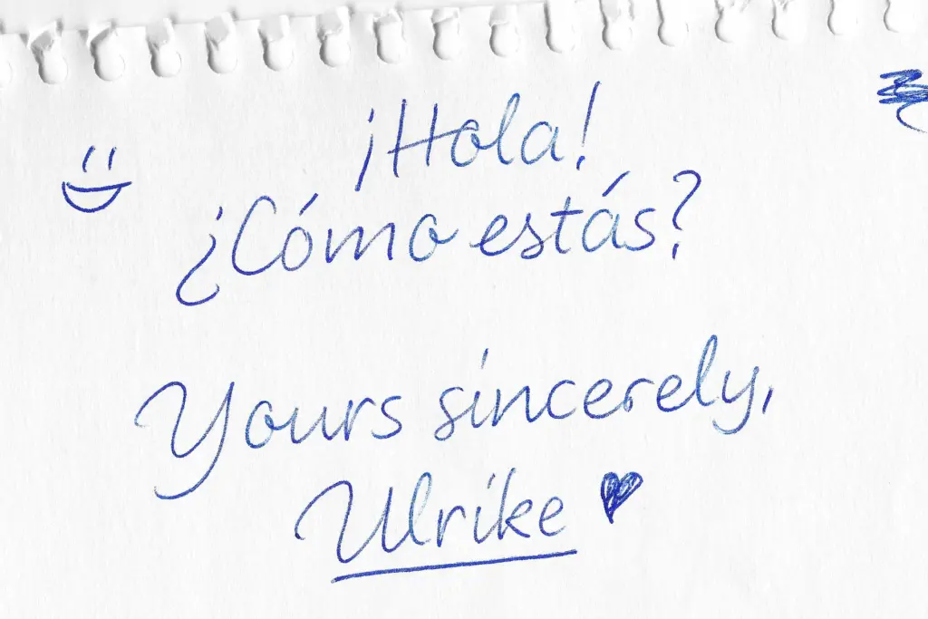
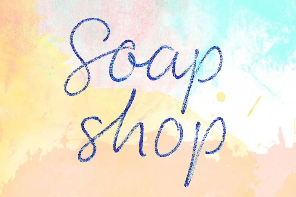
This font is built for close-up, print-once contexts: greeting cards, invitations, packaging copy, social graphics, short handwritten-style notes composited into a design rather than flowed as body text. It works best against light or white backgrounds, and the designer notes a Darken layer blend mode helps it sit on anything else. Anyone doing wedding stationery, personal branding graphics with a handmade feel, or product packaging that wants a genuine ‘someone wrote this’ moment will get real mileage from it. It is not a working typeface for websites, apps, or any live-text environment where color needs to be controlled by CSS or a style sheet — for that, a conventional vector script would serve better. Treat LiebeHeide as an image asset with unusually good typing convenience, not as an all-purpose font.
What we liked, and what we didn’t
Strengths
- Bitmap-based construction gives it authentic pen texture that vector scripts can't fully match
- Nearly 500 glyphs including self-assembling doodles, hearts and arrows via simple keystrokes
- Generous alternate letterforms prevent repeated letters looking stamped and identical
Trade-offs
- Fixed bitmap color can't be changed in standard text editors, only worked around in Photoshop
- Limited to roughly 5cm x-height before print quality degrades, ruling out large-format use
LiebeHeide delivers a genuinely convincing handwritten look because it's built from real pen scans rather than vector approximation. The cost is flexibility: fixed color, app restrictions, and a hard scale ceiling mean it belongs in image compositing work, not general typesetting.
Verdict

Tantype reviews typefaces in depth — every font is tested in real branding, editorial and screen layouts before a word gets written. 555+ fonts reviewed and counting.