
Glitz: a minimalist sans for logos and short branding lines
Design style
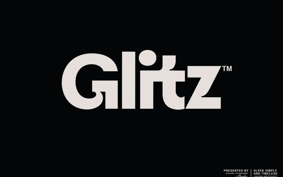
Glitz is a pared-back sans built around clean strokes and quiet curves rather than any obvious structural hook. The letters keep a narrow stance and even weight throughout, with terminals cut straight rather than rounded, which gives the face a slightly clipped, deliberate feel. There’s no contrast to speak of, no flare, no ink traps — it reads as a face that wants to disappear into the layout rather than announce itself.
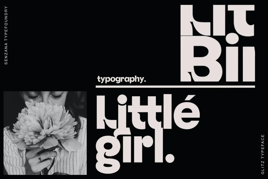
Where it does show personality is in a handful of stylistic and ligature alternates, which loosen up some of the joins and give certain letter pairs a more connected, almost script-adjacent rhythm. Used sparingly, this is the difference between a generic geometric sans and something with a bit of identity. Used across a whole paragraph, it starts to look inconsistent, because the base letters are so restrained that the flourished alternates read as a different voice entirely.
Character set and features
The set covers uppercase, lowercase, numerals and basic Latin punctuation — a functional, no-frills range rather than an extended one. There’s no mention of accented characters or broader language support in the brief, so treat this as an English-first face unless you test it against your specific text first. Ligatures and stylistic alternates are the main extras on offer, and they’re clearly the point of the design: this isn’t a workhorse text family with dozens of weights, it’s a single-style display sans meant to be dressed up selectively.
At small sizes the plainness of the base letterforms works in its favour — nothing fights the eye, spacing is even, and the lowercase holds its shape reasonably well in short runs. But because there’s only one weight to lean on, there’s no way to build hierarchy within the family itself. Any bold or light treatment has to come from size, colour or spacing, which limits how much structural work the font can do on its own in a layout.
Use cases
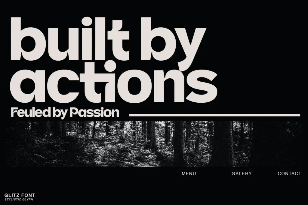
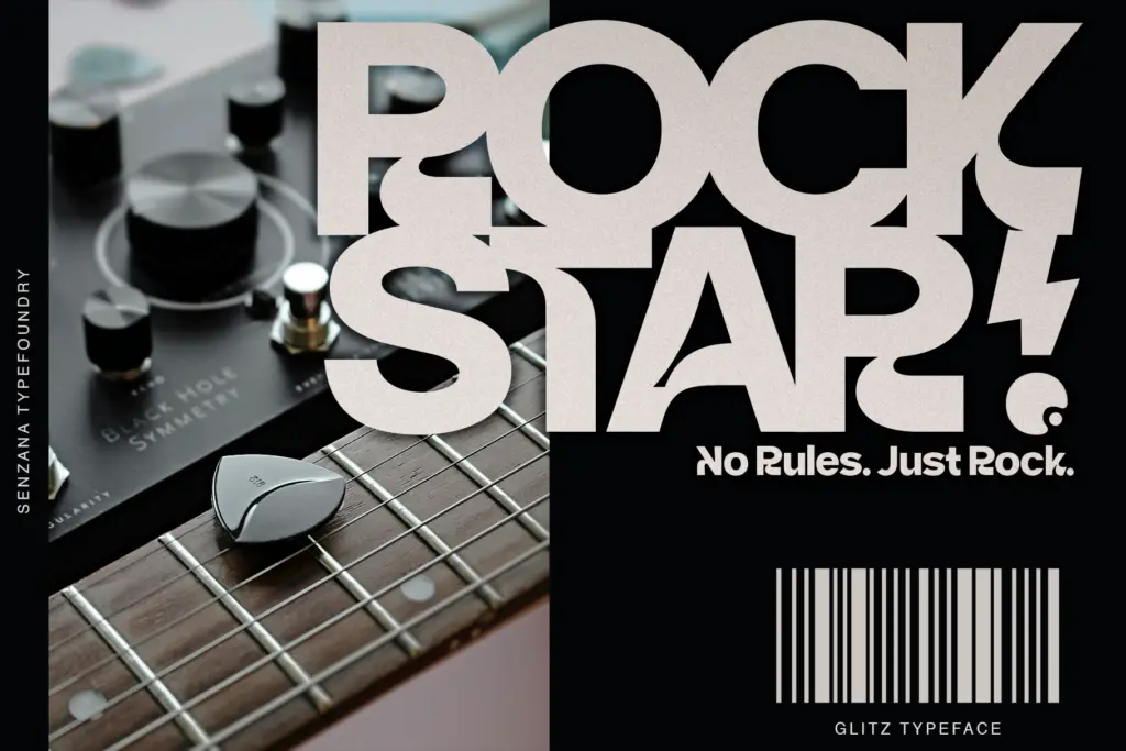
Glitz is best suited to short-form work: logotypes, wordmarks, headline treatments, packaging lockups, the kind of setting where a handful of words carry the whole visual weight. The stylistic alternates make it worth testing for monogram-style branding or a single elegant headline where a touch of individuality matters more than uniformity. It’s less convincing as a body-text or editorial workhorse — with only one weight and a restrained character set, longer passages will feel flat, and there’s nothing here to build a full typographic system around.
Designers doing quick brand identities, minimalist product labels or clean digital headers will get the most out of it. Anyone needing a family with real weight range, extended language coverage, or the flexibility to run both display and body copy from the same face should look elsewhere, or plan to pair Glitz with a more complete text companion.
What we liked, and what we didn’t
Strengths
- Clean, even strokes that stay legible at small sizes
- Stylistic alternates and ligatures add character to short headline settings
- Simple enough to slot into minimalist branding without a heavy design footprint
Trade-offs
- Single weight limits any real hierarchy or system-building within the family
- Alternates look inconsistent if applied across long passages of text
Glitz is a competent, understated sans that finds its personality in a few stylistic alternates rather than in the base letterforms. It works well for short branding moments but runs out of range quickly beyond that.
Verdict

Tantype reviews typefaces in depth — every font is tested in real branding, editorial and screen layouts before a word gets written. 555+ fonts reviewed and counting.