
Souvenir Jacket: a hand-inked sans with souvenir-jacket embroidery texture
Design style
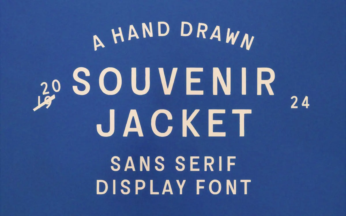
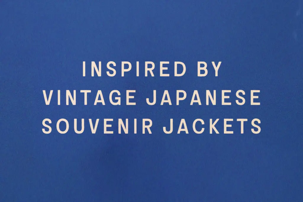
Souvenir Jacket takes its cue from the embroidered tour jackets American servicemen brought home from Japan after WWII, and that reference is legible in the letterforms themselves. Strokes aren’t clean vector sweeps; they carry the slight buckle and thickening you’d expect from a needle pushing through satin, or a brush loaded with too much ink. The result reads as a sans serif built by hand rather than drawn with a pen tool, and it never quite settles into uniformity — which is the point.
Stroke weight is fairly heavy throughout, with terminals that swell rather than taper. Some strokes bow or wobble very slightly off the baseline, giving the whole set a worn, patched-together character rather than the crisp regularity of a geometric sans. It sits closer to a vintage badge or a hand-lettered sign than to anything you’d call neutral. That’s a design choice worth understanding before you commit to it: this is a typeface with a strong personality, not a workhorse text face wearing a costume.
Character set and features
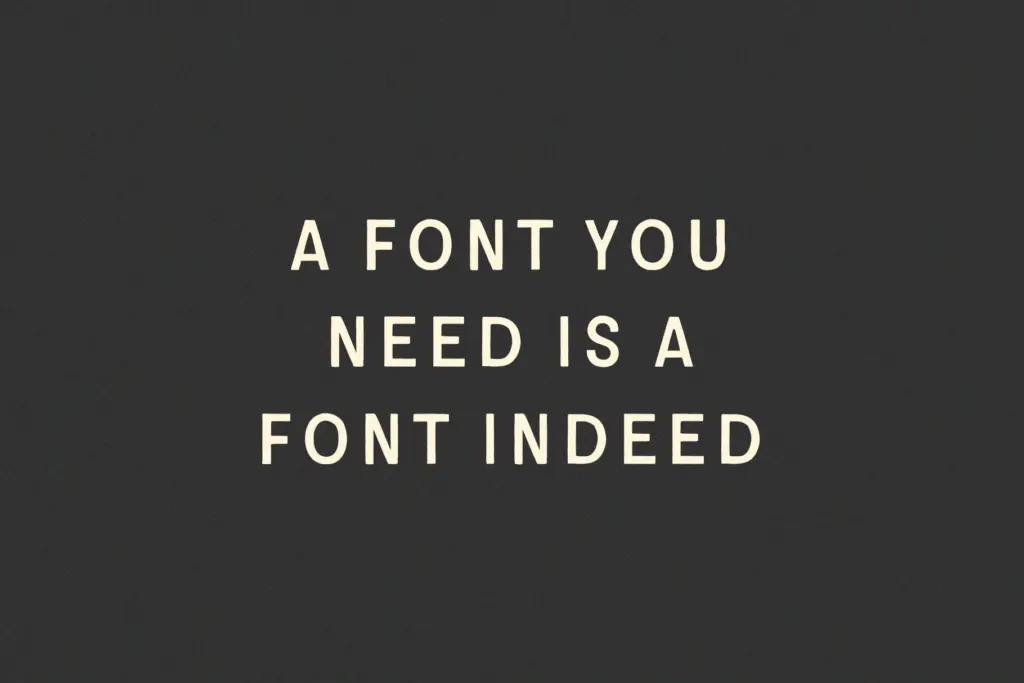
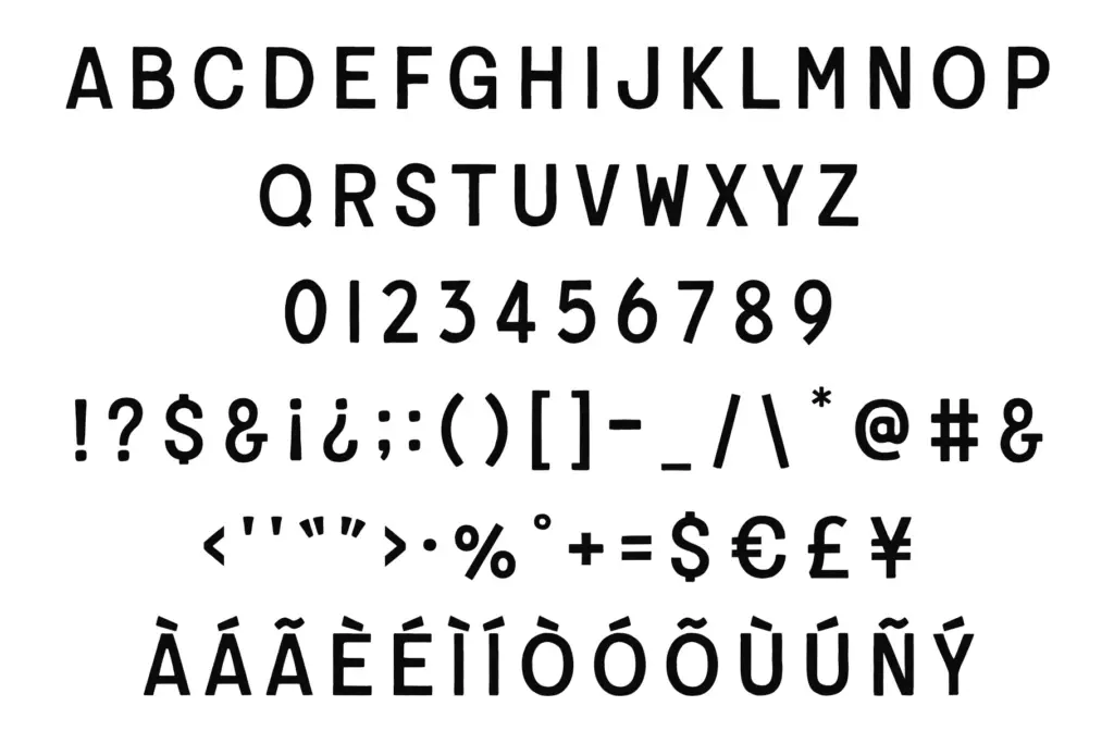
The set is uppercase only — A to Z, numerals 0 through 9, and essential punctuation. There’s no lowercase, so anything you set will read as all-caps by default, which reinforces the badge/jacket-patch feel but also limits how the type can be composed. Linguistic support extends across more than 50 languages, so accented characters for a range of European alphabets are covered, though as with any hand-inked display face it’s worth checking specific diacritics render the way you expect before locking a layout.
Because the irregularities are baked into the drawing rather than randomised per instance, repeated letters look identical every time they appear — useful for consistency in a logotype, less useful if you’re chasing the illusion of genuinely varied hand lettering across a long headline.
Use cases
This is a display face first. Short runs — a jacket-back word, a badge, a product name, a single line on packaging — are where the ink-blot texture and irregular strokes do their job without becoming exhausting to read. The seller’s claim that it works for body text doesn’t hold up in practice: the weight and roughness that make it charming at large sizes will muddy quickly once you’re setting more than a few words, and the lack of lowercase makes long-form reading actively harder.
Where it earns its keep is in branding built around nostalgia — apparel labels, craft or heritage packaging, patch and badge design, anything referencing mid-century Americana or Japanese souvenir culture directly. It also has legs as a standalone wordmark for a small business leaning into a lived-in, handmade aesthetic. Keep it to headlines and short phrases, pair it with a plain, quiet body font for anything that needs to be actually read, and it does exactly the job it was drawn for.
What we liked, and what we didn’t
Strengths
- The ink-blot terminals and slight stroke irregularities genuinely evoke embroidery rather than looking like a generic distressed effect
- Strong, singular reference point (souvenir jackets) gives it a clear identity rather than vague 'vintage' vagueness
- Wide language support means accented Latin text is covered for international branding work
Trade-offs
- No lowercase at all, which limits composition options and forces an all-caps treatment on everything
- Heavy, irregular strokes that work at headline size will blur and tire the eye if pushed into body text
Souvenir Jacket delivers a genuinely specific reference point — embroidered souvenir jackets — and the ink-heavy, slightly buckled strokes carry that idea well at display sizes. It's not built for body copy despite the seller's claim, and the uppercase-only set narrows its range, but as a badge or headline face for heritage-leaning branding it does its one job convincingly.
Verdict

Tantype reviews typefaces in depth — every font is tested in real branding, editorial and screen layouts before a word gets written. 555+ fonts reviewed and counting.