
ED Drayton: A Classic Script Built for Alternates and Invitation Work
Design style
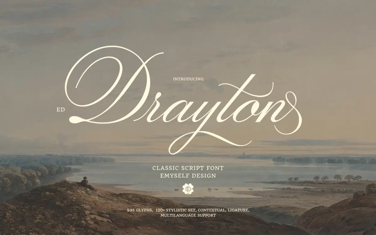
Drayton sits in the well-populated field of connected scripts modelled on wedding-suite calligraphy: moderate slant, looping ascenders and descenders, and a brush-pen feel to the stroke contrast rather than a pointed-pen one. The letters lean toward the fuller, rounder end of the genre — the bowls are generous, the joins are soft, and nothing about the construction feels rushed. It reads as warm and traditional rather than sharp or contemporary.
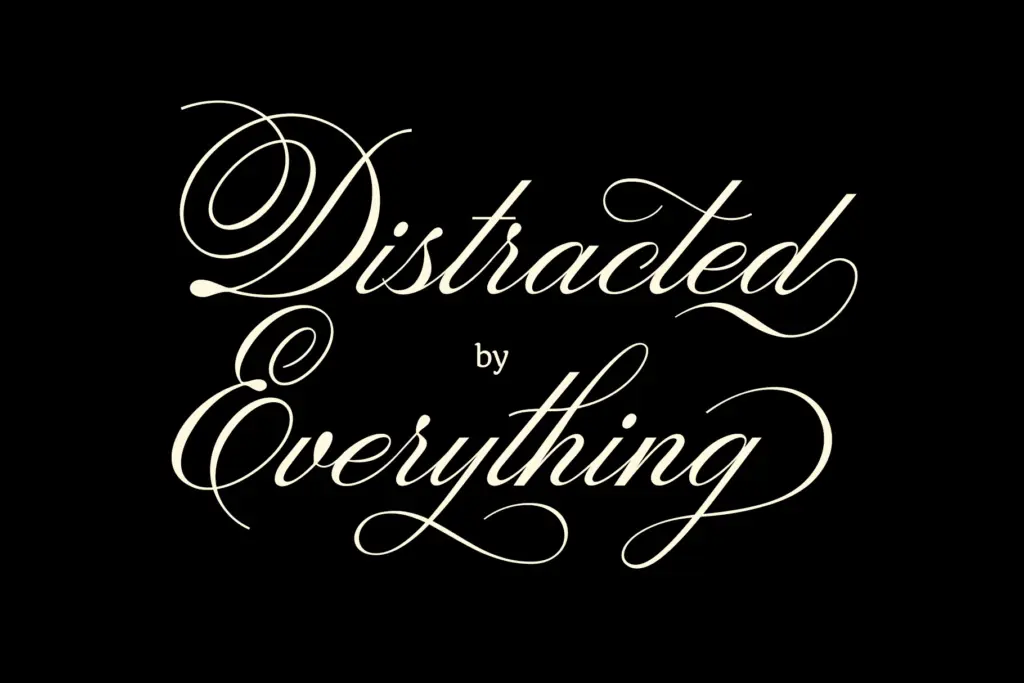
What separates it from a plain script is the amount of variation built into the drawing. The seller’s claim of 120-plus stylistic sets is unusual for this category, and it shows in practice: swash capitals, alternate lowercase entries and exits, and looping versus non-looping options give a working designer real room to adjust the rhythm of a word without switching typefaces. The trade-off is that the default, un-alternated setting can look a little plain compared to what the font is capable of — you need to go digging in OpenType features to find its best self.
Character set and features
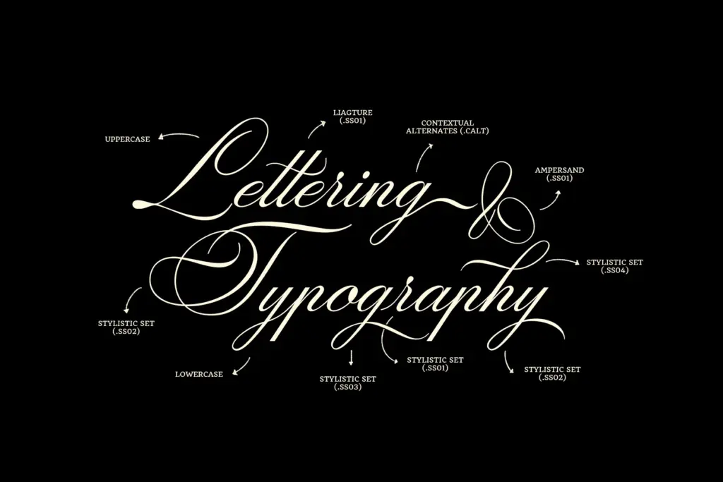
At 535 glyphs, this is a substantial script rather than a bare upper/lowercase set. Contextual alternates are active by default in most applications, so consecutive letters with similar shapes get automatic variation, which softens the repetition that plagues cheaper scripts when a word repeats the same letter twice. Ligatures cover the common awkward pairs — double letters, certain lowercase-to-lowercase transitions — and the stylistic sets extend that further into full-word customisation for anyone willing to hand-pick alternates letter by letter.
Multi-language support is listed among the features, which is worth noting for anyone setting copy outside basic English, though the brief doesn’t specify which scripts or diacritics are covered, so it’s worth checking your specific language needs before committing. Punctuation and symbols round out a set that’s clearly been built for finished pieces, not just headline words.
Use cases
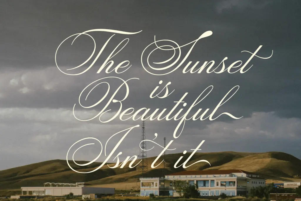
Drayton’s natural home is the same territory most classic scripts occupy: wedding invitations, save-the-dates, place cards, and the softer end of packaging and label design. The connected, looping structure means it wants space and a reasonably large point size — this is not a script built for dense body copy or small print, and pushing it below display sizes will cost legibility as the joins compress.
The stylistic set depth makes it a reasonable choice for logotypes and monograms where a designer wants to hand-tune a specific word mark rather than accept the default flow. It also suits printed quotes, greeting cards, and apparel graphics where a handwritten, personal tone is the goal. It’s less suited to interface work, long-form editorial text, or anything requiring a script to hold up at small sizes on screen — the fine strokes and tight joins are built for print-scale elegance, not pixel density.
What we liked, and what we didn’t
Strengths
- Deep stylistic-set and ligature system allows real word-by-word customisation.
- Contextual alternates reduce repetition in words with doubled letters.
- Rounded, warm letterforms suit traditional invitation and packaging work well.
Trade-offs
- Default, unadjusted setting looks plainer than the font's alternates suggest it can be.
- Tight joins and fine strokes limit legibility at small sizes or on screen.
ED Drayton is a competent, traditional wedding-style script whose real strength is the sheer depth of its stylistic alternates. It won't surprise anyone stylistically, but it gives a patient designer unusual control over word-by-word character. Best kept to display sizes and print-oriented work rather than screen or small text.
Verdict

Tantype reviews typefaces in depth — every font is tested in real branding, editorial and screen layouts before a word gets written. 555+ fonts reviewed and counting.