
MIROA: a hand-drawn art nouveau display face with desert warmth
Design style
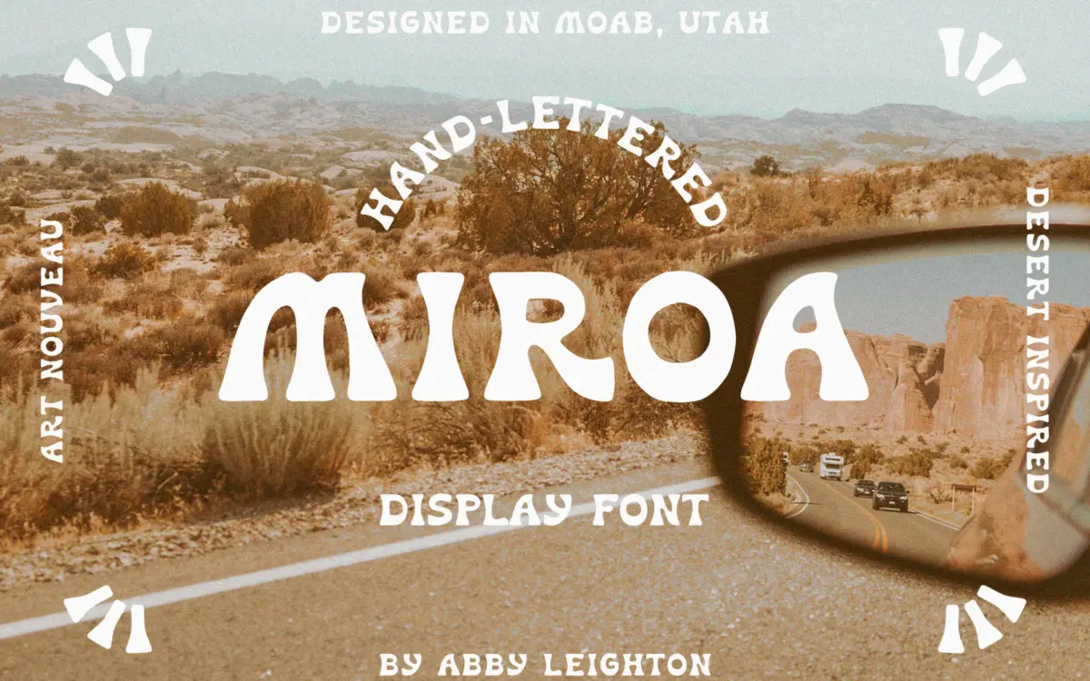
MIROA sits somewhere between art nouveau lettering and the loose hand-drawn display faces that have been popular in branding work over the last few years. The influence shows up in the way strokes swell and taper rather than holding a constant width, and in curves that flare out at the ends instead of terminating cleanly. It reads as drawn, not built — there’s a visible hand behind the letterforms, with small inconsistencies in stroke weight that give it a warmth a vector-perfect display face wouldn’t have.
The desert reference the designer mentions comes through less in any literal symbolism and more in the tone: sun-bleached, slightly worn, unhurried. Letters lean toward organic curves over hard geometry, and the overall rhythm is loose enough that it never feels stamped out by a grid. This is a typeface with a point of view, and it’s not trying to be neutral.
Character set and features
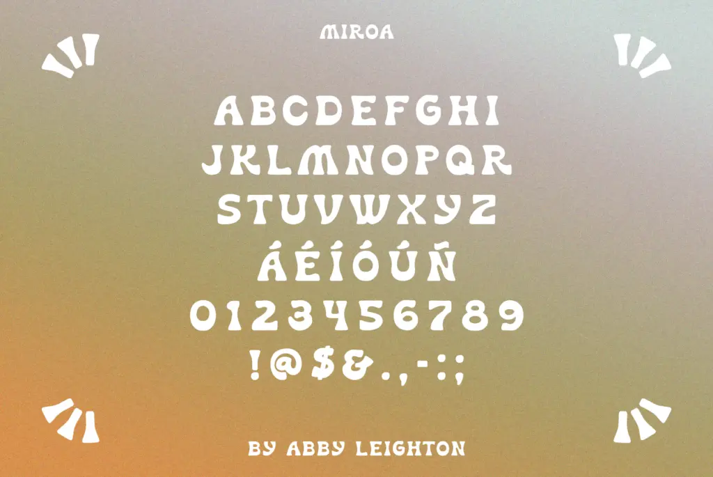
As a hand-lettered display face, MIROA works best treated as a set of characters to be composed rather than typed and forgotten. The organic terminals and swelling strokes mean kerning pairs need attention at larger sizes — a hand-drawn face like this rarely behaves perfectly out of the box, and a few letter combinations will need manual nudging to sit right. That’s normal for the category, not a flaw specific to this release, but buyers should go in expecting to do some fine-tuning rather than dropping in a headline and walking away.
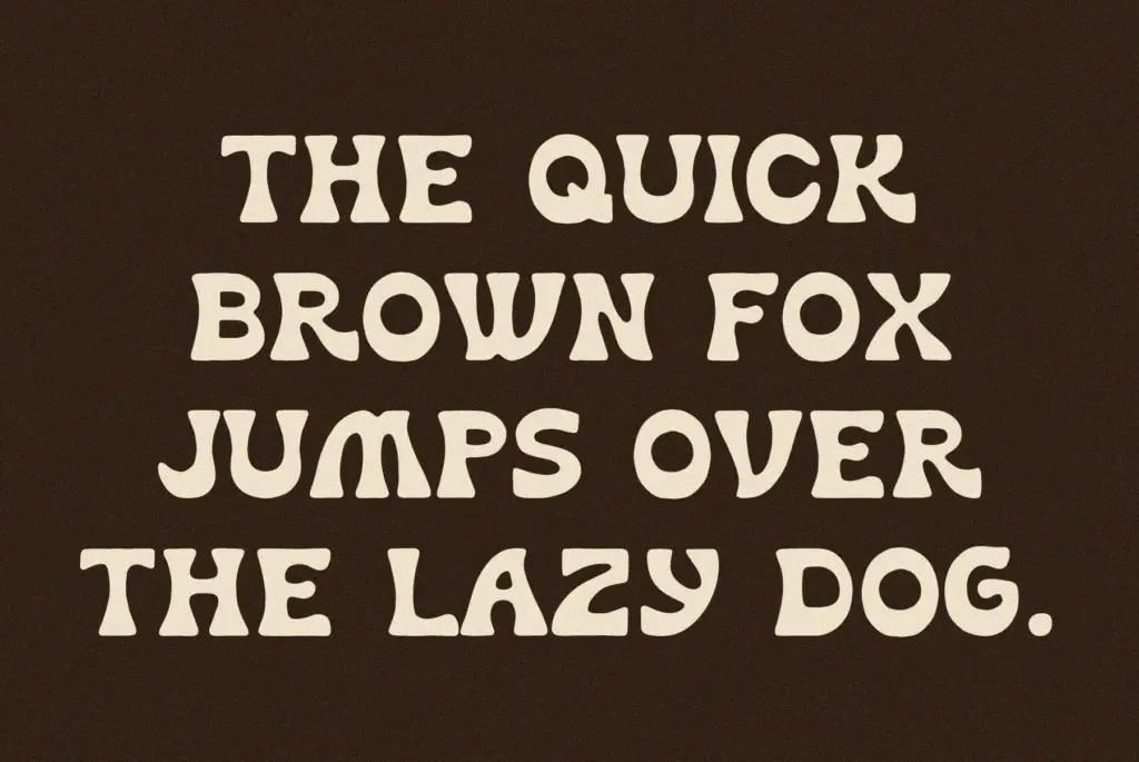
The retro, playful character of the letterforms means it carries personality even in short bursts — a word or two is often enough to establish the tone of a piece, which is exactly what a display face like this is for. It’s not designed to disappear into a paragraph, and it shouldn’t be asked to.
Use cases
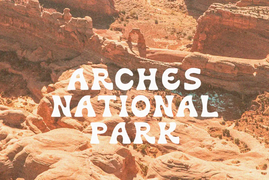
MIROA is built for moments where a brand or a piece of packaging wants a hand-lettered signature rather than a set typeface. Think logotypes, product labels, wedding stationery with a vintage feel, or editorial headlines that want some visible craft. Its art nouveau curves and desert-adjacent warmth suit brands leaning into a modern-heritage aesthetic — think small-batch goods, boutique hospitality, or lifestyle brands trying to avoid a cold, corporate feel.
It’s less suited to anything requiring long-form reading or strict uniformity — body copy, dense UI, or contexts where legibility at small sizes matters more than character. Pair it with a plain, quiet sans or serif for supporting text, and let MIROA carry the headline or the logotype where its hand-drawn quality can actually be seen and appreciated. Used sparingly, in the sizes and contexts it was drawn for, it does its job well; asked to do more than that, its charm turns into a liability.
What we liked, and what we didn’t
Strengths
- Organic, hand-drawn strokes give it genuine warmth rather than a templated retro look
- Strong personality even in short words, ideal for logotypes and headline treatments
- Vintage, art nouveau character suits modern-heritage and boutique branding well
Trade-offs
- Requires manual kerning attention at display sizes due to its irregular, hand-lettered strokes
- Not suited to body copy or small-size legibility work
MIROA is a confidently drawn display face with real character, suited to branding, packaging, and stationery work that wants a hand-lettered touch. It needs manual kerning attention and isn't meant for anything beyond short, expressive text. Used where it belongs — headlines, logotypes, short labels — it earns its keep.
Verdict

Tantype reviews typefaces in depth — every font is tested in real branding, editorial and screen layouts before a word gets written. 555+ fonts reviewed and counting.