
Summertime Stories: an uppercase marker script for casual, personal-feeling layouts
Design style
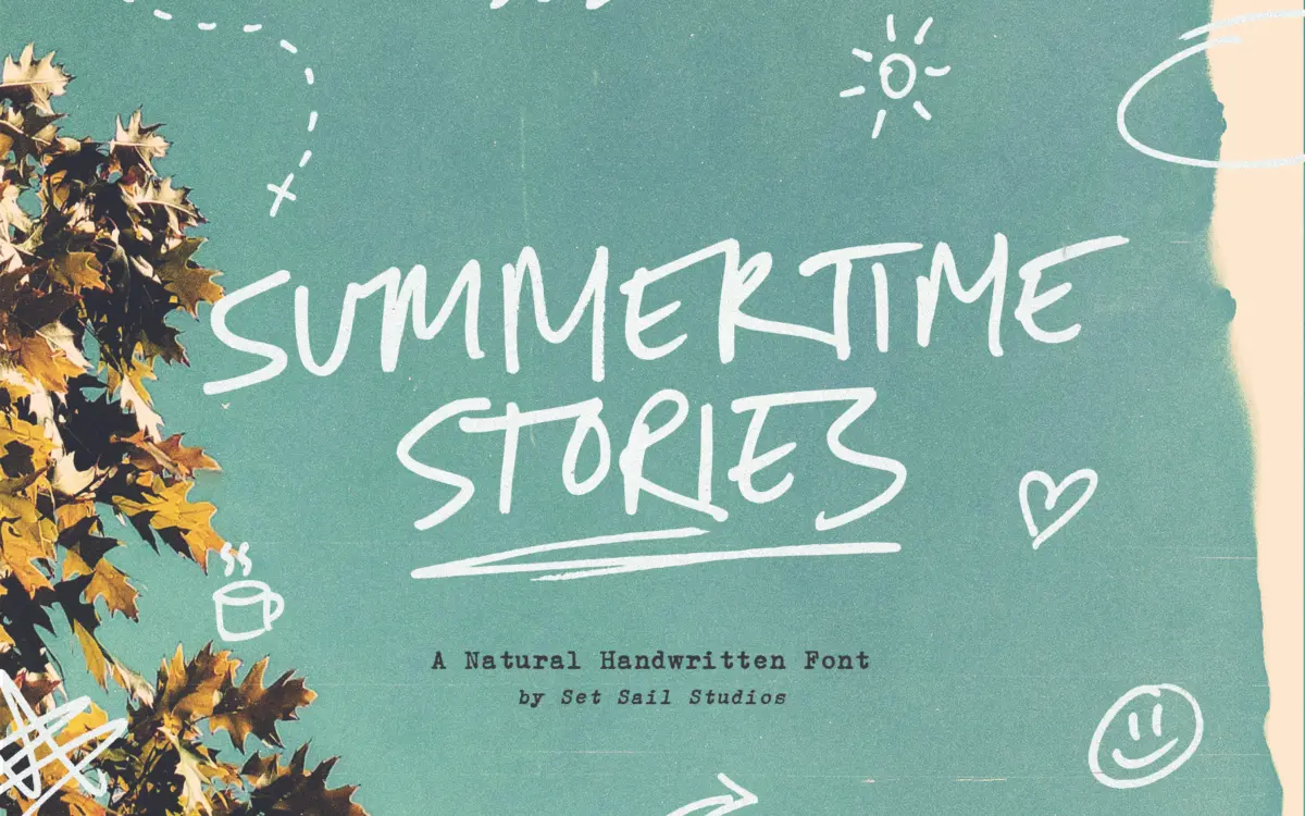
Summertime Stories is an uppercase-only script built from actual pen marks rather than a smoothed-over digital approximation of one. You can see it in the stroke weight: it swells and thins the way a felt marker does when the hand slows down to turn a corner, and the baseline drifts slightly letter to letter rather than sitting on an invisible rail. The letterforms lean casual and a little rushed, with open counters and loose joins that read as a quick note rather than formal calligraphy. It sits closer to the rough, marker-and-paper end of the handwritten spectrum than to the polished brush-script category, and that’s clearly the intent — the texture is doing the work, not refinement.
Because it’s capitals only, the rhythm is more even than a mixed-case script, but also more insistent. Every letter carries similar visual weight, so word shapes don’t vary the way they would with ascenders and descenders. That’s a stylistic choice worth knowing going in, not a flaw, but it does mean long stretches of text start to feel like shouting, however gently.
Character set and features
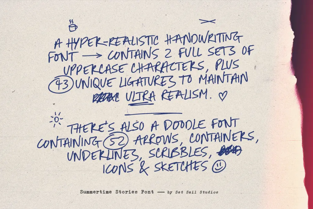
The core idea here is the alternate set paired with 43 ligatures aimed at double-letter combinations, which is the main thing stopping a monocase script from looking mechanically repeated. Swap in an alternate for a repeated letter and the ligatures stitch the pen-strokes together at the joins, and the illusion of continuous handwriting holds up noticeably better than in scripts that rely on a single glyph per letter. It’s a detail that rewards actually opening the glyph panel rather than just typing and moving on.
The separate Doodles font is the other half of the package — 52 arrows, scribbles, underlines, containers and small icons drawn in the same loose hand. These aren’t a script ornament set bolted on afterward; they’re pitched to sit at the same pressure and line quality as the lettering, so a scribbled underline or a hand-drawn arrow doesn’t look like it came from a different artist. Language support runs across most Western and several Central European character sets, so accented setting in French, German, Polish or Czech should hold its shape without obvious gaps.
Use cases
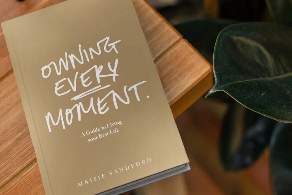
This is a font for short bursts of text where personality matters more than reading speed: a blog header, a product label, a social graphic, a hand-lettered logotype, packaging copy that wants to feel artisanal rather than corporate. The doodle set makes it useful for anyone building a scrapbook-style layout — travel journals, seasonal promotions, greeting cards — where the marks around the words matter as much as the words themselves. It’s less suited to anything requiring sentence-length copy or a formal tone; the monocase structure and rough texture work against both legibility and polish once you’re past a few words. Treat it as a headline and accent tool, not a body-copy solution, and it does its job well.

What we liked, and what we didn’t
Strengths
- 43 ligatures and alternate letters genuinely vary repeated letters instead of looking mechanical
- the matching Doodles font shares the same pen pressure and feel, so it doesn't look bolted on
- broad language support covers most Western and Central European accented setting
Trade-offs
- uppercase-only structure flattens word shapes and tires the eye over more than a few words
- the rough, uneven baseline works against legibility at small sizes or in dense layouts
Summertime Stories delivers genuine pen-and-paper texture through its alternates and ligatures, and the bundled doodle set is a real asset rather than filler. It's built for short, personality-driven text, and it shows strain the moment you ask it to do anything longer.
Verdict

Tantype reviews typefaces in depth — every font is tested in real branding, editorial and screen layouts before a word gets written. 555+ fonts reviewed and counting.