
Sarin SVG: a condensed industrial sans built for atmosphere, not body text
Design style
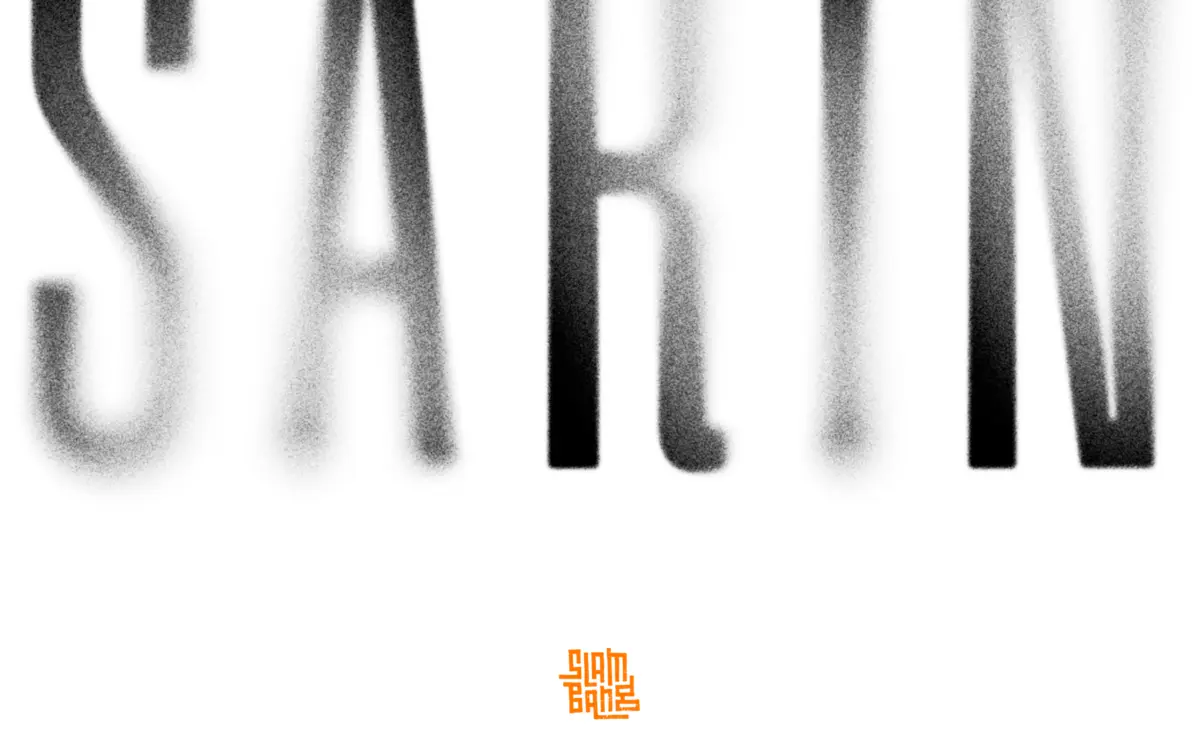
Sarin SVG is a condensed industrial sans that leans hard into decay rather than fighting it. The skeleton underneath is a fairly conventional grotesque-adjacent condensed structure — tight apertures, squared-off terminals, a vertical stress that keeps words from sprawling. But the surface treatment is where the design actually lives. Each letterform carries a fine-grain blur that reads as smoke, dust, or degraded print, with edges that dissolve rather than end cleanly. It sits somewhere between a solid mark and a residue of one.
That texture is the whole point, and it’s handled with more restraint than a lot of grunge-sans releases. The grit isn’t randomised noise slapped over clean letters; it’s baked into the shape of each glyph, so the roughness feels structural rather than filtered on top. The condensed proportions also do real work here — narrow counters and tight spacing give the texture somewhere to sit without turning words into mush.
Character set and features
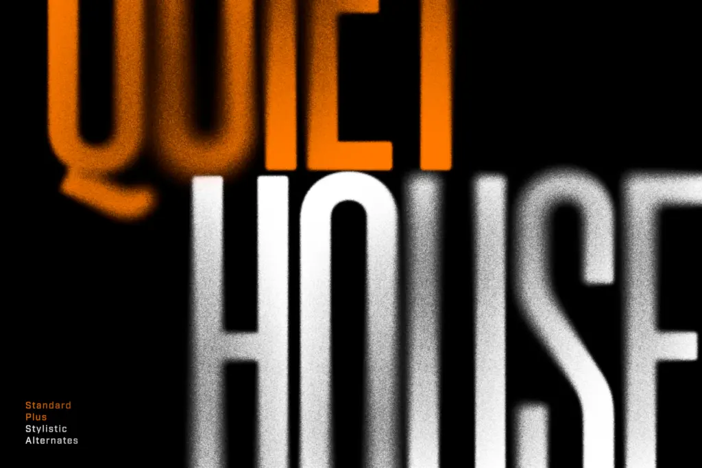
The family bundles four variants: Sarin SVG (the textured colour-layer version), Sarin Rough (a standard OTF with a similar gritty look), Sarin Clean (the same skeleton with the texture stripped out), and a Mac-specific encoding aimed at Procreate. This is a sensible way to hedge against SVG fonts’ patchy support — Rough and Clean behave like normal fonts anywhere, while the SVG format is really built for Adobe’s layered colour-font pipeline in Illustrator, Photoshop and InDesign.
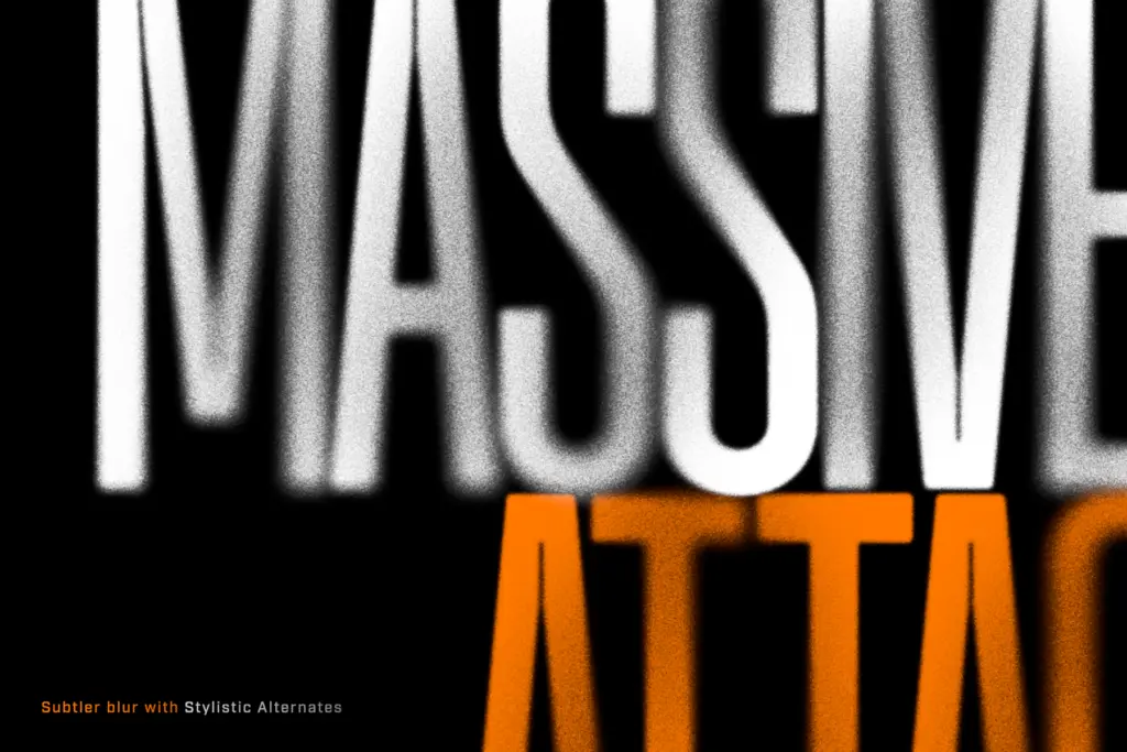
Both SVG and Rough versions include four texture variants per letter, with the stylistic alternates dialled down to a subtler grain for anyone who wants less chaos. There’s also a repeat-letter substitution feature that automatically swaps in a different texture variant when the same letter appears twice in a row, so double letters don’t read as an obvious copy-paste of the same distress pattern. It’s a small detail, but it’s the kind of thing that separates a font built by someone who’s actually used grunge type in production from one that just applied a filter once and called it done.
Use cases
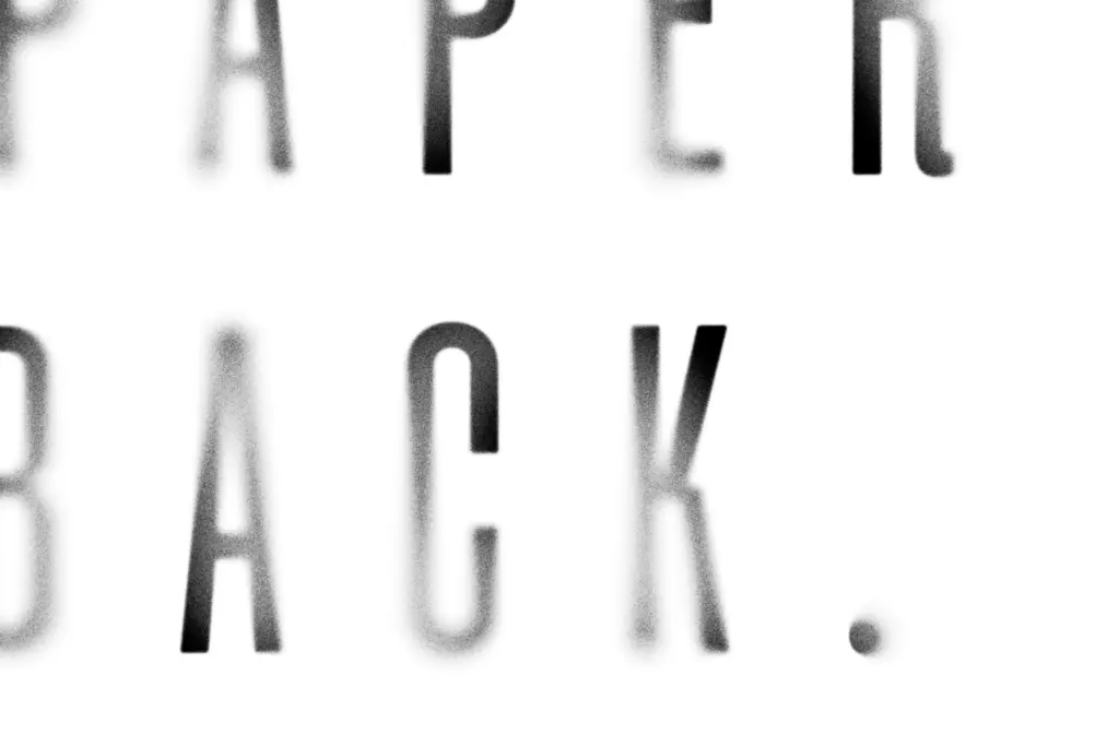
This is a display face, full stop. The condensed proportions and heavy texture make it unsuitable for anything beyond a few words at a time — headlines, single-word marks, poster type, album art. It does exactly what the seller pitches it for: dystopian film titling, music packaging, distressed poster work, anything where the letters are meant to look worn down or half-erased rather than crisp.
Where it’s less useful is anywhere texture becomes a liability — small sizes, screens with compression artifacts, or any context that needs the grime to survive scaling and printing without turning to mud. The Clean variant helps here by giving you the same silhouette without the surface noise, which is a smart inclusion rather than an afterthought. But it also means Clean is really a backup skeleton, not a typeface with its own personality — the SVG texture is the reason to reach for this family in the first place, and it only earns its keep at headline size.
What we liked, and what we didn’t
Strengths
- Texture is built into the letterforms rather than applied as a generic filter
- Repeat-letter substitution avoids the obvious copy-paste look of adjacent identical characters
- Clean and Rough variants extend usability beyond Adobe's SVG-font pipeline
Trade-offs
- Only works at display sizes — the texture collapses at small scale or on screen
- SVG format support is limited outside Adobe applications, restricting where the flagship version can actually be used
Sarin SVG is a well-made grunge display sans that knows what it's for and doesn't overreach. The texture is genuinely considered rather than filtered on, but that also means it's strictly a headline tool — useful for a narrow, specific job and not much else.
Verdict

Tantype reviews typefaces in depth — every font is tested in real branding, editorial and screen layouts before a word gets written. 555+ fonts reviewed and counting.