
Salome Nomadic: a sun-worn handwritten serif for boho branding
Design style
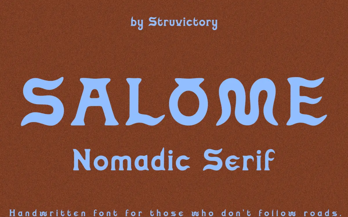
Salome Nomadic is a handwritten serif that leans hard into texture over precision. The letterforms are tall and narrow, with curves that look like they were drawn slowly rather than built to a grid. There’s a visible looseness to the strokes — thick-thin transitions that don’t always land where you’d expect, small wobbles at the joins, terminals that taper unevenly. That’s clearly deliberate. It reads as sun-bleached and hand-worked rather than sloppy, though the line between the two is thinner here than in more disciplined script revivals.
The serifs themselves are minimal, more suggestion than structure, which keeps the font from tipping into anything formal. It sits closer to a loose brush-serif hybrid than a traditional bookish serif, and it’s better understood that way. Anyone expecting a classic serif under that marketplace label will be surprised by how expressive and unruly the letterforms actually are.
Character set and features
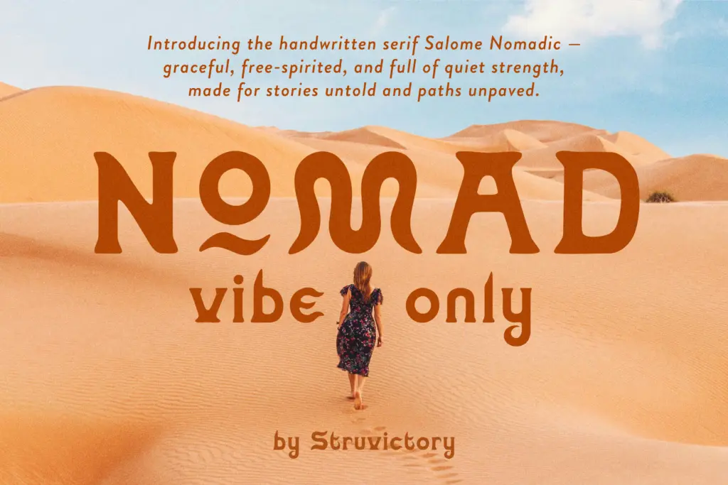
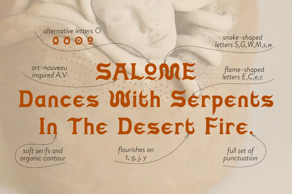
The font includes stylistic alternates for the letter O, which is a small but useful inclusion — repeated O’s in a wordmark or headline can start to feel monotonous in a font this idiosyncratic, and having a second option gives some breathing room. Latin-based language support is included, covering the accented characters most European markets need, though buyers with more specialised diacritic needs should check the glyph list directly rather than assume full coverage.
Because the characters are tall and irregular, kerning pairs matter more than usual here. Loose, generous letter-spacing tends to favour the design; tight-set headlines risk collisions between ascenders and the more flamboyant curves. This isn’t a fault so much as a font that asks for a bit of manual attention rather than being fully plug-and-play.
Use cases
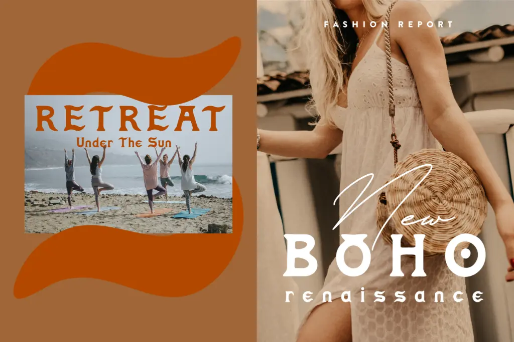
This is a display font first, and it should be treated that way. At logo size, short brand names, or single-word wordmarks, the sun-worn irregularity reads as intentional and characterful. It suits the boho, desert, and wellness-adjacent branding it’s clearly built for — glamping outfits, ceramics studios, candle labels, spiritual or wellness product lines, anything trying to signal handmade warmth rather than corporate polish.
It’s less suited to body copy or anything requiring sustained reading. The irregular baseline and inconsistent stroke weight that make it charming at large sizes will tire the eye quickly in paragraph form, and legibility drops fast below display sizes. Pair it with a plain, quiet sans or serif for supporting text and let Salome Nomadic do the talking only where a few words are all that’s needed — a logotype, a packaging headline, an editorial title. Used within that narrow lane, it does its job well; pushed beyond it, the same qualities that give it personality start working against it.
What we liked, and what we didn’t
Strengths
- Sun-worn, irregular strokes give it a distinct handmade character at display sizes
- Alternate O glyphs help avoid repetition in short wordmarks
- Latin language support covers common European diacritics
Trade-offs
- Legibility drops quickly at smaller sizes or in longer text
- Irregular spacing and joins mean tight kerning needs manual adjustment
Salome Nomadic is a characterful, deliberately imperfect handwritten serif suited to short boho-branding jobs — logos, packaging headlines, single-word wordmarks. It's not built for reading, and it knows it, but within that narrow lane it has real personality.
Verdict

Tantype reviews typefaces in depth — every font is tested in real branding, editorial and screen layouts before a word gets written. 555+ fonts reviewed and counting.