
Network: a marker-styled handwritten script for brand and street-style work
Design style
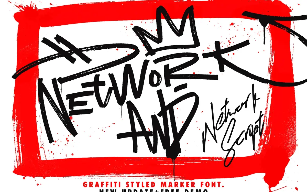
Network is a marker-brush script built to look like a signature scrawled with a chisel-tip pen rather than a formal calligraphy nib. The strokes are thick and slightly ragged at the edges, with visible texture rather than clean vector smoothness. Letters lean forward and connect loosely, giving the impression of quick, confident handwriting rather than careful lettering. It sits closer to graffiti-tag energy than to wedding-invitation elegance, and it reads that way at a glance: informal, urban, a little rough around the edges by design.
The connecting logic between letters isn’t always even. Some pairs flow together smoothly, others feel like they’ve been forced into contact, which is common in marker-script fonts built for character rather than uniform rhythm. That’s not necessarily a flaw here — it’s part of the handmade illusion — but it means the font works best when you let it be loose rather than trying to force perfectly even setting.
Character set and features
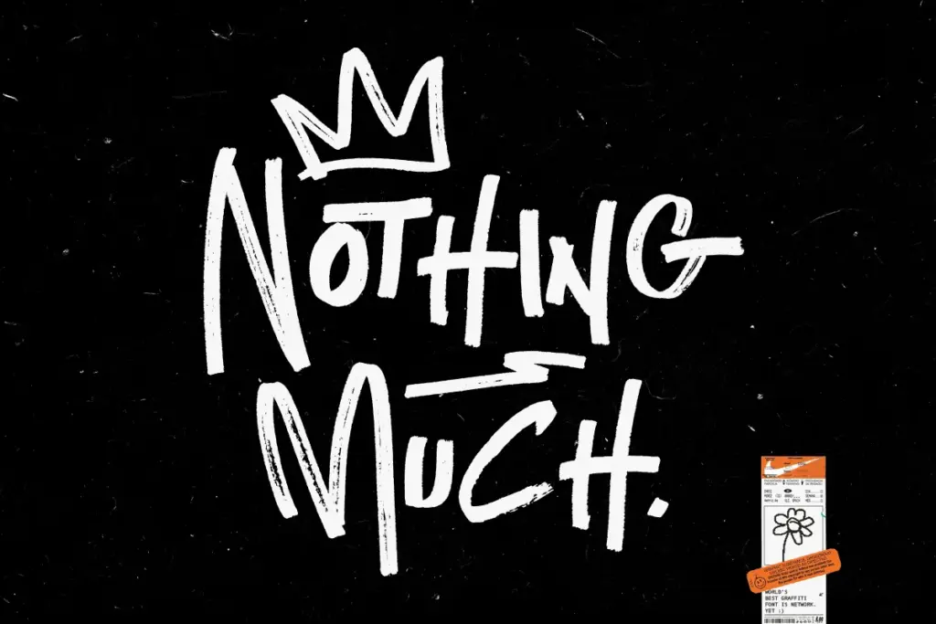
The package is split into several related fonts rather than one: a base Network font, plus Alt, Balt and Calt variants that appear to offer alternate letterform styles or contextual substitutions. This is the font’s most useful structural feature — instead of relying on OpenType alternates hidden behind a feature panel, you get separate files you can swap between directly, which is friendlier for anyone using software without deep OpenType support. There’s also a swash-only companion set for adding flourishes to caps or line-ends, and six spray-texture assets included alongside the fonts, clearly meant for the graffiti-adjacent aesthetic rather than clean brand work.
Because this is a script built around personality rather than a large, disciplined type system, don’t expect refined kerning across every combination. Some letter pairs will need manual tightening or a nudge of tracking, especially in longer words. The multiple style files are there partly to let you dodge the pairs that don’t sit well by switching versions rather than editing by hand.
Use cases
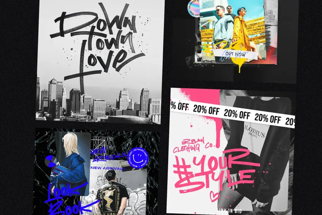
Network is aimed at the same territory as most marker-script display fonts: t-shirt graphics, streetwear branding, sale banners, social graphics, and logo marks that want an urban, hand-tagged feel rather than a polished script look. The spray textures point directly at that audience — this isn’t a font built for restrained editorial or luxury packaging work. It’s built for loud, casual, brand-forward pieces where a bit of grit reads as authenticity rather than error.
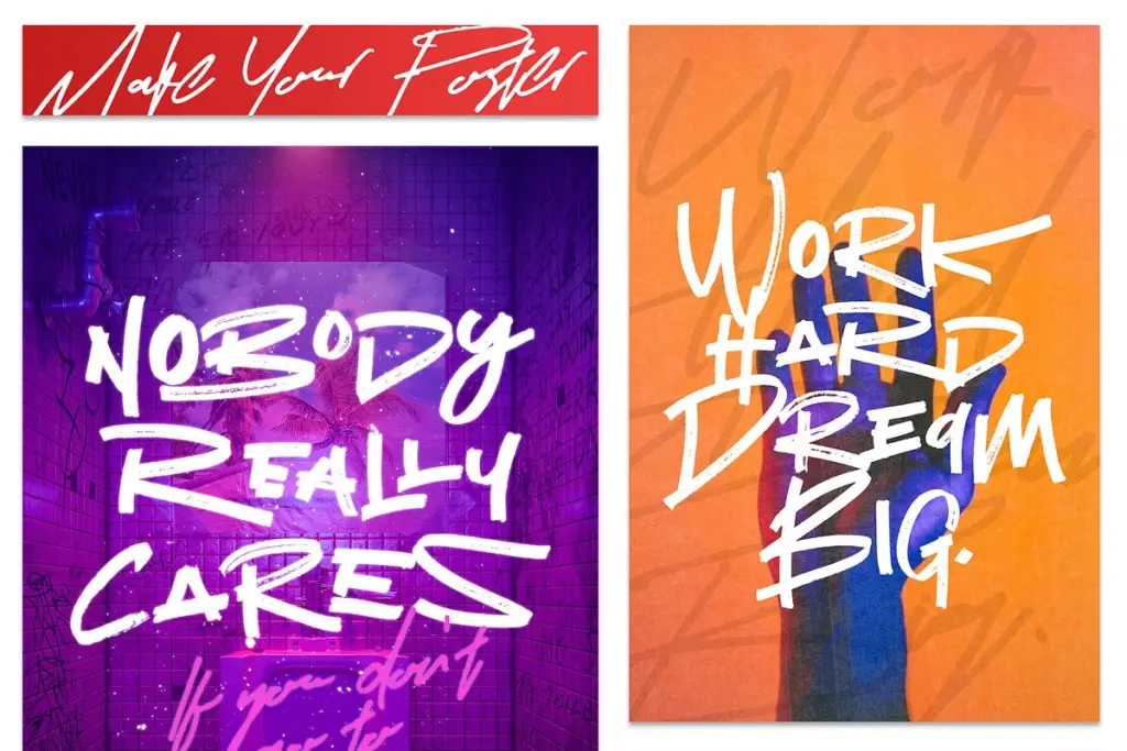
At small sizes or in dense paragraphs it will struggle; this is a display face, not a text face, and legibility drops off quickly below a few dozen points. Used large — as a wordmark, a headline, a single line on a banner or shirt front — the roughness reads as intentional style rather than noise. Pair it with a plain sans for supporting copy and let Network carry the personality on its own.
What we liked, and what we didn’t
Strengths
- Multiple standalone style files let you swap looks without digging through OpenType panels
- Marker texture and uneven strokes give it a genuine hand-tagged feel
- Swash companion set adds flourish options for logos and headlines
Trade-offs
- Letter connections are inconsistent and often need manual kerning adjustments
- Not legible at small sizes or in extended text, strictly a display face
Network delivers a convincing marker-script personality with useful alternate-style files instead of buried OpenType features. It's a display font through and through, best suited to loud, casual branding work rather than anything needing fine legibility or restraint.
Verdict

Tantype reviews typefaces in depth — every font is tested in real branding, editorial and screen layouts before a word gets written. 555+ fonts reviewed and counting.