
Papyrcuts: a torn-paper display font for posters and zine covers
Design style
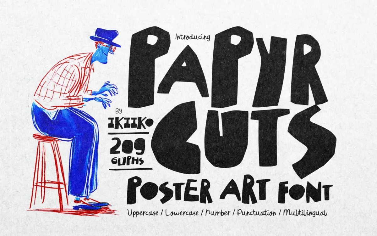
Papyrcuts leans into the ransom-note tradition of cut paper lettering, but it isn’t going for menace so much as art-school scrappiness. Strokes look torn rather than drawn: edges are jagged, corners are notched, and no two letters sit at quite the same angle. The overall effect reads as collage — like someone with an X-Acto knife and a stack of construction paper built an alphabet by hand and photographed it flat.
There’s a rawness to the drawing that feels deliberate rather than sloppy. The irregular contours repeat in a way that suggests a consistent cutting technique across the set, which keeps the font from tipping into total chaos. It’s rough, but it’s rough on purpose, and that distinction matters — a font this aggressive needs an internal logic or it just looks broken.
Character set and features
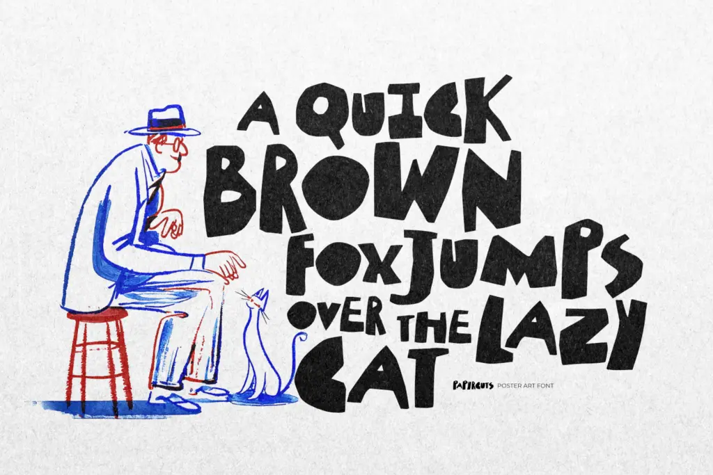
The set covers uppercase and lowercase, numerals, and punctuation, with multilingual support extending its reach beyond English-only projects. Both TTF and OTF formats are included, so it’ll drop into whatever layout software or OS you’re running without conversion headaches.
Because the letterforms are so texturally busy, kerning pairs and spacing become the real test of a font like this, and here it holds up reasonably well at large sizes — the jagged edges of adjacent letters don’t collide or read as noise. Push it down to body copy sizes, though, and the torn edges start to muddy the letter shapes; this is not a font for paragraphs, and it was never meant to be. It wants space, scale, and a short word count.
Use cases
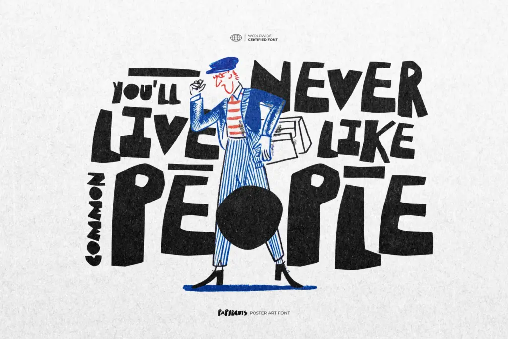
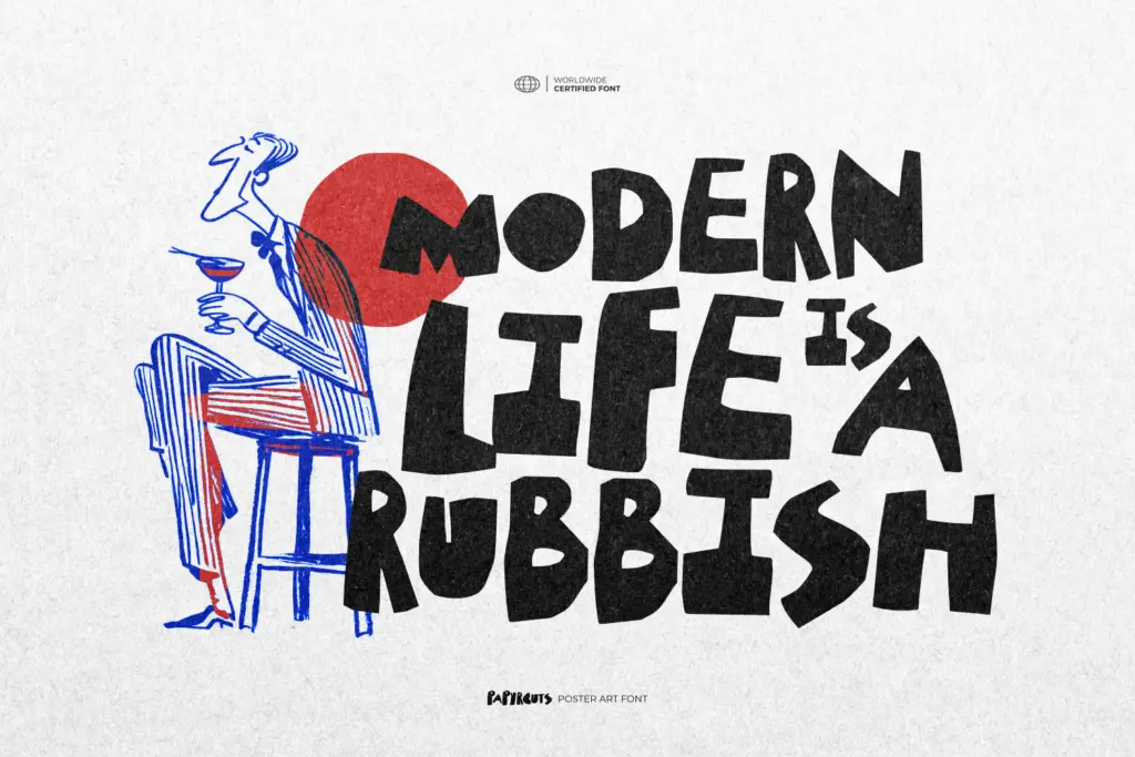
Papyrcuts is built for headlines, not sentences. A poster title, a magazine masthead, a one-word logotype for a streetwear or music brand — these are the contexts where the cut-paper texture reads as intentional and the roughness becomes the point. It also has an obvious home in exhibition and event posters, where a hand-torn, DIY feel signals something more artisanal or underground than a clean sans would.
Editorial covers and zine work are a natural fit too, particularly anything trading on a lo-fi, photocopied, or punk aesthetic. Pair it sparingly with a plain, quiet body font elsewhere on the page — Papyrcuts is loud enough on its own and will fight for attention if surrounded by other display type.
Where it won’t work: anything that needs to feel polished, corporate, or luxury. The whole premise here is imperfection, and no amount of careful kerning will make it read as refined. It’s also a poor fit for long-form reading or dense information design, where its texture becomes a legibility tax rather than a design asset. Used within its lane — big, bold, brief — it does the job it was built for.
What we liked, and what we didn’t
Strengths
- The jagged, torn-edge letterforms feel consistently crafted rather than randomly distressed
- Holds together well at large display sizes without letters colliding or muddying
- Multilingual support and both TTF/OTF formats make it easy to drop into most workflows
Trade-offs
- Legibility drops fast at smaller sizes, limiting it strictly to headline use
- The aggressive, raw aesthetic only suits a narrow band of edgy or DIY-branded projects
Papyrcuts commits fully to its torn-paper premise and looks convincing at poster scale. It's a one-trick font, but the trick is well executed, provided you never ask it to do body copy or anything remotely formal.
Verdict

Tantype reviews typefaces in depth — every font is tested in real branding, editorial and screen layouts before a word gets written. 555+ fonts reviewed and counting.