
Black Signatures: a bold monoline script built for signing off work
Design style
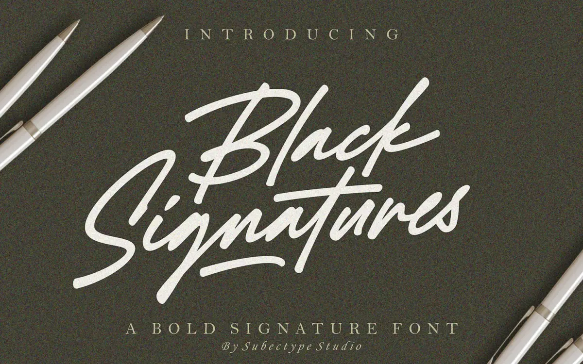
Black Signatures belongs to the thick-marker school of signature scripts: a monoline stroke with heavy, consistent weight, drawn to look like it was signed fast with a broad-tipped pen rather than a fine nib. There’s no contrast between thick and thin strokes here — the weight stays constant through entry, body, and exit, which gives the face a blunt, confident energy rather than the delicacy you’d get from a copperplate-derived script.
The joins are loose and gestural. Letters lean forward slightly and connect with long, looping ligatures that swing well below the baseline on descenders. It reads as handwritten rather than calligraphic — closer to what you’d scrawl on a poster with a paint marker than what you’d write with a dip pen. That’s the point: this is a signature font in the literal sense, meant to stand in for an actual signature rather than to evoke old-world elegance.

Character set and features
The set covers uppercase, lowercase, numerals, and full punctuation, with ligatures and swash endings built in to vary the terminal flourishes on final letters. Because it’s monoline and bold throughout, the letterforms hold their shape reasonably well even when scaled down, which isn’t always true of scripts with this much looping.
The stated multilingual support extending into European and Asian Latin scripts is a genuine practical plus if your work needs diacritics beyond basic English — though as with most script faces, accented characters sit less gracefully in the design than the base alphabet, since scripts are drawn letter by letter rather than as a unified diacritic system.
Legibility is the honest trade-off. At small sizes or in dense paragraphs this font falls apart — that’s true of virtually every script with this much flourish and connection, and Black Signatures is no exception. It’s built to be read as a mark, a name, a word or two, not as running text.
Use cases
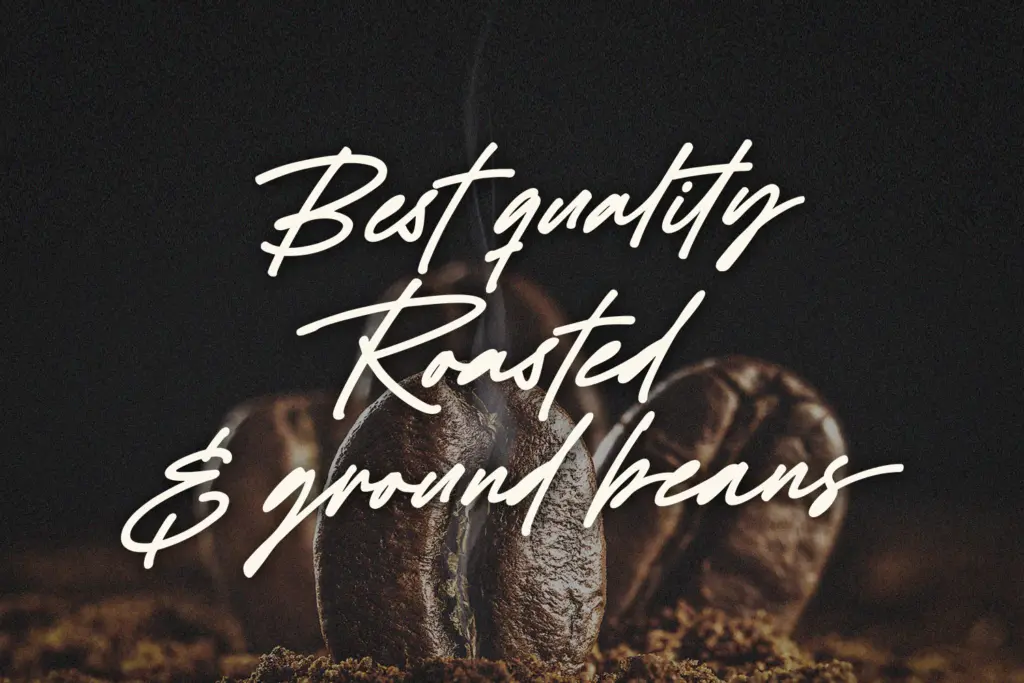
The obvious use is exactly what the name promises: a stand-in signature for personal branding, photography watermarks, or a closing flourish on a letterhead or invoice. It also works as a short lockup on a book cover, a t-shirt graphic, or a logotype where you want something that reads as handmade and assertive rather than polished and corporate.
It’s less suited to anything that needs to sit quietly — body copy, long headlines, or contexts where a script needs to look refined rather than loud. The boldness that makes it work as a standalone mark also makes it compete for attention when paired with other display elements on a page, so it wants space around it rather than a crowded layout. Used at the size and role it’s built for — a name, a word, a short phrase — it does its job cleanly.

What we liked, and what we didn’t
Strengths
- Consistent monoline weight gives it a bold, assertive presence at small sizes.
- Ligatures and swash endings add variety to word-final letters without needing manual kerning tricks.
- Genuinely useful multilingual character support beyond basic Latin.
Trade-offs
- Legibility drops fast in longer text or dense paragraphs.
- Its boldness makes it hard to pair quietly with other type on a busy layout.
Black Signatures does one job well: standing in for an actual signature with a bold, confident, monoline stroke. It's not built for reading in bulk, and it demands breathing room in a layout, but as a branding mark or short logotype it delivers exactly what it promises.
Verdict

Tantype reviews typefaces in depth — every font is tested in real branding, editorial and screen layouts before a word gets written. 555+ fonts reviewed and counting.