
Recline: a ten-weight sans for brand systems that need range
Design style
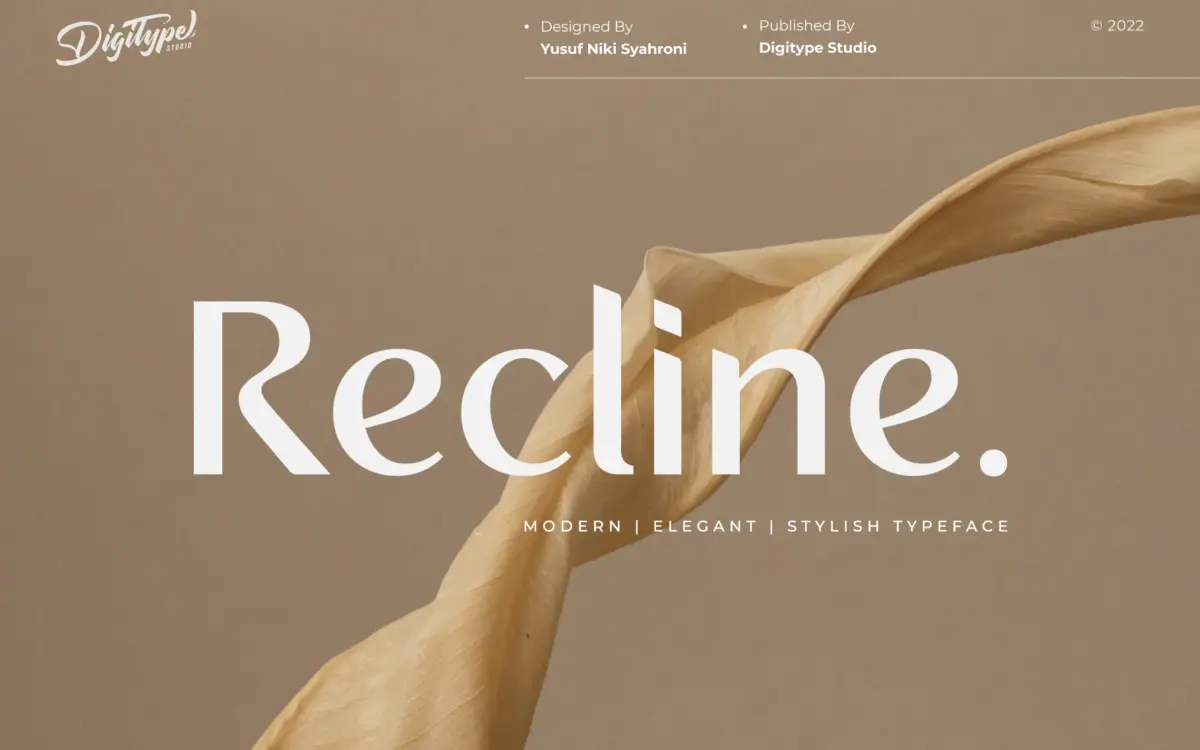
Recline is a modern sans built around restraint rather than personality. The letterforms are clean, low-contrast, and even in rhythm, with none of the quirks that make a display face memorable on its own. That’s the point. This is a workhorse family designed to sit quietly behind a brand rather than announce itself. Curves are gently squared off, apertures are moderate, and the x-height sits comfortably mid-range, giving it the kind of neutrality that corporate identity work tends to reward.
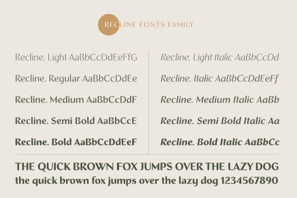
What makes Recline more interesting than a generic grotesque is the split between five straight-cut weights and five angled ones. The angled set introduces a slight slant to terminals and stroke ends without tipping into a true italic — it reads more like a structural variant than a stylistic flourish. Used together, the two axes give a designer a way to add contrast within a single family: straight for headers, angled for pull quotes or captions, without reaching for a second typeface.
Character set and features
Ten weights across two constructions is the headline feature here, and it’s a genuine practical advantage. Rather than picking a face and hoping the foundry included a usable medium and a usable bold, Recline gives you a full ladder from hairline-light through to a solid black, plus the angled counterparts at each stop. That range covers most of what a brand style guide asks for — body copy, subheads, captions, oversized display type — from one family, which keeps kerning, spacing and metrics consistent across a project instead of stitching together fonts from different sources.
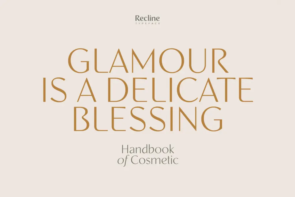
The letterforms themselves don’t take risks. There’s no unusual ligature system, no swash alternates, no decorative extras to speak of. What you get is a disciplined, technically thorough weight system built on a fairly conventional sans skeleton. That’s a fair trade for some buyers and a disappointment for others — if you’re after a sans with a distinct voice, Recline isn’t it. If you need a dependable structural tool, the depth of the family compensates for the plainness of the drawing.

Use cases
Recline earns its keep in corporate identity work, editorial layouts, and packaging systems where a single typeface has to carry logo, body text, and labelling without looking mismatched. The lighter weights suit long-form text in books and magazines; the heavier straight cuts hold up fine at poster or cover size. The angled weights are useful for adding a secondary voice — think captions, footnotes, or a quieter counterpoint to a bold headline — without introducing a second typeface into the mix.
It’s less suited to work that wants a sans with real character, or a brand trying to stand out through its wordmark alone. Recline plays a supporting role well; it’s not built to be the star of the show. For teams building a design system that needs to flex from ten-point body copy to a two-metre banner without switching fonts, that’s exactly the job it’s for.
What we liked, and what we didn’t
Strengths
- Ten weights across straight and angled cuts cover body, display and caption needs from one family
- Angled weights offer a built-in secondary voice without switching typefaces
- Even, moderate proportions make it dependable at both text and display sizes
Trade-offs
- The letterforms are conventional and won't give a brand a distinctive voice on their own
- No alternates, ligatures or decorative extras to add character where needed
Recline is a competent, unshowy sans whose real strength is its ten-weight structure rather than any distinctive drawing. It's a solid pick for brand systems and editorial layouts that need range and consistency, but not a font that will define a look on its own.
Verdict

Tantype reviews typefaces in depth — every font is tested in real branding, editorial and screen layouts before a word gets written. 555+ fonts reviewed and counting.