
Silverado: a Western slab duo for rustic branding and merch
Design style
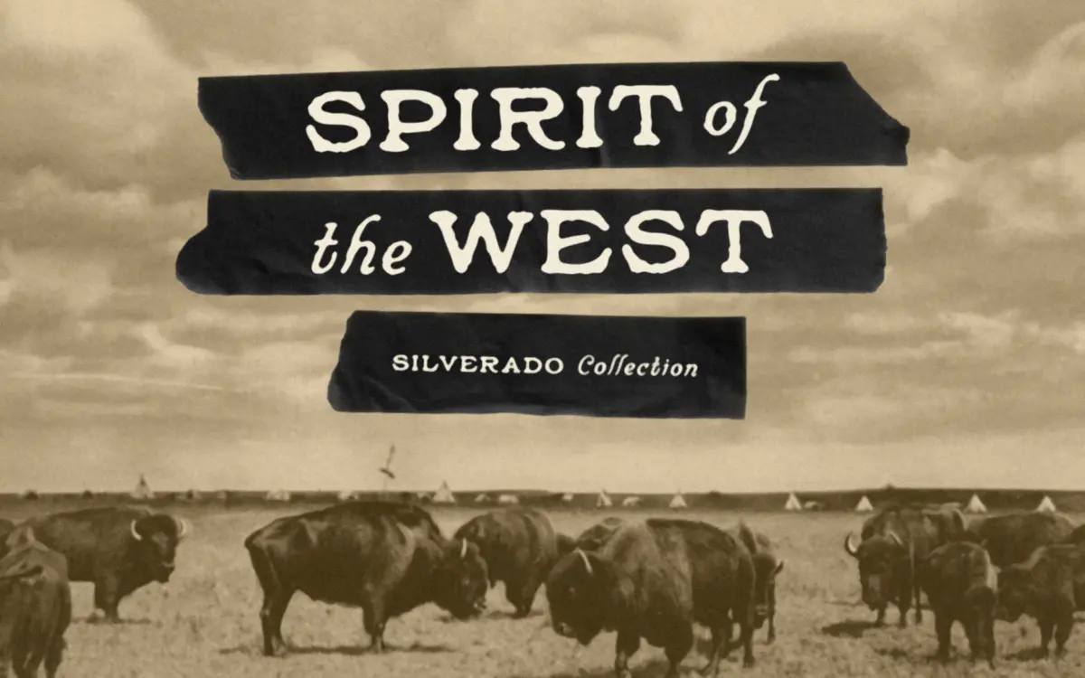
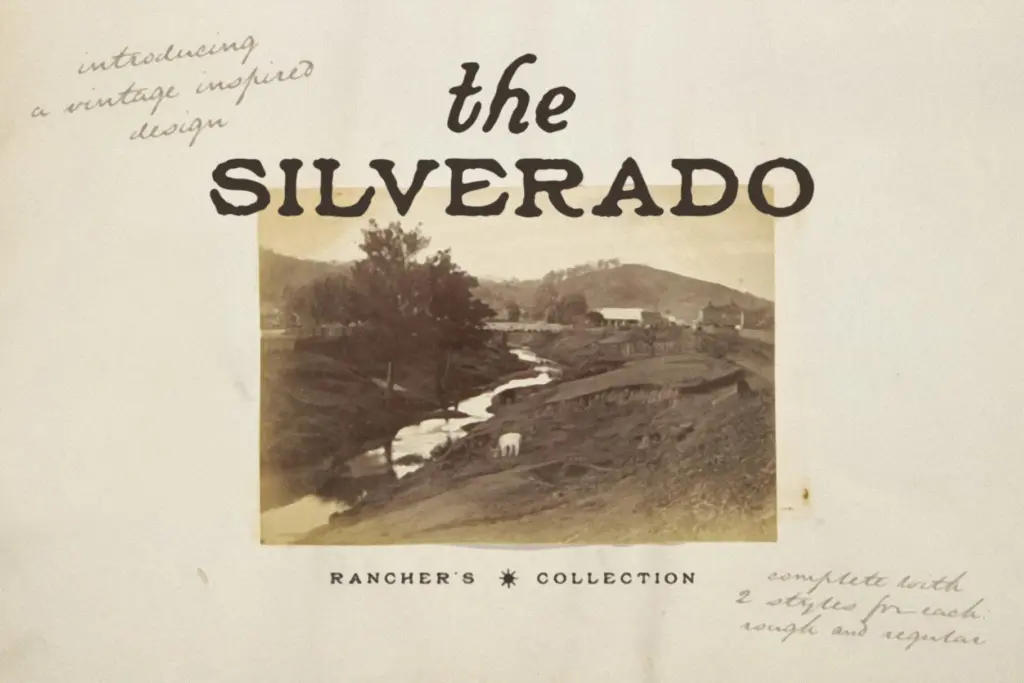
Silverado is a Western-flavored slab collection built as a small family rather than a single face: a Regular slab, a Rough version with distressed edges, a Script, and a Rough Script. The slab is blocky and confident, the kind of letterform you’d expect stamped on a feed sack or bolted to a saloon door. Serifs are heavy and squared off, with slightly bowed strokes that keep the letters from feeling too mechanical. It leans hard into a frontier, hand-tooled look rather than a clean geometric slab, and it doesn’t pretend otherwise.
The Rough variant adds worn edges and broken strokes to the same skeleton, giving you the weathered-signage effect without redrawing anything from scratch. The Script partner is looser and more casual, with a hand-lettered feel that plays against the slab’s rigidity. Paired together, slab and script give you the classic two-tier logo lockup — bold stacked letters on top, a looser flourish underneath — that’s been a staple of Western and rodeo branding for decades. It’s a familiar formula, executed competently rather than reinvented.
Character set and features
The package totals 640 glyphs across the four styles, covering uppercase and lowercase, numerals, punctuation, and symbols. That’s a reasonable spread for a display face, enough to set full words and short lines without hunting for missing characters. Language support extends to several Western European languages including French, German, Spanish, Italian and the Scandinavian set, so accented characters are covered for most European branding jobs.
What’s not included is anything resembling alternates or swash sets beyond the four base styles — this is a font duo (or quartet, depending how you count the rough variants) rather than a face with contextual variation built in. The roughness in the distressed versions is fixed per glyph, not randomized, so repeated letters in a word will show the same wear pattern every time. At small sizes the texture in the Rough styles can clog and lose definition, so it’s a face that wants generous point sizes rather than body text duty.
Use cases
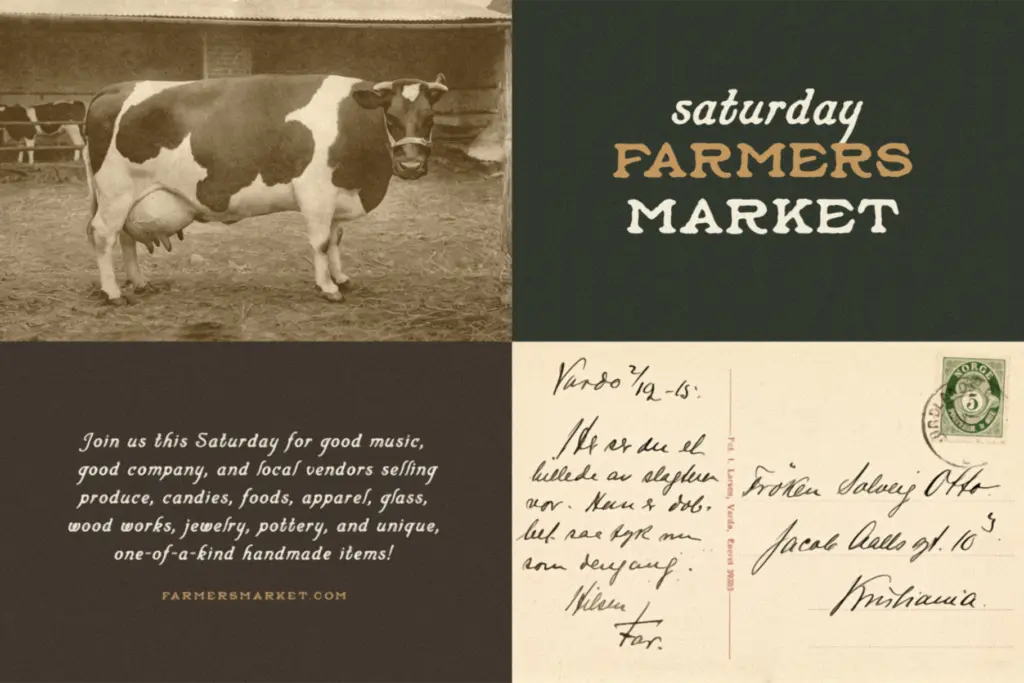
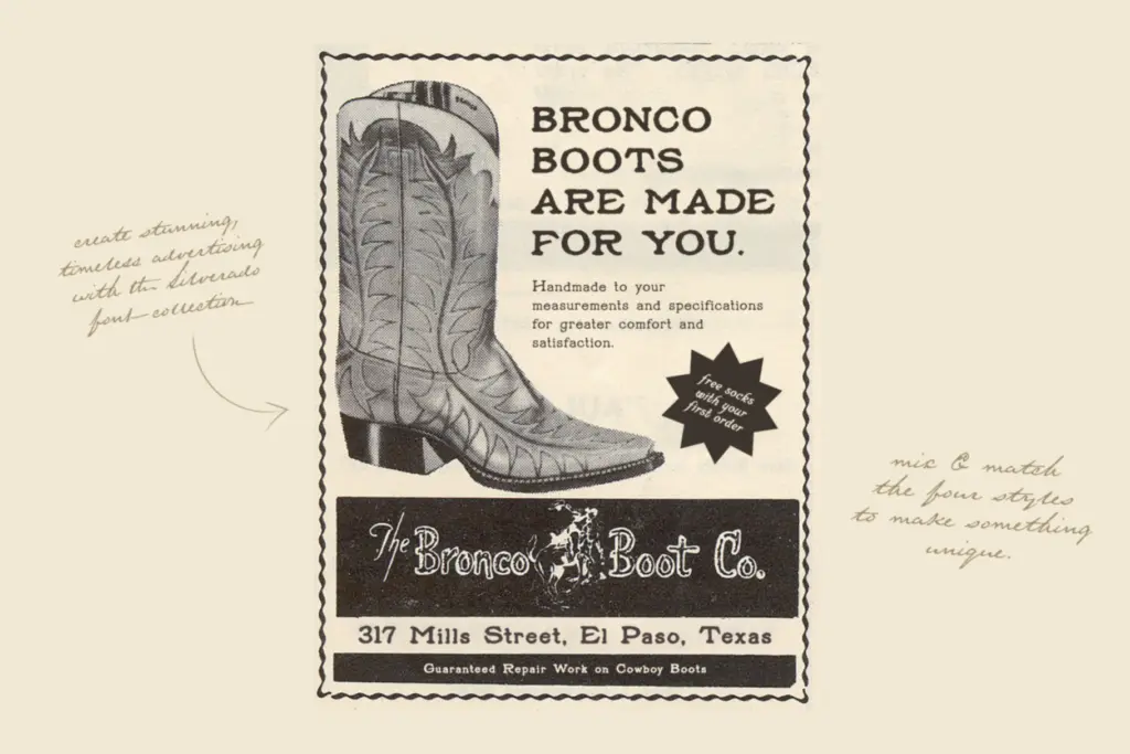
Silverado is aimed squarely at rustic and Western branding: rodeo posters, tequila and whiskey labels, apparel graphics, cattle-brand-style logos, packaging for anything positioning itself as handmade or frontier-adjacent. The slab alone works as a standalone display face for headlines and short product names, where its heaviness reads clearly across a room or a shelf. The script complements it well in a stacked lockup, giving a logo both a bold top line and a more personal, human second line.
It’s not a font for body copy or dense information — the glyph count and weight options don’t support that kind of work, and the rough texture actively fights legibility below a few inches. It’s also not a neutral choice; the Western vintage identity is baked in deep enough that it will look out of place on anything not leaning into that aesthetic. For the right brief — beachy-meets-cowboy packaging, saloon signage, apparel drops with a rugged theme — it does the job cleanly and doesn’t ask the designer to do much extra work to sell the mood.
What we liked, and what we didn’t
Strengths
- The slab and script pairing gives a ready-made two-tier logo lockup without extra design work.
- The Rough variants add convincing distressed texture without needing to hand-draw wear yourself.
- Language support and 640 glyphs cover most short-form branding jobs across several European languages.
Trade-offs
- The distress texture is fixed per glyph, so repeated letters show identical wear rather than natural variation.
- It's a narrow-use display face — not built for body text or anything outside the Western vintage aesthetic.
Silverado is a competent, single-purpose Western display duo that does exactly what it promises without much surprise. It's a strong fit for rustic branding and packaging, but the fixed distress texture and heavy weight limit it outside that niche.
Verdict

Tantype reviews typefaces in depth — every font is tested in real branding, editorial and screen layouts before a word gets written. 555+ fonts reviewed and counting.