
Bobby Jones: a 16-weight bundle of deliberately wonky sans display fonts
Design style
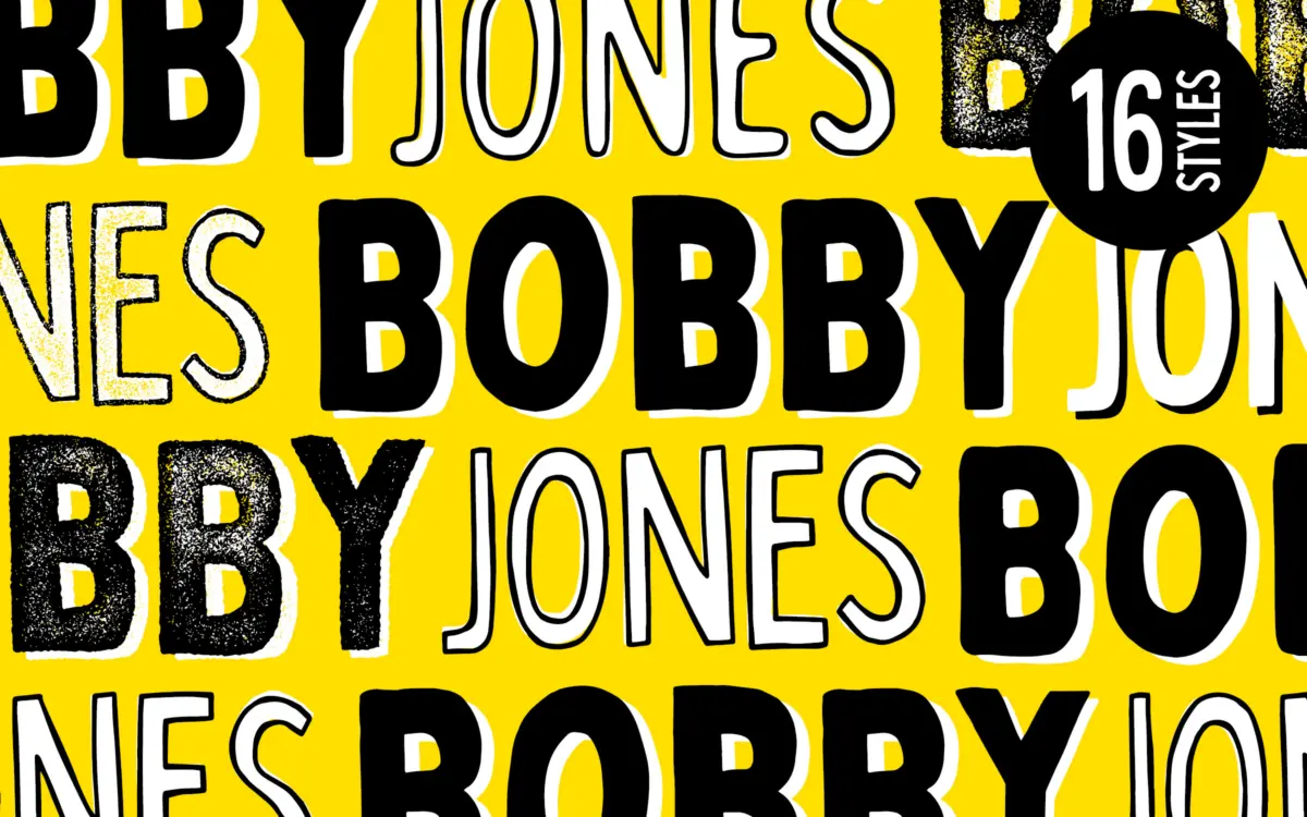
Bobby Jones is a chunky, hand-built sans built on the idea that imperfection is the point. The strokes aren’t uniform, the corners round off unevenly, and the outlines wobble just enough that you notice on second glance rather than first. It reads as a font drawn by hand and then cleaned up just enough to function as a typeface, not so much that it lost its rough edges.
The letterforms are thick, blocky, and confident. There’s no attempt at classical proportion here — the counters are tight, the x-height is generous, and the whole thing leans into a heavy, graffiti-adjacent energy. It’s a font with attitude rather than refinement, and it knows it. Where it succeeds is in staying consistent about its own logic: the wobble isn’t random noise, it’s a stylistic choice applied evenly across the set, so nothing feels like a mistake that slipped through.
Character set and features
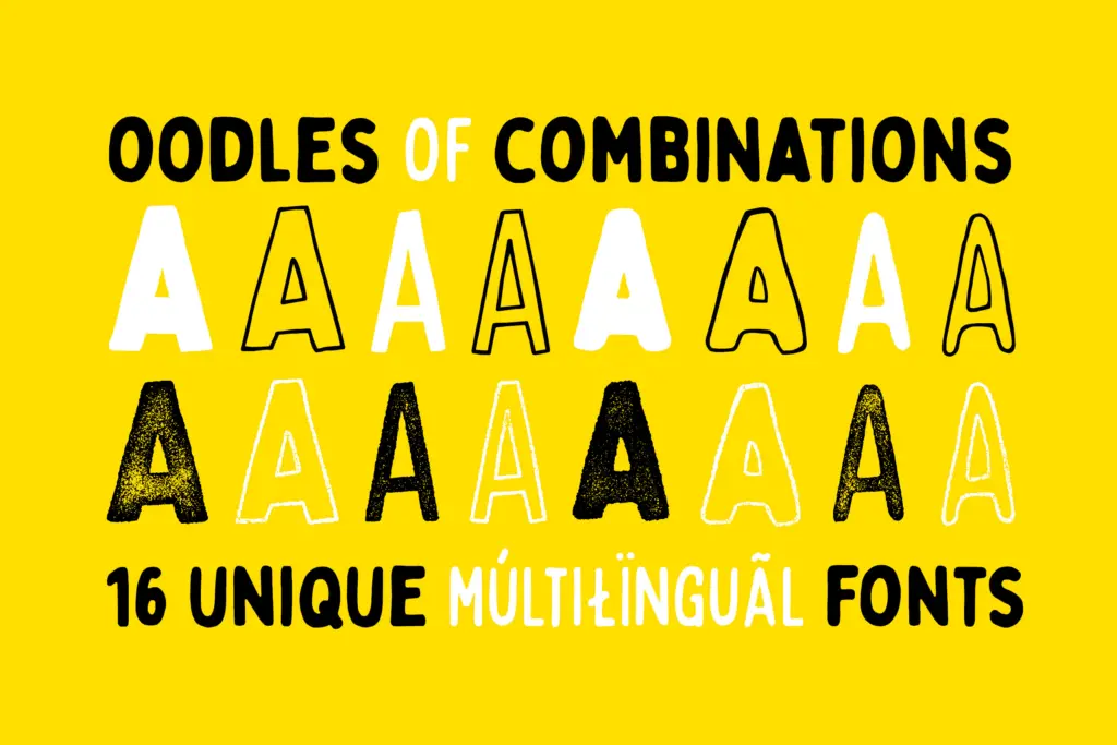
The collection bundles eight structural variants, each also available in a textured version, for sixteen fonts total. There’s the original Bobby Jones, a rounded Soft cut, a leaner Condensed version, and a Condensed Soft that combines both traits. Each of those four gets a companion Rough version with visible surface texture — the kind of grain that mimics stamped ink or worn print rather than clean vector edges.
This gives buyers a genuine range of moods from one purchase: the plain weights work for cleaner, punchier headlines, while the Rough variants bring in a printed, distressed quality suited to labels or apparel graphics. The Condensed cuts are notably more practical for tighter spaces — headlines, badges, single-word logotypes — since the standard width eats space fast at display sizes. Multilingual glyph coverage is included across the set, which matters for a font family this size since consistency across sixteen separate files isn’t guaranteed by default. There’s no indication of extensive OpenType features like alternates or ligatures; this is a shape-driven font family, not a feature-driven one.
Use cases
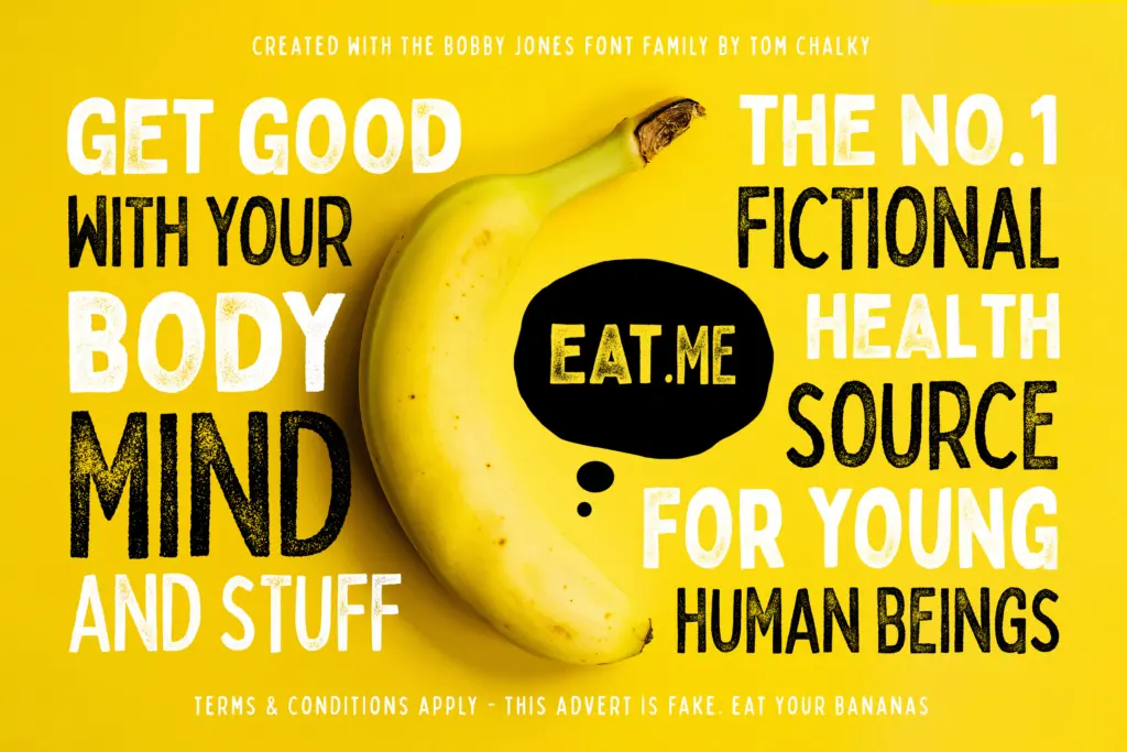
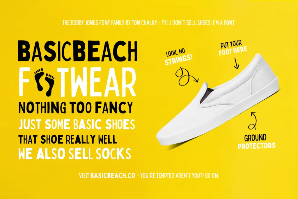
This is a headline font, full stop — not a font you set paragraphs in, and it doesn’t pretend otherwise. The chunky weight and irregular outlines mean it holds up best at large sizes: posters, apparel prints, packaging call-outs, social graphics, logotypes for brands that want to look scrappy rather than polished. The rough textured variants suit anything referencing print, stamp, or vintage sportswear aesthetics; the smooth variants suit cleaner branding work that still wants a handmade edge.
Where it will strain is any context asking for restraint. Corporate identity work, anything needing to read as trustworthy or understated, or long-form text of any kind is outside its lane. It’s also a font that dates itself stylistically — the hand-drawn, quirky-sans look has been widely used in the last several years, so it won’t feel novel in every market. But for apparel, packaging, and loud branding work where the brief calls for personality over polish, having eight structural variants and their textured twins in one purchase gives a working designer real flexibility without hunting for a second font to pair it with.
What we liked, and what we didn’t
Strengths
- Sixteen variants give real structural range from one purchase — rounded, condensed, rough, and combinations thereof
- The intentional imperfections stay consistent rather than reading as sloppy
- Condensed cuts solve the space problem that the standard width creates at large sizes
Trade-offs
- Not usable for body text or any context requiring visual restraint
- The hand-drawn quirky-sans look is common enough now that it won't feel distinctive in every market
Bobby Jones is a confident, chunky display font family that delivers real range across sixteen variants without losing its hand-built identity. It's not built for subtlety or small text, but for loud, playful branding and print work it earns its keep.
Verdict

Tantype reviews typefaces in depth — every font is tested in real branding, editorial and screen layouts before a word gets written. 555+ fonts reviewed and counting.