
Maison du Soleil DUO: a handmade script paired with a bold sans for warm, casual branding
Design style
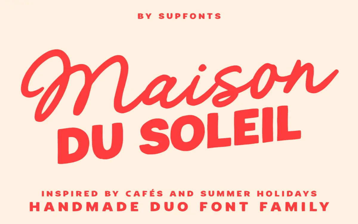
Maison du Soleil DUO is built from two contrasting hands: a loose, handwritten script and a bold, blocky sans. The script leans casual rather than formal — strokes wobble slightly, joins are loose, and there’s none of the calligraphic polish you’d get from a copperplate-style face. It reads as marker-on-paper rather than pen-on-paper, which suits the stated café-and-summer brief. The sans is the workhorse half: thick, rounded terminals, generous x-height, and a friendly rather than aggressive weight. Together they’re meant to do the classic duo job — script for flourish, sans for anchoring text — and that division of labour is clear from the first look.
The pairing works because the two styles don’t compete for attention. The script is loud in personality but often light in stroke weight, while the sans carries the visual weight of a layout. Neither pretends to be neutral, which is honest: this is a decorative pairing, not a system for long-form text.
Character set and features
Both fonts include multilingual support, which extends their reach beyond a basic Latin set — useful if a brand needs accented characters for European markets without switching typefaces mid-project. Beyond that, the brief doesn’t specify swash alternates, ligatures, or stylistic sets, so treat the script as a single, consistent voice rather than one with a deep bag of contextual tricks. That’s not a knock, just a expectation to set correctly: what you see in the specimen is largely what you get.
The handmade quality is the font’s main asset and its main constraint. Letters carry the texture of a real hand, which gives short lines — a logotype, a product name, a monogram — genuine warmth. But that same irregularity means rhythm can wobble at length. Set the script across a full sentence and the eye starts noticing the inconsistency between letters rather than reading smoothly. This is a font for words, not paragraphs.

Use cases
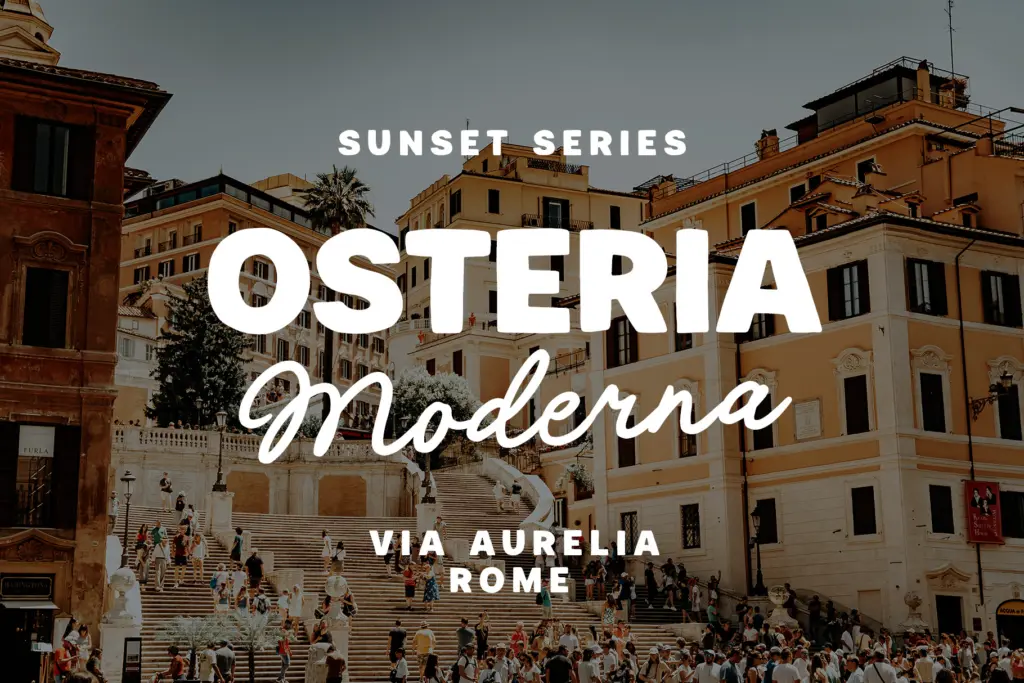
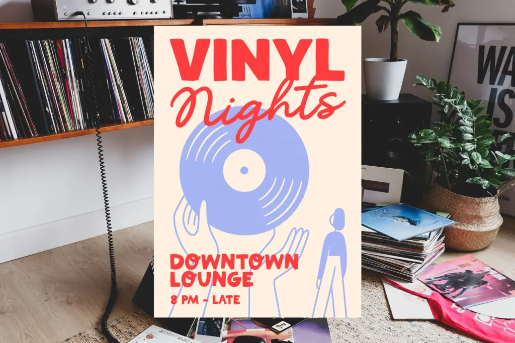
Café signage, packaging labels, and small hospitality branding are the obvious fits — the brief practically names them, and the letterforms back it up. A bakery name, a drinks menu header, a market stall sign: all places where a handmade wobble reads as personality rather than sloppiness. Wedding stationery works too, provided the script stays reserved for names and headers while a cleaner face — or the bundled sans — handles addresses and body copy.
Logo work is a reasonable use, especially for brands wanting a lo-fi, artisanal feel rather than a slick or corporate one. The sans half can carry taglines, secondary lines, or packaging ingredient lists where legibility at small sizes matters more than character.
Where it struggles: anything requiring formality, precision, or long text. Legal documents, dense editorial layouts, or corporate branding will fight against the script’s looseness. And because the handmade texture is the whole appeal, pairing it with equally loud display type elsewhere in a layout risks visual clutter — it wants a quiet sans or plenty of white space around it to do its job.
What we liked, and what we didn’t
Strengths
- Script and sans halves are clearly differentiated, so the pairing does its job without overlap
- Handmade texture gives short-form lettering real personality for café and packaging work
- Multilingual support extends usefulness beyond a basic Latin character set
Trade-offs
- Script's irregular rhythm becomes distracting when set across full sentences rather than short words
- Feature set appears basic, with no mention of alternates or ligatures to vary repeated letters
Maison du Soleil DUO is a solid, unpretentious pick for café and small-brand work that wants a handmade feel without much fuss. It's not built for long text or formal contexts, but for short lines and packaging it delivers genuine warmth.
Verdict

Tantype reviews typefaces in depth — every font is tested in real branding, editorial and screen layouts before a word gets written. 555+ fonts reviewed and counting.