
Lace House: a stitched-effect script for handmade and boutique branding
Design style
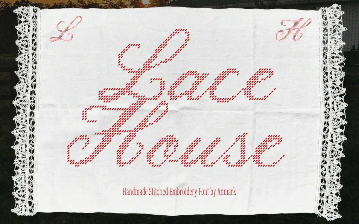
Lace House is a calligraphic script built to mimic the look of thread pulled through fabric rather than ink pressed on paper. The strokes carry a slightly irregular, textured edge instead of the clean vector curve you’d get from a standard brush script, and that texture is the whole point of the design. Connections between letters lean and loop the way cursive embroidery does when a machine or a steady hand is following a signature. The result reads as warm and domestic rather than formal — it’s closer to a monogram stitched on a linen napkin than a wedding invitation engraved in copperplate.
The stitched texture is applied consistently across the alphabet, so the font doesn’t waver between a clean glyph and a rough one from letter to letter. That consistency matters with an effect font like this: inconsistency would read as a bug rather than a feature. Where it falls short of a true handmade object is in variation — real embroidery has slack, tension changes, the odd skipped stitch, and a typeface, however textured, will always repeat its texture exactly. Anyone expecting genuine irregularity from letter to letter should know the texture is baked into the outlines, not randomised.
Character set and features
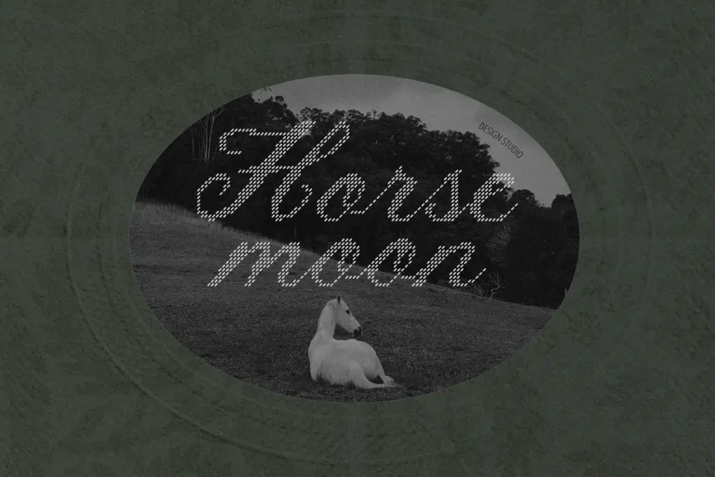
As a script built around a decorative texture, Lace House works best at the sizes and settings scripts generally work best at: short lines, single words, names. The stitched outline holds up at logo and label size, where the texture reads clearly as embroidery rather than noise. Push it much smaller — into body copy or long captions — and the stitched edges start to compete with the letterforms themselves, softening legibility in a way a plain script wouldn’t suffer from.
The connecting script structure means kerning and letter spacing do real work here; tight pairs can make the stitched texture blur together, so a little breathing room between characters helps the embroidery effect stay legible rather than becoming a solid, mottled line. Because the brief doesn’t specify what’s included beyond the core alphabet, treat any swashes, alternates or language coverage as something to check before committing to a project that needs them.
Use cases
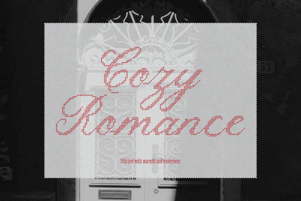
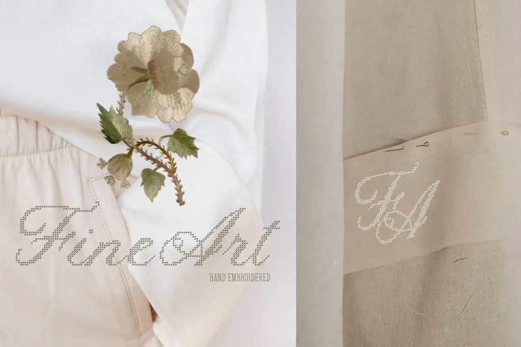
This is a font for surfaces where the eye is meant to linger and the message is short: monograms, logo wordmarks for boutiques and craft-based brands, wedding stationery, product tags and packaging for handmade goods. It fits the cottagecore, artisan, small-batch end of branding — the visual language of tissue paper, kraft labels and hand-tied ribbon. It’s less suited to anything that needs to be read quickly or at small size, like body text on a website or a busy product page with lots of competing type. Pair it with a plain sans or a simple serif for supporting information, and let Lace House carry the name or the headline where its texture can actually be seen.
What we liked, and what we didn’t
Strengths
- Consistent stitched texture across the whole alphabet rather than a one-off decorative trick
- Reads clearly as embroidery at logo and label sizes, where the effect is meant to be seen
- Fits a specific, recognisable niche in handmade and boutique branding without trying to be all things
Trade-offs
- Legibility drops off at small sizes or in longer lines of text, where the texture starts to blur the letterforms
- The stitched effect is uniform rather than irregular, so it can't fully replicate the variation of real hand embroidery
Lace House does one thing — a stitched, embroidery-textured script — and does it with a consistent, well-drawn hand. It's a strong choice for boutique branding, monograms and stationery, but the texture that makes it distinctive also limits how small or how densely it can be used.
Verdict

Tantype reviews typefaces in depth — every font is tested in real branding, editorial and screen layouts before a word gets written. 555+ fonts reviewed and counting.