
Peach Sunset Script: a casual handwriting font for cards and invites
Design style
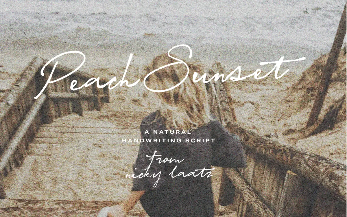
Peach Sunset Script sits in the casual handwriting camp rather than the formal calligraphy one. The strokes are loose, slightly uneven in pressure, and the baseline drifts a little from letter to letter the way real handwriting does. There’s no calligraphic swordplay here — no dramatic thick-thin contrast built on a broad-nib model. Instead it reads like someone wrote it fast with a felt-tip on good paper: confident, a bit breezy, not fussy about precision. That’s a deliberate choice and it works, provided you’re not expecting the polish of a formal wedding script.
The three height variants — flat, slightly taller, tallest — are a smart way to bank some variety into one purchase. Swapping between them changes the whole mood of a line: the flat version feels grounded and casual, the tallest starts to feel a bit more excitable. It’s a cheap way to get range without learning a second typeface.
Character set and features
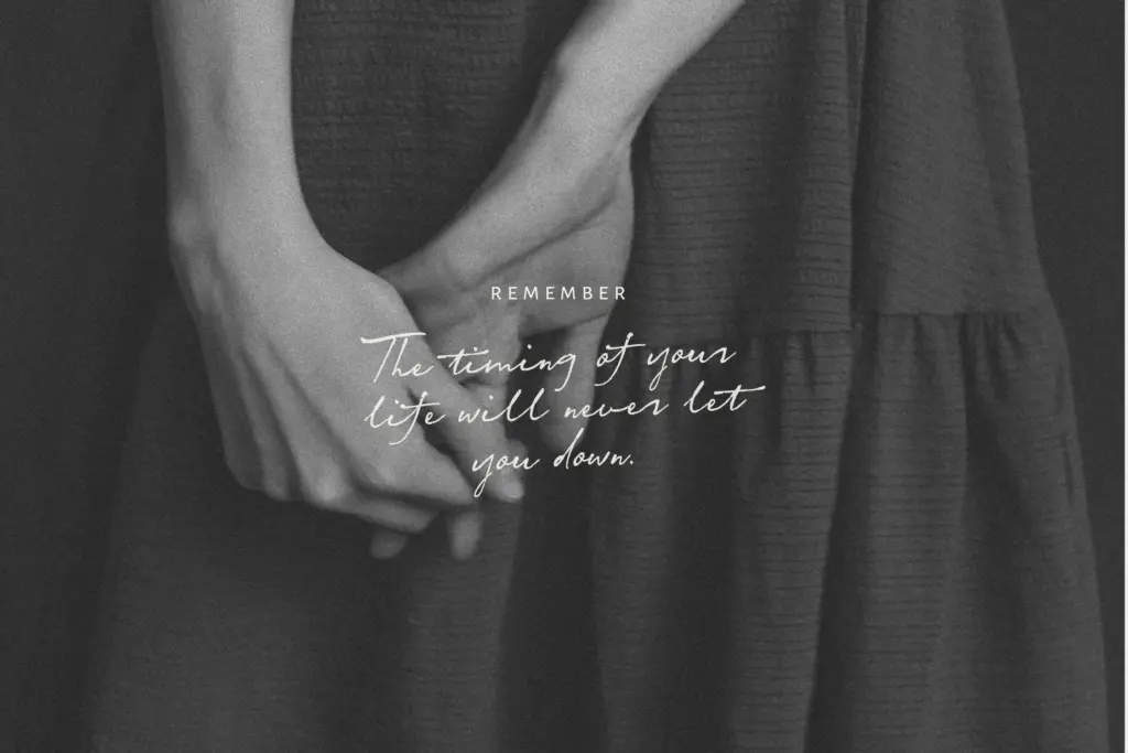
The alternate character sets for both cases are the real workhorse feature. Running the same word twice with alternates swapped in produces genuinely different results, which matters a lot in a script this loose — repeated letterforms in a handwriting font are usually what gives away that it’s a font rather than handwriting. The contextual ligatures for common double-letter pairs do similar work, smoothing over the joins that otherwise look mechanical.
Non-OpenType users aren’t left out — everything is reachable through Fontbook or Charmap, though that’s a slower workflow and worth knowing before you commit to a layout that needs a lot of alternate-swapping. The extras — underlines, small hearts, a few decorative bits — are minor but useful for filling awkward white space under a signature line or beside a name, and they save you hunting for separate ornament assets.
Use cases
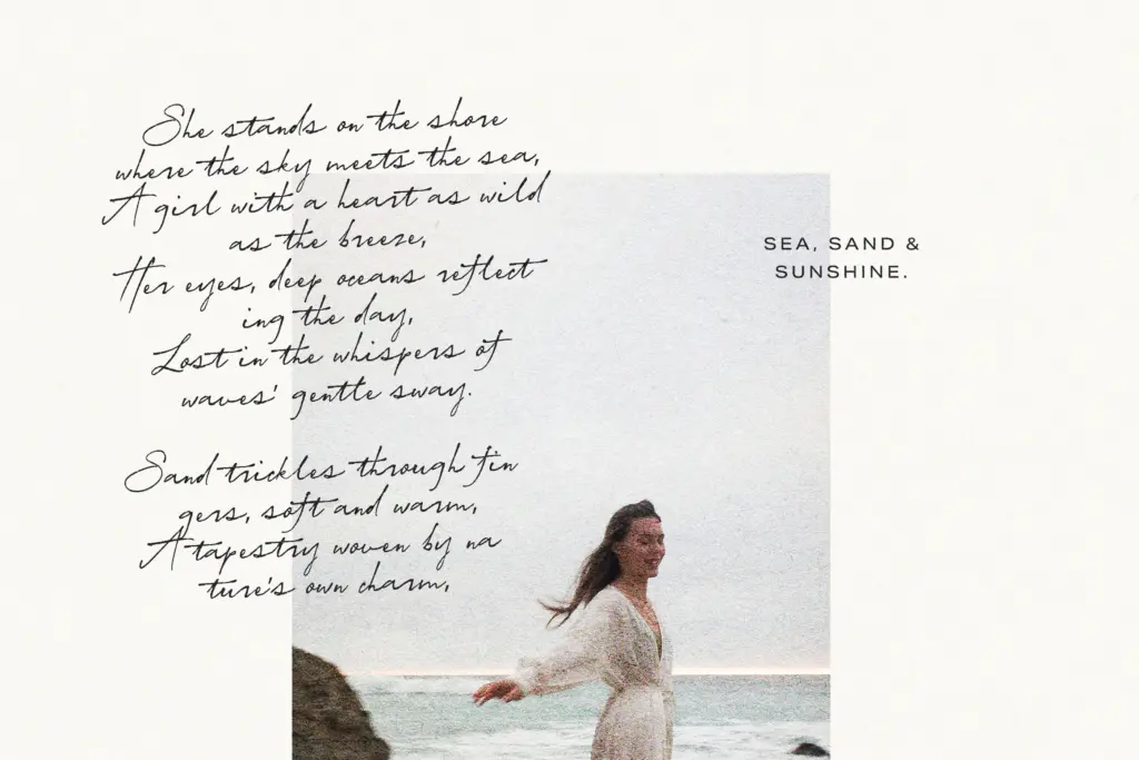
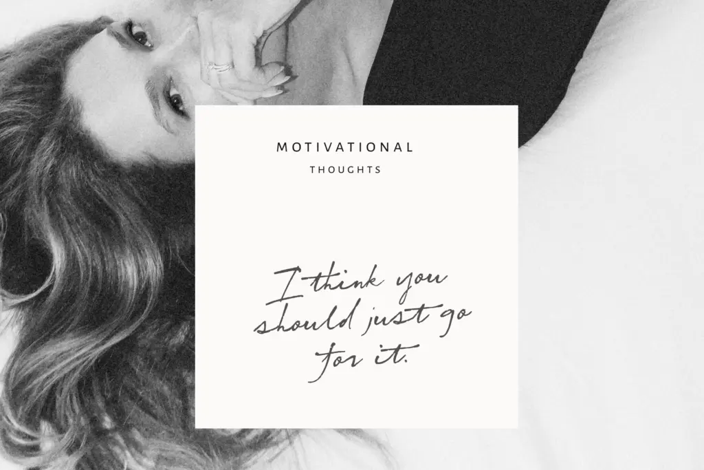
This is a font built for short, warm lines of text: a name on an invitation, a greeting on a card, a signature-style sign-off, a few words on packaging that need a handwritten touch rather than a printed one. It’s not built for paragraphs — the irregularity that makes it feel human at large sizes becomes fatiguing to read once you stack more than a line or two, and legibility drops fast below a certain point size because the loose baseline and joins need room to breathe.
Pair it, as intended, with a plain sans or serif for any supporting text — a return address, event details, a product name — so the script can stay decorative rather than doing the reading-heavy lifting. Wedding stationery, greeting cards, Valentine’s-adjacent design, and logo lockups where a brand wants a personal, handwritten signature are all sensible homes for it. Where it will struggle is anything requiring strict formality or long-form setting — this script is casual by design and doesn’t pretend otherwise.
What we liked, and what we didn’t
Strengths
- Alternate uppercase and lowercase sets meaningfully break up repeated letterforms
- Contextual ligatures for double letters smooth over mechanical-looking joins
- Three height variants give three distinct moods from one purchase
Trade-offs
- Legibility drops quickly at small sizes or in longer passages of text
- Non-OpenType users must manually access alternates via Fontbook or Charmap, slowing the workflow
Peach Sunset Script does one job well: short, warm, handwritten-feeling lines for cards, invites and signage. The alternate sets and ligatures genuinely reduce the repetition problem common to script fonts, and the three height variants add useful range. It's not built for long text or formal calligraphy, and it knows it.
Verdict

Tantype reviews typefaces in depth — every font is tested in real branding, editorial and screen layouts before a word gets written. 555+ fonts reviewed and counting.