Serif
3.7
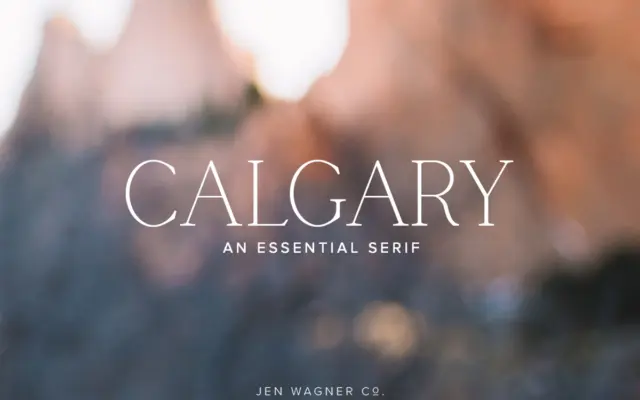
Calgary: A Narrow Serif for Clean, Understated Branding
Design style Calgary is a narrow serif built for restraint rather than flourish. The letterforms are tall and condensed, with…
 Tantype

Design style Calgary is a narrow serif built for restraint rather than flourish. The letterforms are tall and condensed, with…
Tantype
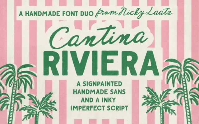
Design style Cantina Riviera is built around a simple pairing logic: a sturdy, roughed-up sans for structure, and a fluid…
Tantype
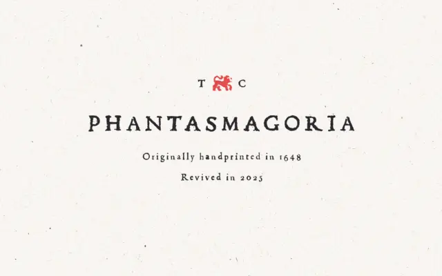
Design style Phantasmagoria works from an old-print template rather than a contemporary drawing board. The letters carry the uneven ink…
Tantype
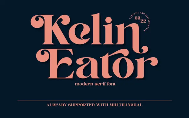
Design style Kelin Eator sits in the well-worn territory of vintage-inspired display serifs: moderate contrast, bracketed serifs, and a general…
Tantype
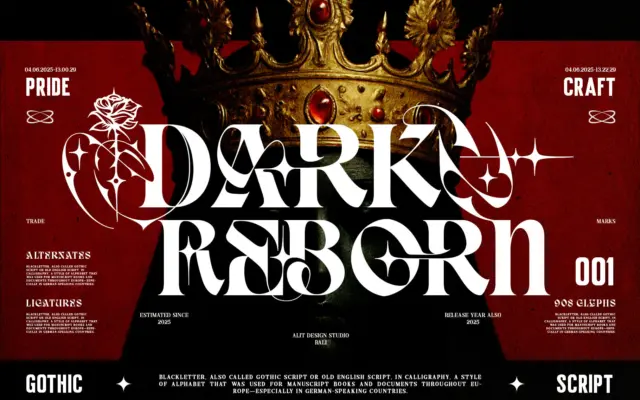
Design style Dark Reborn sits at the crossing point of Blackletter and slab-weight serif, and it doesn’t try to hide…
Tantype
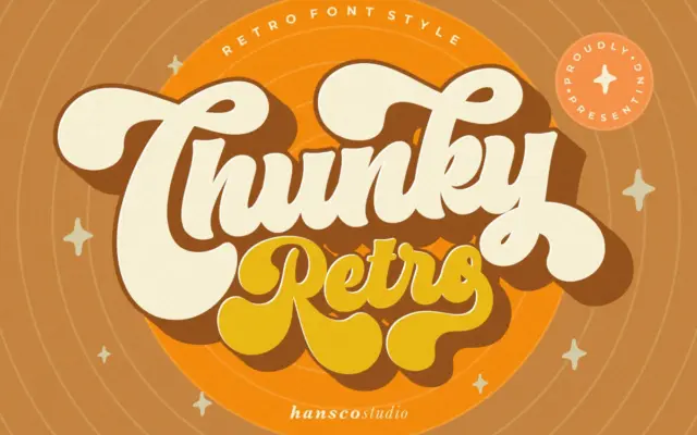
Design style Chunky Retro Font sits squarely in the bold, rounded display tradition that pulls from mid-century signage and packaging…
Tantype
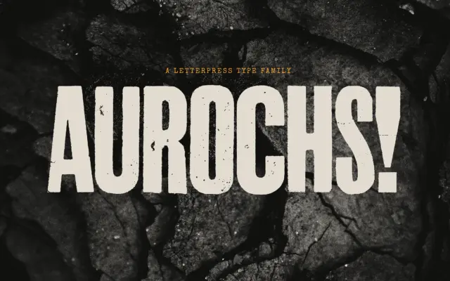
Design style Aurochs is a display sans drawn from scans of old letterpress and woodblock capitals, and it wears that…
Tantype
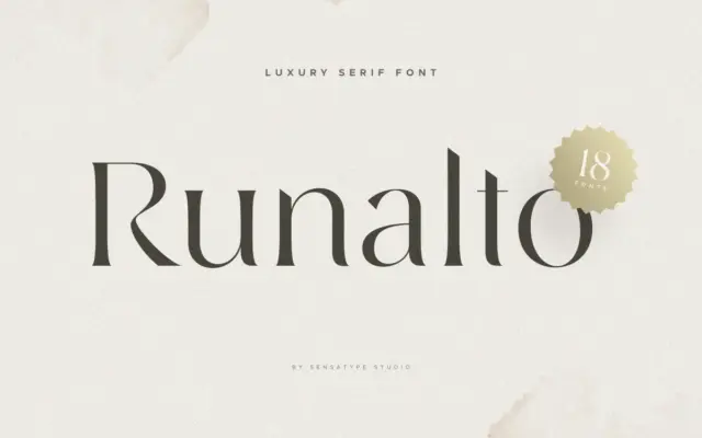
Design style Runalto sits in the well-populated field of “luxury” display serifs: high contrast strokes, sharpened serifs, and a general…
Tantype
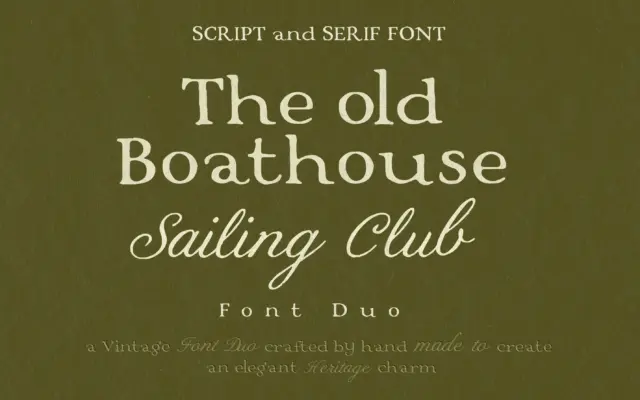
Design style This is a two-face pairing built around a single idea: heritage without costume. The serif half carries softened…
Tantype