
Oranges & Lemons: a hand-lettered duo for casual, kid-friendly design
Design style
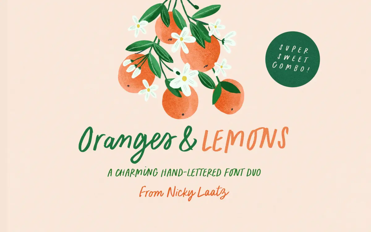
Oranges & Lemons is a two-font pairing built on the same loose, marker-drawn hand. One font is a casual all-caps face with the blunt, slightly wobbly stroke of a felt-tip; the other is a matching script that leans into a looser, more connected cursive. Both share the same weight and the same sense of a hand moving quickly rather than carefully, which is what gives the pair its charm and also what limits it.
The drawing is consistent rather than precise. Strokes vary in thickness the way a real marker does, curves overshoot slightly at the joins, and the caps sit unevenly on the baseline in a way that reads as intentional rather than sloppy — but only just. This is not a refined calligraphic script with disciplined contrast; it’s a font built to feel like a friend wrote it, and it succeeds at that specific brief.
Character set and features
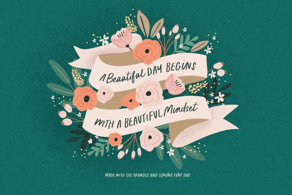
Both fonts carry OpenType ligatures, and the seller is right to flag turning them on — without them, the script in particular loses much of the joined-up, hand-drawn quality that’s the whole point of buying it. With ligatures active, common letter pairs connect more naturally and the repetition you’d otherwise notice in a casual script (every ‘a’ or ‘ll’ looking identical) is broken up.
Language support extends to Danish, French, German, Swiss German, the Norwegian variants, Portuguese, Spanish and Swedish, alongside English — a reasonable spread for a decorative face aimed at European and North American markets, though not full multilingual coverage.
There’s no indication of a wide weight range or extended numeral/small-cap system here; this is a duo built to do one job — casual, friendly lettering — rather than a flexible family with many registers. That’s fine as long as you know that going in.
Use cases
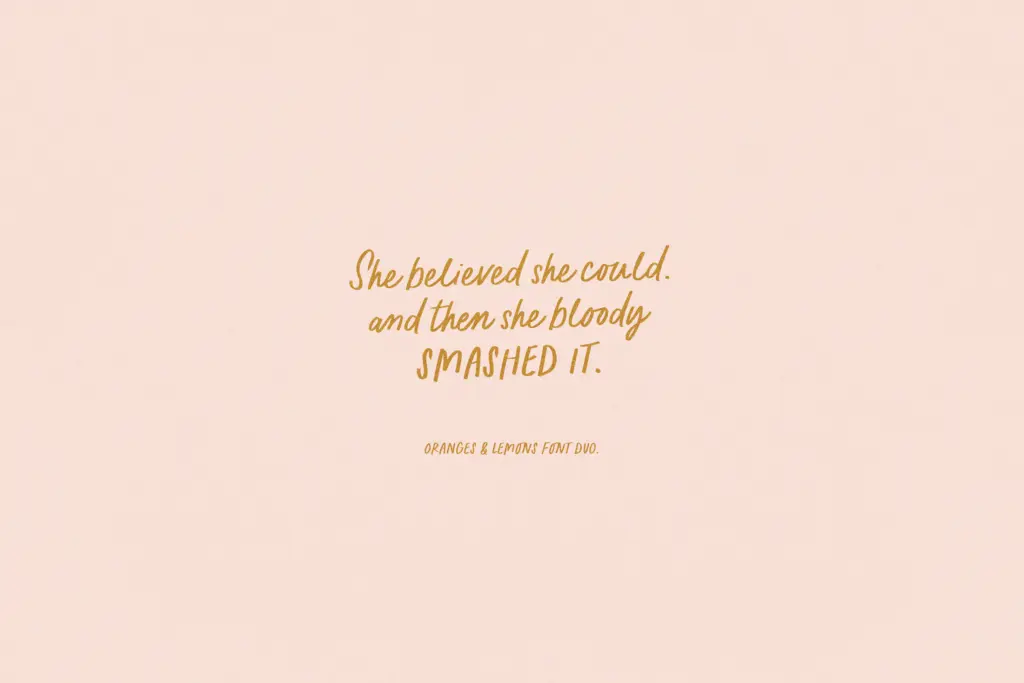
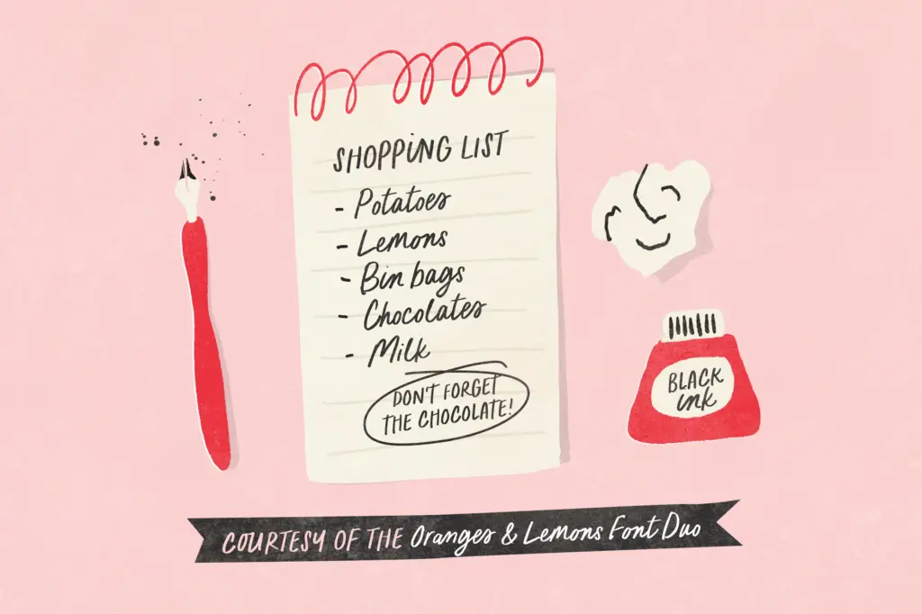
This pairing is at its best in short bursts: a greeting card message, a single line on packaging, a book cover title, a hand-lettered quote for social media. The caps font works well as a header or label — think jam jar lids, kids’ product packaging, party invitations — while the script suits a warmer, more personal line underneath or beside it, the kind of thing you’d want to look like it was written by hand rather than typeset.
It is not a body-copy font. The irregularity that makes it charming at large sizes becomes fatiguing to read in paragraphs, and neither weight is drawn with the discipline needed for small-size legibility. Nor is it suited to anything that wants to read as polished or upscale — this is casual and a little goofy by design, not elegant.
Where it earns its keep is in projects for children, informal branding, and editorial moments that want warmth over sophistication: birthday cards, nursery decor, playful food packaging, quirky invitations. Pair the caps and script together for contrast, or use either alone for a lighter touch — just keep the copy short and the ligatures switched on.
What we liked, and what we didn’t
Strengths
- The caps and script share a consistent marker-drawn hand that pairs naturally together.
- Built-in ligatures break up repetition and keep the script feeling genuinely hand-lettered.
- Solid multilingual character support for a decorative duo.
Trade-offs
- Irregular strokes and uneven baselines make it unsuitable for body copy or small sizes.
- The casual, kid-friendly tone limits its use in anything aiming for elegance or restraint.
Oranges & Lemons does one thing well: casual, marker-drawn warmth for short lines of type. It's not built for long-form reading or polished branding, but for cards, packaging and kids' projects it hits the right tone without trying too hard.
Verdict

Tantype reviews typefaces in depth — every font is tested in real branding, editorial and screen layouts before a word gets written. 555+ fonts reviewed and counting.