
Royale Couture: a bold serif, classic sans and script trio for fashion branding
Design style
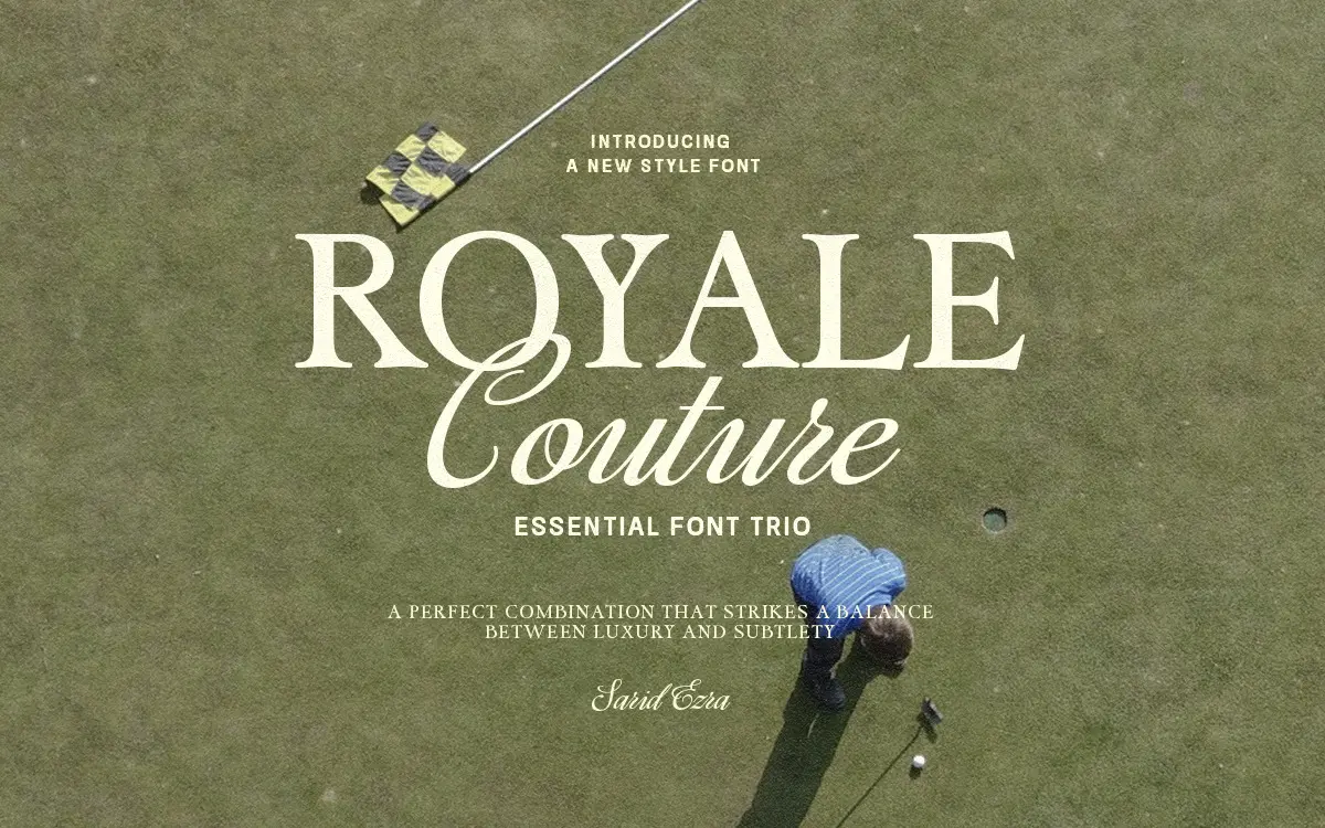
Royale Couture is a font trio built around a single brief: high-contrast, editorial-leaning luxury branding. The bold serif anchors the set — thick stems, sharp bracketed serifs, and a slight compression that reads as fashion-house rather than newspaper. It sits comfortably next to the kind of logotypes you see on perfume boxes and boutique signage. The classic sans is the quieter partner, a workhorse geometric-leaning face with even strokes and no eccentricities, clearly drawn to support rather than compete. The script rounds out the set with a looping, semi-formal hand — connected but not overly ornate, closer to a signature than a wedding invitation flourish.
None of the three is trying to be radical. The value here is in the combination: a designer picking this trio gets a pre-matched hierarchy — display serif for the wordmark, sans for supporting copy, script for an accent line — without having to hunt for compatible x-heights and proportions across separate purchases.
Character set and features
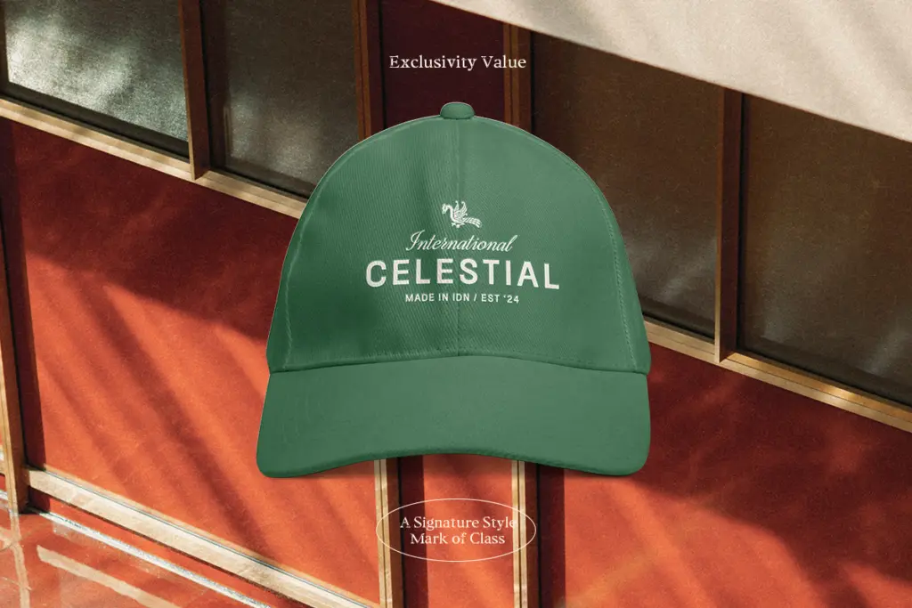
The brief notes multilingual support along with numerals and symbols, so the trio should cover more than basic Latin branding jobs. That’s a genuine advantage for a set aimed at commercial packaging and retail use, where accented characters and currency symbols come up constantly. Beyond that, there isn’t much to report in the way of alternates or ligatures — this reads as a straightforward, no-frills character set rather than one built for typographic play. The script, in particular, would benefit from connecting alternates to avoid awkward joins in longer words, but none are mentioned, and the drawing doesn’t suggest an extensive contextual system is hiding underneath.
At small sizes the bold serif’s contrast will start to close up fine details, so it’s best kept to headline and logotype duty rather than body text. The sans is the one component built for smaller sizes and longer runs — it’s plain enough to hold up in captions, taglines, or product labelling. The script needs generous size and spacing; cramped tracking will make the connections muddy.
Use cases
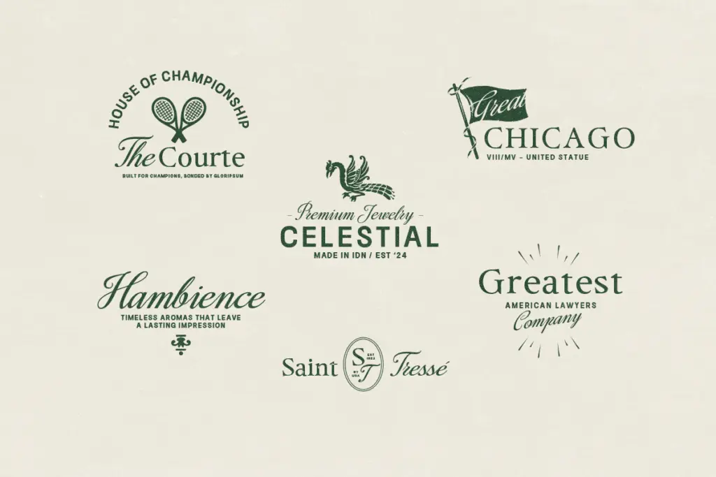
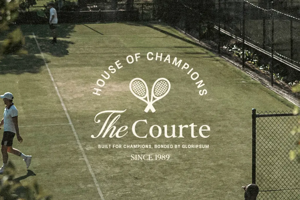
This is a branding trio first. Fashion labels, beauty and cosmetics packaging, boutique hotel signage, and Instagram-native product brands are the obvious fits — anywhere a wordmark needs to feel expensive without needing to be exotic. The bold serif works well as a standalone logotype; pair it with the sans for a tagline or address line and you get a coherent identity system without extra pairing decisions.
Wedding stationery is a plausible secondary use, especially where the script handles a couple’s names and the serif or sans carries the details, though the script’s relatively restrained loop style means it won’t satisfy anyone looking for a highly decorative calligraphic feel. Editorial headers, quote graphics, and social media templates are also reasonable territory, given the set’s legibility at larger display sizes.
It’s not a font for long-form text, and it’s not particularly experimental — buyers wanting an unusual voice or an extensive alternate set should look elsewhere. But as a fast, coordinated toolkit for a luxury-adjacent brand identity, it does what it sets out to do.
What we liked, and what we didn’t
Strengths
- The three styles are proportioned to work together without additional pairing effort.
- The bold serif has real logotype presence with confident contrast and sharp serifs.
- Multilingual and symbol support extends its use beyond basic English branding jobs.
Trade-offs
- The script lacks connecting alternates, so longer words can look mechanically joined.
- The character set is fairly plain, with little in the way of ligatures or stylistic variation.
Royale Couture is a competent, pre-matched branding trio rather than a showpiece typeface. It handles logotype and identity work confidently, but its restraint means it won't excite anyone looking for distinctive character sets or decorative flourish.
Verdict

Tantype reviews typefaces in depth — every font is tested in real branding, editorial and screen layouts before a word gets written. 555+ fonts reviewed and counting.