
Berantakan Tapi Gapapa: a wobbly doodle font for scrappy, hand-made design
Design style
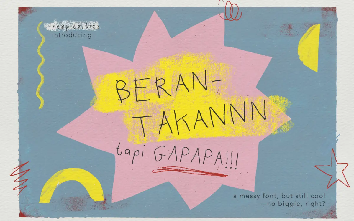
Berantakan Tapi Gapapa translates roughly from Indonesian as “messy but it’s okay,” and the name is doing real descriptive work. This is a deliberately loose, marker-scrawl typeface, the kind of thing you’d get if someone wrote fast on a napkin without worrying about baseline or letter width. Strokes wobble, terminals stop wherever the pen happened to lift, and no two instances of the same letter look quite identical across the four included variants.
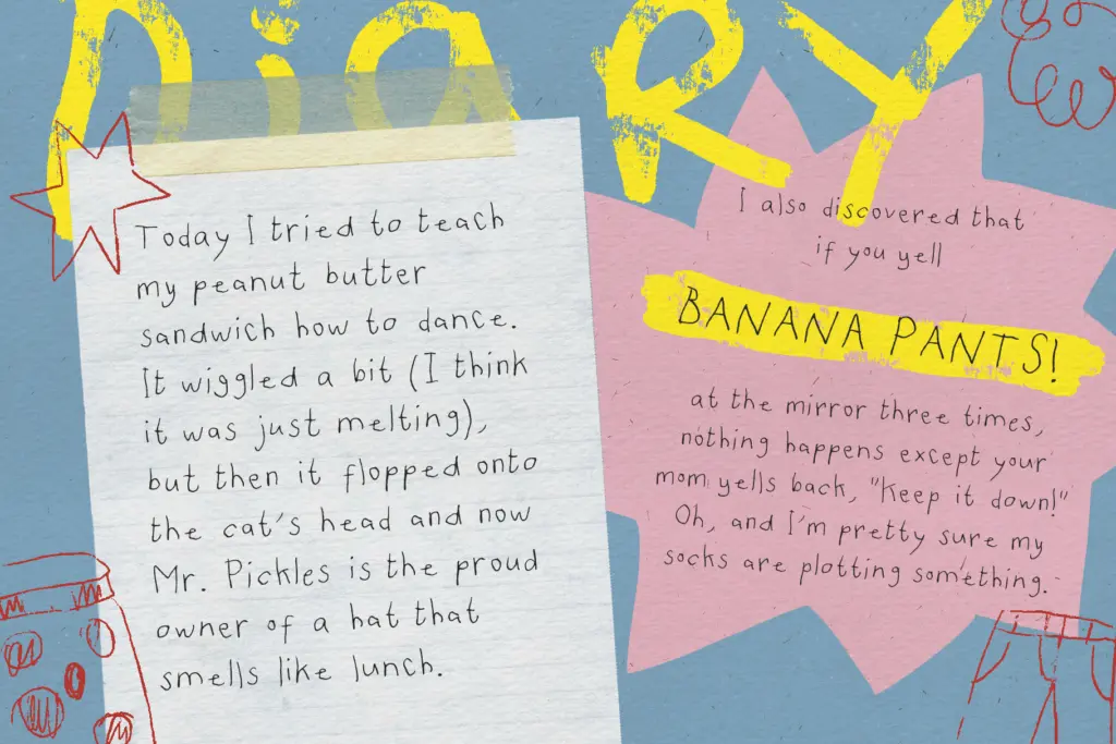
The four files — a base style plus three alternates — read as different takes on the same messy hand rather than a weight or width family. Some are scratchier, some rounder, some lean harder into the doodle feel with looping ascenders and squashed bowls. There’s no attempt at optical correction or consistent x-height discipline, and that’s the point: this is anti-polish as a style choice, not a technical shortcoming.
Character set and features
The set covers uppercase and lowercase, numerals, punctuation, and alternate characters, plus an extended Latin range for accented characters — enough for a handful of European languages beyond basic English. Having three separate alternate fonts rather than just OpenType stylistic alternates means you get variation without needing an app that supports glyph substitution, which is a practical decision for anyone working in tools with limited OpenType support.
Don’t expect the letterforms to line up neatly. Baseline wander is part of the design, so tight paragraph setting will look genuinely chaotic rather than charmingly imperfect. Kerning is loose in places, particularly around round letters butting against straight stems, and at small sizes the scrawled strokes start to clot into illegible shapes. This is a font built for big, spaced-out, single-word or short-phrase use, not body copy.
Use cases
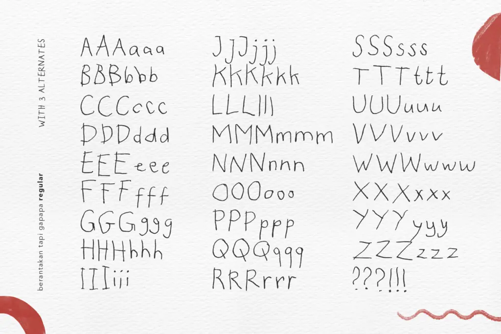
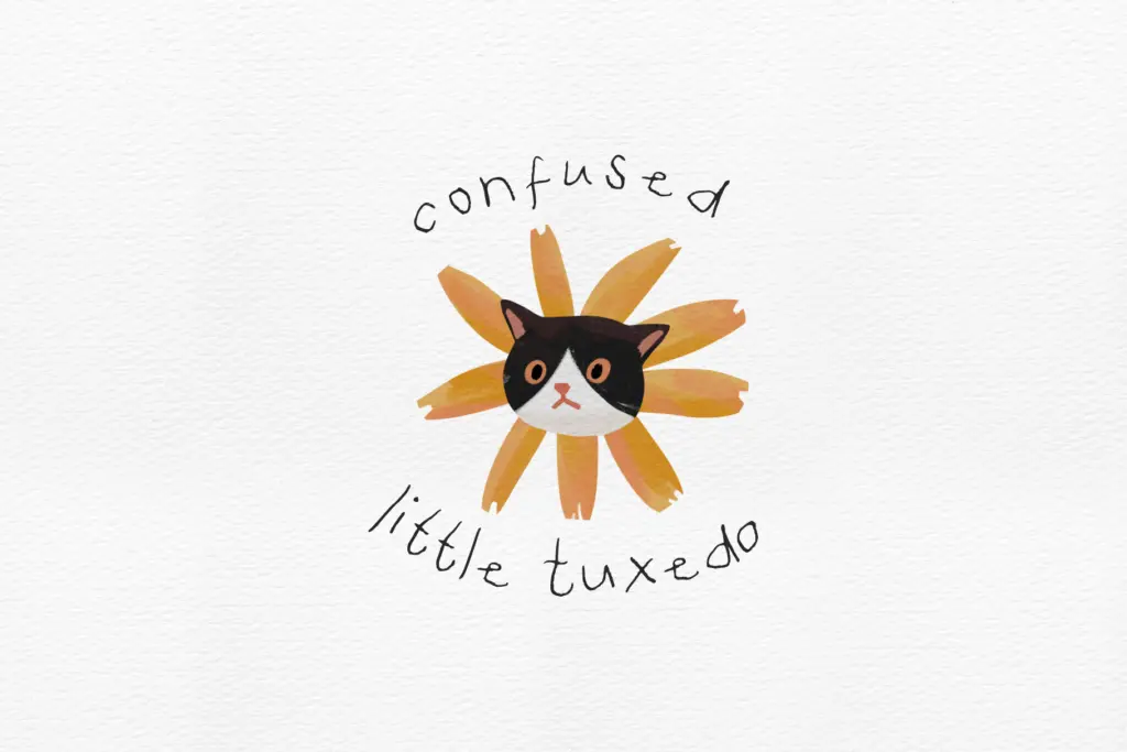
This suits packaging and labels for craft or food brands going for a handmade, unpolished feel — think small-batch jam labels, zine covers, or DIY workshop flyers where a slick script would feel dishonest. It works for children’s book titles and covers, scrapbook and journaling layouts, and social graphics that want to look sketched rather than designed. Logo marks built from a single word can work well, especially where the brand wants to signal informality or playfulness over craft precision.
Swap between the four style files within one project to fake variation, using one for headlines and another for supporting doodle-style callouts. Keep sizes large — display headlines, poster type, hand-lettered-style titles — and avoid setting sentences of running text in it, since legibility drops fast once the wobble compounds across multiple words. Pair it with a plain, quiet sans or serif for any body copy nearby so the messiness reads as a considered contrast rather than the only decision made.
What we liked, and what we didn’t
Strengths
- Four separate alternate style files give real variation without relying on OpenType substitution
- Extended Latin character support covers more languages than most novelty handwritten fonts
- Commits fully to an unpolished, hand-scrawled aesthetic without half-measures
Trade-offs
- Baseline wander and loose kerning make anything beyond a headline hard to read
- Legibility collapses quickly at small sizes, limiting it to display use only
Berantakan Tapi Gapapa commits fully to its scrappy, hand-drawn premise and delivers four distinct messy variants rather than one. It's a strong pick for packaging, zines, and playful branding at large sizes, but it has no ambition to work as text and shouldn't be asked to.
Verdict

Tantype reviews typefaces in depth — every font is tested in real branding, editorial and screen layouts before a word gets written. 555+ fonts reviewed and counting.