
September Spirit: a handwritten script duo built on ligatures and alternates
Design style
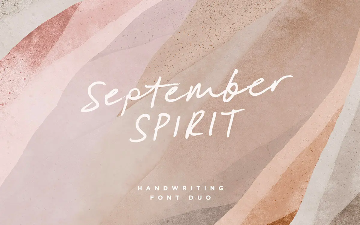
September Spirit belongs to the fast, loose end of the script spectrum: a felt-tip or brush-pen handwriting style rather than a formal calligraphic one. The letters lean forward, join with real connecting strokes, and carry the small inconsistencies of actual handwriting — slightly uneven baselines, terminals that taper rather than stop cleanly. That texture is the point. It reads as written, not drawn to look written, which is a harder trick than it sounds and one a lot of script fonts fumble.
The duo structure (in practice more like four fonts, once you count the alternate lowercase set and the all-caps companion) is where the design earns its keep. Rather than relying on one alphabet stretched across a whole layout, you get a second, differently-shaped lowercase set to swap in when repeated letters start looking too uniform. It’s a simple idea, well executed, and it solves the single biggest tell of a machine-set script: the same ‘a’ appearing four times in one line.
Character set and features
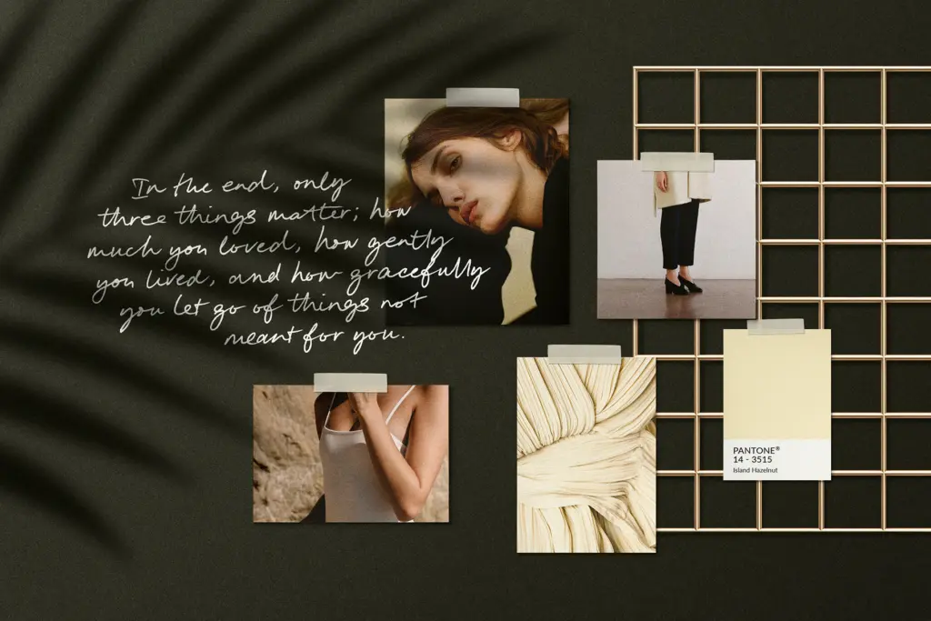
The ligature set is the real workhorse here. Handwritten scripts tend to fall apart at letter pairs — awkward collisions, overlapping ascenders and descenders, gaps where a join should be. September Spirit ties a large number of these combinations into custom glyphs, so common pairings sit the way they would if a hand had written them in one motion. It takes some manual substitution work in your design software to access them, but the payoff is visible: fewer patched-together words, more continuous lines.
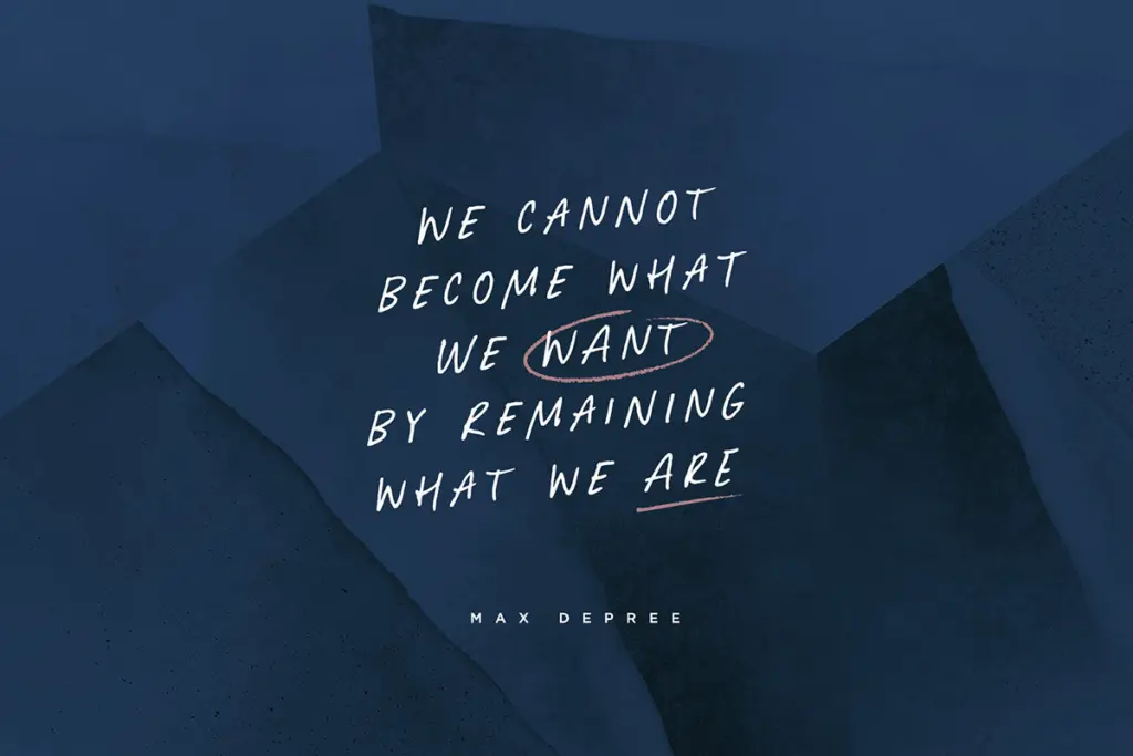
The all-caps companion is a genuinely useful separate tool rather than a token extra. It’s stiffer and more upright than the script, which makes it good for a short word set inside a longer script phrase — a name in caps under a flowing signature line, say — without the two fighting for attention. There’s also a bonus file of hand-drawn circles, underlines and arrows, the kind of ornament that’s easy to overuse but useful in small doses for pointing at a word or closing off a layout.
What’s not confirmed in the brief is language support beyond basic Latin punctuation and numerals, so anyone working outside English should test the character map before committing a layout to it.
Use cases
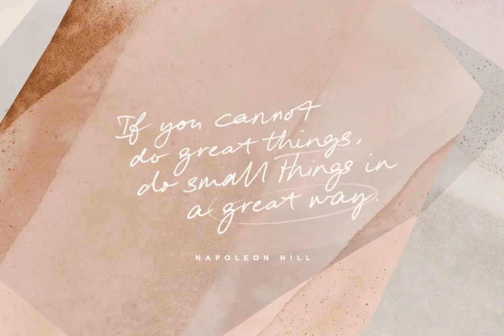
This is a font for surfaces where handwriting reads as personal: greeting cards, quote graphics, Instagram captions, packaging that wants a handmade feel, wedding stationery where a looser script suits the tone better than formal calligraphy. The alternate lowercase set makes it viable for slightly longer passages — a few lines of a quote, a short paragraph — where a single-alphabet script would start repeating itself distractingly.
It’s less suited to anything that needs to sit small and stay legible, like body copy or fine print; the joins and flourishes need size to read properly. And because the whole appeal rests on that raw, handwritten irregularity, it won’t suit a brand chasing a polished, geometric or corporate feel — that’s simply not what it’s for.
What we liked, and what we didn’t
Strengths
- The alternate lowercase alphabet genuinely reduces repeated-letter monotony in longer phrases
- Ligatures smooth over the awkward joins that usually give handwritten scripts away
- The all-caps companion works both as emphasis and as a standalone display option
Trade-offs
- Legibility drops quickly at small sizes, limiting it to display and short-text use
- Accessing the ligature and alternate sets requires manual glyph substitution rather than automatic OpenType features in every app
September Spirit is a well-drawn handwritten script that avoids the repetition problem most scripts suffer from, thanks to its alternate lowercase set and generous ligatures. It's best used at display sizes for quotes, cards and packaging rather than for anything that needs to stay small or formal.
Verdict

Tantype reviews typefaces in depth — every font is tested in real branding, editorial and screen layouts before a word gets written. 555+ fonts reviewed and counting.