
Ideas Script: a hand-lettered connecting script for invitations and branding
Design style
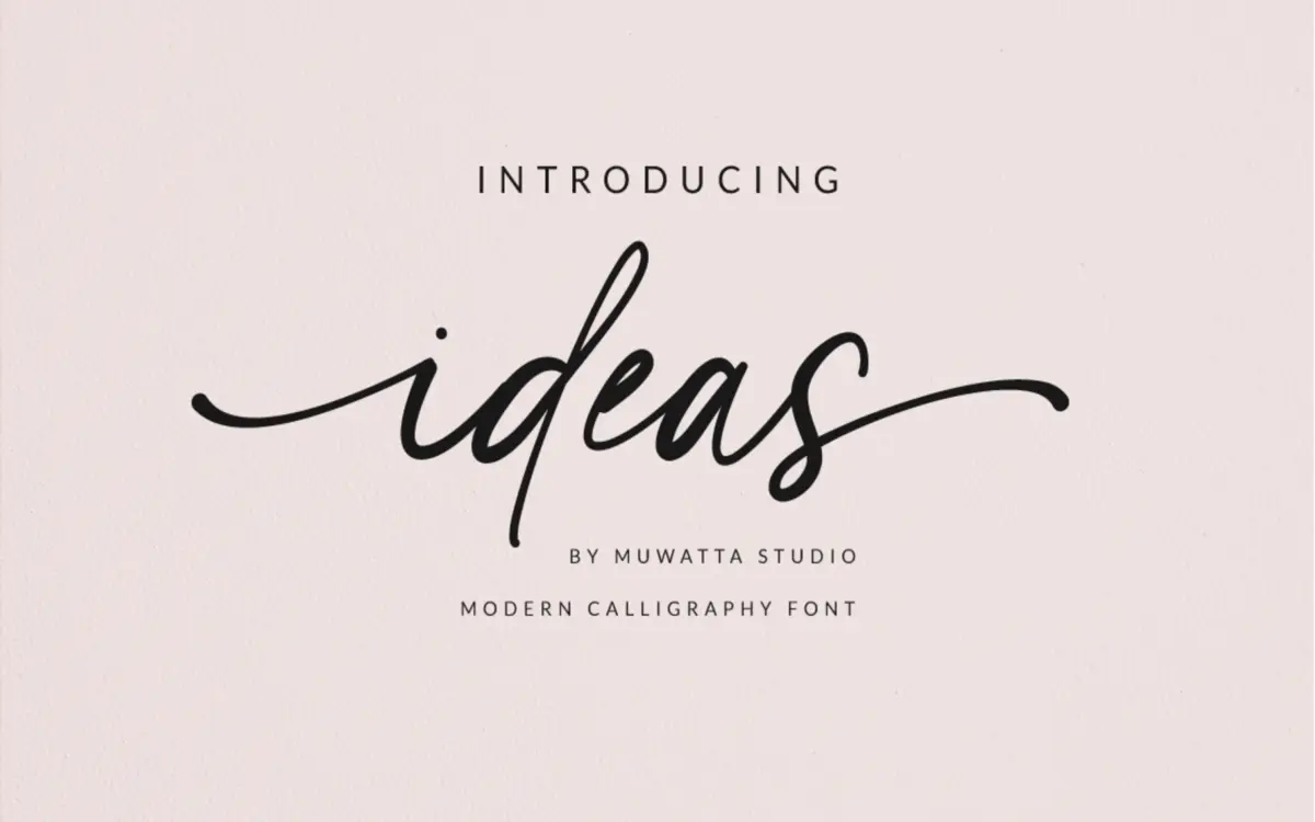
Ideas is a casual, hand-lettered script built on a connecting lowercase skeleton rather than a calligraphic one. The strokes have a consistent, fairly narrow contrast — none of the thick-thin swing you get from a pointed-brush script — which gives the face a more even, handwriting-like colour on the page. Curves are loose and a little informal, with entry and exit strokes that link letters into a continuous line rather than isolated glyphs. It reads as friendly rather than formal, closer to a considered handwriting sample than to engraved copperplate.
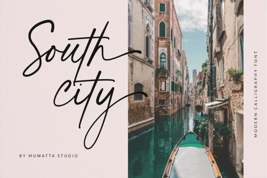
The uppercase carries most of the personality: exaggerated ascenders, generous loops, and swash variants that extend well beyond the baseline. These capitals are clearly meant to be used sparingly, as single initials or short words, because their size and flourish would crowd a sentence set entirely in caps. The lowercase is calmer and does the actual reading work, which is the right division of labour for a script like this.
Character set and features
The set covers a full uppercase and lowercase A–Z, figures, and standard punctuation, along with alternate lowercase letters and ligatures for the script style. The alternates are worth digging into — swapping in a few will break up repetition in longer words and soften the otherwise regular rhythm of the connecting joins. Ligatures help with awkward pairs where the default connection would otherwise look pinched or overlapping, which is a common failure point in connecting scripts and one this set seems to have anticipated.
Multilingual support is included, though the brief doesn’t specify which language sets are covered, so anyone working outside basic Latin should check the character map before committing. There’s no separate display or sans companion mentioned, so this is a single-style script rather than a font family with built-in pairing options.
Use cases
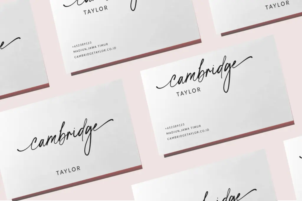
This is a script for short-form, decorative text rather than paragraphs. Wedding invitations are the obvious fit — names, dates, and short phrases where the connecting joins and swash capitals have room to breathe. It also works for logotypes and monograms where a single word needs a bit of warmth without tipping into full formal calligraphy, and for packaging or stationery accents where a script line sits alongside a plain sans for contact details or ingredients.
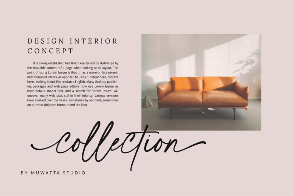
Keep it out of body copy and long headlines — the connecting strokes and tight rhythm that read as charming in a three-word invitation line start to blur and slow reading at sentence length. It also wants generous surrounding space; because letters lean into each other, cramped layouts undercut the legibility of the joins. Pair it with a plain, quiet sans or serif for any supporting text, since the script needs a calm neutral background to do its job rather than competing typographic personality.
What we liked, and what we didn’t
Strengths
- Alternate lowercase letters and ligatures break up repetitive letter combinations effectively
- Swash uppercase gives strong standalone character for initials and monograms
- Even stroke contrast makes it read as approachable handwriting rather than stiff calligraphy
Trade-offs
- Not legible at length — best reserved for short phrases, names, and headlines
- No accompanying sans or serif family, so pairing decisions are left entirely to the user
Ideas is a competent connecting script with enough alternates and ligatures to avoid obvious repetition, best used for short invitation lines, monograms, and logotypes. It isn't built for long-form setting and needs generous spacing to keep its joins legible, but within its lane it does the job without fuss.
Verdict

Tantype reviews typefaces in depth — every font is tested in real branding, editorial and screen layouts before a word gets written. 555+ fonts reviewed and counting.