
Active: a signature-style script for quick, casual branding touches
Design style
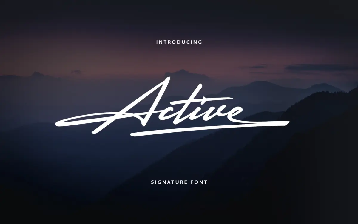
Active belongs to the signature-script family that has flooded the marketplace over the last several years: a single weight, connected strokes, and a brush-pen or fine-marker feel meant to mimic an actual autograph. The joins are loose rather than tight, so words lean and bounce a bit rather than sitting on a strict baseline. There’s a casual, slightly hurried energy to it — this isn’t a formal copperplate revival, it reads more like something dashed off quickly and photographed for a logo.
The stroke contrast is modest. Thick-thin transitions exist but they’re not dramatic, which keeps the font from feeling overly ornamental. Letterforms lean forward at a consistent angle, and the connections between letters vary in how tightly they overlap, giving it some of the irregularity you’d want from a handwriting font rather than the mechanical repetition of a purely geometric script.
Character set and features
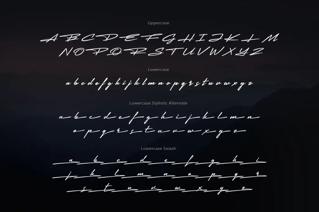
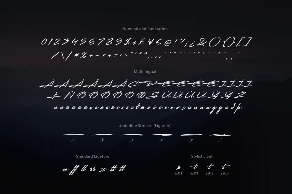
The set runs to 257 glyphs, which is a reasonable spread for this category: uppercase and lowercase alphabets, numerals, punctuation, a set of ligatures, stylistic alternates, swashes, and multilingual character support. The alternates matter more than they might in a text face — because the base letterforms are simple, having a handful of alternate lowercase letters and swash capitals gives you a way to break up repeated letters within a single word or signature, which is often the difference between a font-driven signature and one that looks hand-drawn.
Ligatures are present for the common combinations you’d expect in a script — nothing exotic, but enough to soften the more awkward junctions that happen when a connecting script meets certain letter pairs. The multilingual support is a genuine plus if your project needs accented characters, though the brief doesn’t specify which languages are covered, so it’s worth checking the glyph chart against your specific text before committing.
At small sizes the joins start to blur, as they do with most one-weight scripts of this loose a construction. This isn’t a font built for body copy or long-form setting — it’s built for short bursts: names, single words, a line of text set large.
Use cases
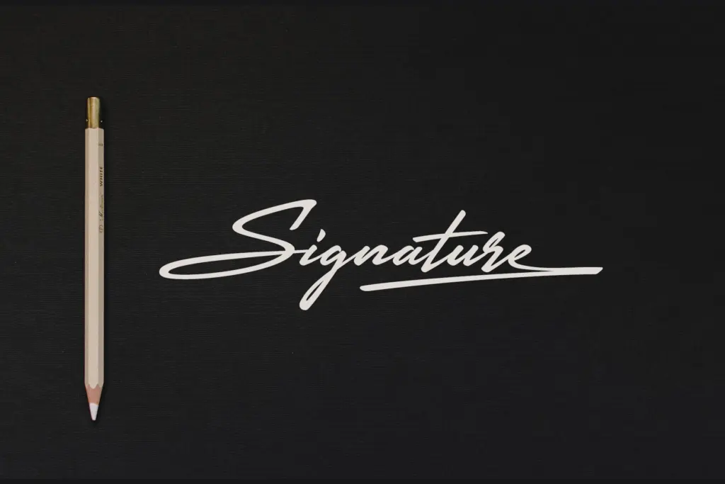
The obvious home for Active is exactly what its name promises — a signature look for logos, wordmarks, and personal branding where you want the impression of a handwritten mark without commissioning actual calligraphy. It also does well in packaging accents, social graphics, and quote cards where a short phrase needs a human, informal voice against a lot of clean sans-serif or serif text elsewhere on the page.
It’s less suited to anything requiring sustained reading — invitations with paragraphs of copy, editorial pull quotes longer than a sentence, or dense product labeling. Save it for the moment where a script needs to carry weight rather than volume: a name, a tagline, a single evocative word.
What we liked, and what we didn’t
Strengths
- Loose, natural-feeling joins that avoid the mechanical repetition common in single-weight scripts
- Stylistic alternates and swash capitals let you vary repeated letters within a word
- Multilingual character support broadens its use beyond English-only branding
Trade-offs
- Joins blur at small sizes, so it's unsuitable for body text or dense settings
- The overall look is close to many other signature-style scripts already on the market, offering little that feels distinct
Active does one job competently: it looks like a quick, confident signature when set large and short. It's not distinctive enough to stand out among the many similar scripts on the market, but the alternates and swashes give it enough flexibility for logo and branding work.
Verdict

Tantype reviews typefaces in depth — every font is tested in real branding, editorial and screen layouts before a word gets written. 555+ fonts reviewed and counting.