
The Charming Atelier: a letterpress-worn serif and script duo for vintage stationery
Design style
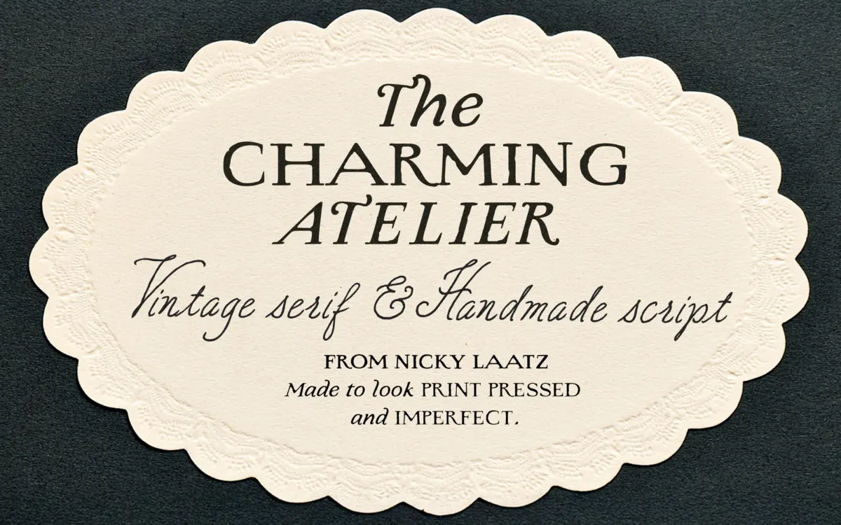
The Charming Atelier is a two-part family: a distressed serif built to look like it came off a worn printing plate, and an ornamental script meant to sit alongside it as the handwritten counterpoint. The serif carries rough, wobbly edges and bleed effects into its strokes, so instead of clean vector outlines you get letterforms that look inked and slightly overprinted. It’s a specific effect, closer to a rubber stamp than a digital serif, and it commits to that texture rather than hedging with just a light grain overlay.
The script is the more conventional half of the pair, built on connected, looping strokes with a fair amount of movement in the joins. Letters lean and curve with intentional irregularity rather than mechanical repetition, which is the usual trick for making a script feel handwritten rather than templated. It reads as decorative and a little formal, in keeping with the ‘old-world’ brief rather than the looser, brush-style scripts common elsewhere in this category.
Character set and features
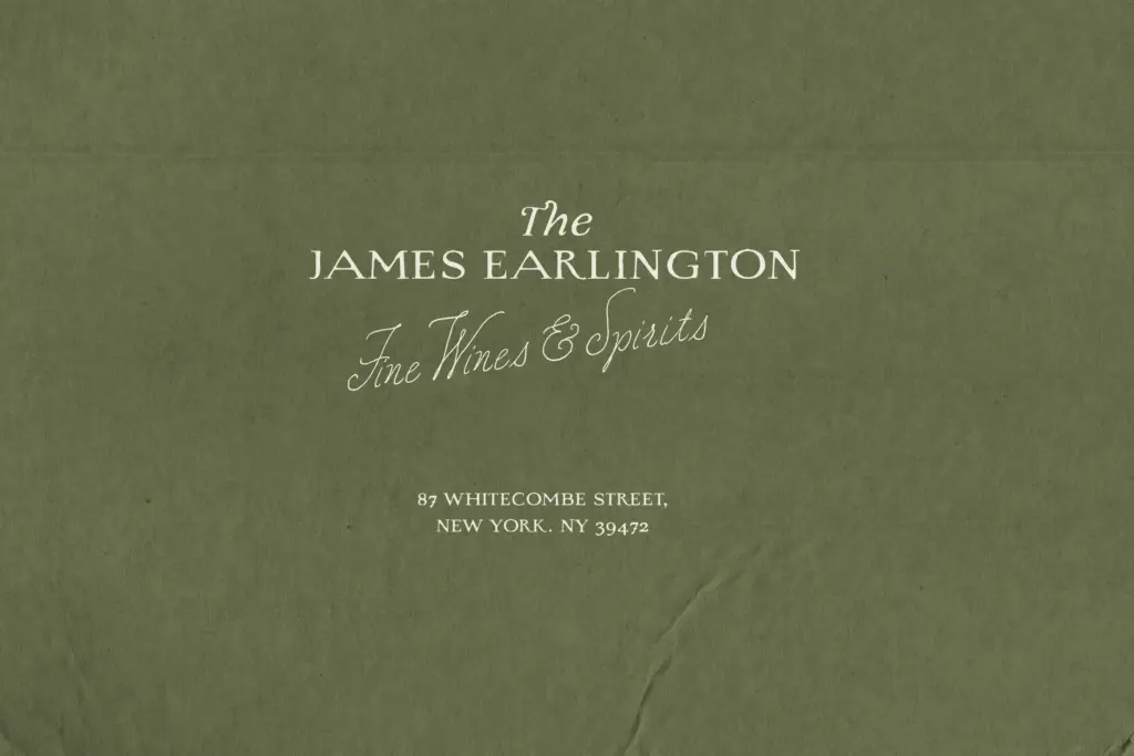
Both the serif and script are supplied in multiple weight variants, which is the practical strength of this duo — you’re not stuck with one density of ink. A heavier serif weight can carry a headline or monogram, while a lighter one works for body text or fine print, and the same logic applies to the script for signature lines versus display flourishes. That range gives you more to work with than a single-weight novelty face.
The distressing on the serif is baked into the letterforms rather than applied as a separate texture layer, which means it’s consistent across sizes but also non-negotiable — you can’t dial the wear back if a job calls for a cleaner mark. The script’s ornamental swashes and connecting strokes are clearly the more labour-intensive part of the drawing, and it shows in how naturally the letters flow into one another at display sizes. Neither face is built for dense paragraphs; both are display-oriented tools, and the brief doesn’t claim otherwise.
Use cases
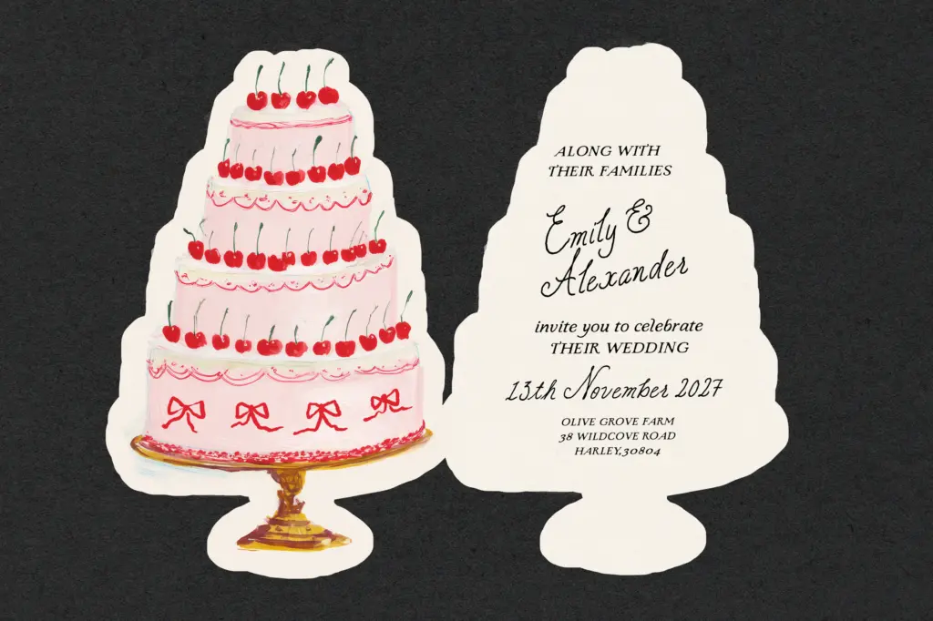
This pairing is aimed squarely at romantic, vintage-adjacent branding: wedding invitations, boutique packaging, letterpress-style stationery, editorial spreads that want an antique feel. The serif works well for short lines — a monogram, a date, a product name stamped onto a label — where its rough edges read as intentional character rather than noise. Push it into long-form text and the bleed effects start to fight legibility, so it’s best kept to headlines, labels and short accent copy.
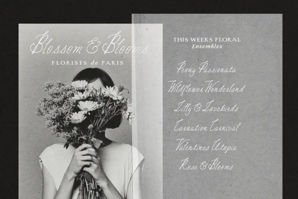
The script pairs naturally as the secondary voice: a signature line under the serif’s stamped heading, or a standalone flourish on an invitation suite. Because both come in several weights, you can build a reasonably varied hierarchy — heavy serif headline, light serif subhead, script accent — without reaching for a third typeface. It’s a duo built for a fairly narrow aesthetic lane, but within that lane, print-adjacent stationery and packaging with an antique, handcrafted mood, it does what it sets out to do.
What we liked, and what we didn’t
Strengths
- Multiple weights in both the serif and script give real hierarchy options without adding a third typeface
- The letterpress distressing is drawn into the letterforms rather than a generic texture overlay
- The script's connecting strokes flow naturally, avoiding the mechanical look of templated scripts
Trade-offs
- The serif's bleed and wobble effects hurt legibility past short headlines or labels
- The distressed texture is fixed, so there's no cleaner option if a project needs less wear
A well-matched pair for a specific antique-stationery mood, with enough weight variants to build real hierarchy. The baked-in distressing limits its use to short display text, and the script's formality won't suit every 'handwritten' brief.
Verdict

Tantype reviews typefaces in depth — every font is tested in real branding, editorial and screen layouts before a word gets written. 555+ fonts reviewed and counting.