
Feeling Passionate: a brush script with enough alternates to earn its keep
Design style
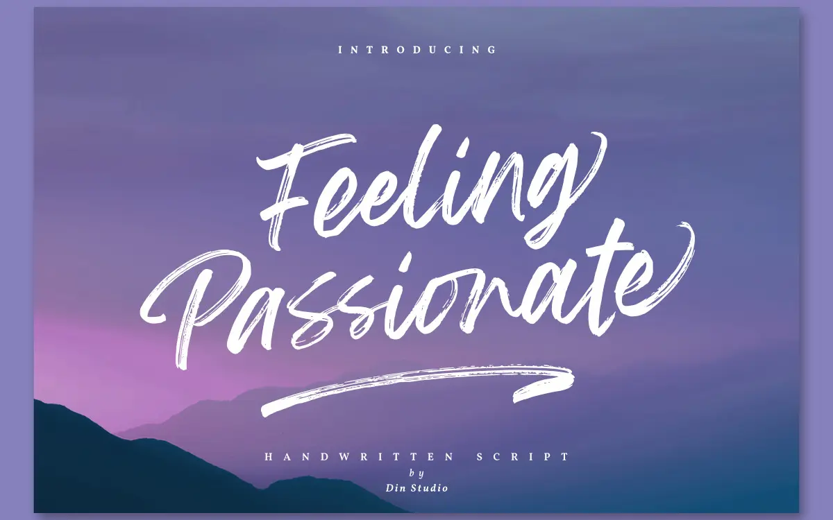
Feeling Passionate sits in the casual brush-script camp: strokes that swell and taper the way a flat brush loaded with ink actually behaves, with joins that lean loose rather than mechanically connected. The baseline dips and rises letter to letter, which is the point of a brush script but also its risk — done badly it reads as messy. Here the movement feels controlled. Ascenders and descenders loop generously without colliding into neighbouring lines, and the overall angle stays consistent enough that a paragraph of it doesn’t wander. It’s warm rather than elegant, closer to a handwritten note than a formal invitation hand, and it reads as contemporary rather than vintage — no distressed edges, no faux-ink texture, just clean brush strokes.
Character set and features
This is where the font does its real work. Seventy-eight alternates and fifty-two swashes mean the same word set twice in a layout doesn’t have to look identical, and that matters with brush scripts, where repetition exposes the template underneath. The fifteen ligatures handle the letter pairs that brush scripts usually stumble over — awkward ascender-descender collisions, double letters that would otherwise overlap badly. PUA encoding is the sensible way to reach all of this without a glyph panel that most people won’t open, though it does mean anyone wanting the fancier swashes needs to know that convention or use a plugin that maps them for you. Numerals and punctuation are included and drawn with the same brush logic, so a date or a price doesn’t suddenly look like it was borrowed from another font. Multilingual support extends the font past a narrow English-only use case, though the brief doesn’t specify which language sets, so check coverage before committing to a project with heavy diacritic needs.
Use cases
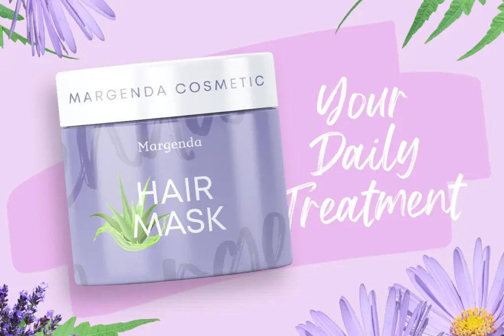
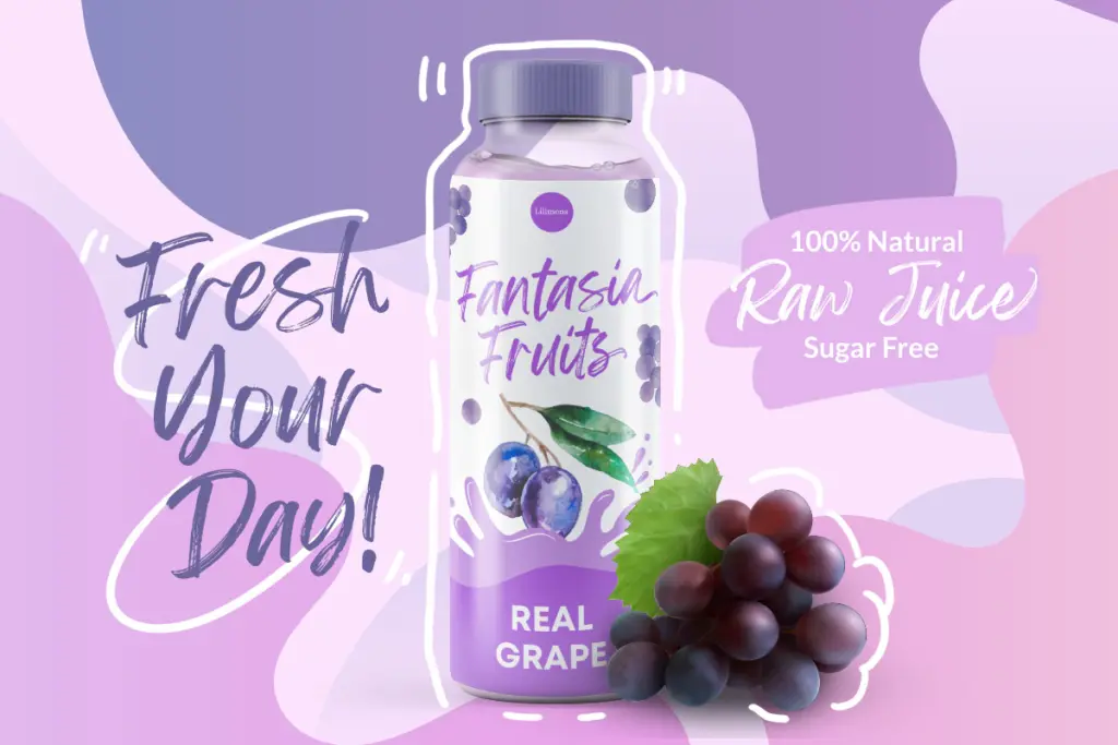
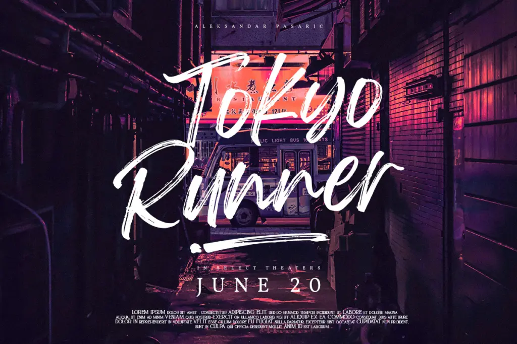
At display sizes — headlines, logotypes, cover lines, the front of a poster — this font does what a brush script should: it adds warmth and a sense of handmade energy without looking like a template. Logos benefit from the alternates in particular, since swapping a swash capital or a tail on the final letter can turn a generic-looking wordmark into something with a bit more personality. Packaging and merchandise work well too, especially anything trying for a friendly, approachable tone rather than a luxury one. Where it gets harder is body text or anything set small: the baseline movement and looping strokes that read as charming at 60pt turn into visual noise at 10pt, so this isn’t a font for paragraphs or dense information. Wedding stationery is a plausible use, but it leans more casual-celebration than formal-black-tie, so it suits a relaxed invitation better than a traditional one. Social media graphics, headers, and short editorial pull-quotes are a comfortable fit, provided the layout gives the letterforms room to breathe.
What we liked, and what we didn’t
Strengths
- Seventy-eight alternates and fifty-two swashes keep repeated letters from looking identical
- Ligatures smooth over the awkward ascender-descender collisions common in brush scripts
- Numerals and punctuation are drawn with the same brush consistency as the letters
Trade-offs
- Baseline movement and looping strokes lose clarity fast below display sizes
- Accessing the full alternate set requires PUA encoding know-how or a compatible plugin
Feeling Passionate is a well-drawn casual brush script that avoids looking templated thanks to its generous alternates and swashes. It's built for display use — logos, headers, packaging — and shouldn't be pushed into small text or dense paragraphs. A solid, dependable choice rather than a showstopper.
Verdict

Tantype reviews typefaces in depth — every font is tested in real branding, editorial and screen layouts before a word gets written. 555+ fonts reviewed and counting.