
Faustine: a swash-heavy script for feminine branding and invitations
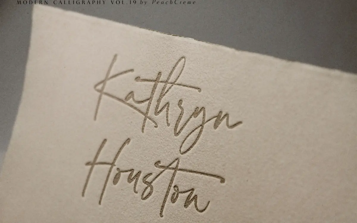
Design style
Faustine sits in the crowded field of modern calligraphy scripts, the kind built to look handwritten with a brush pen but cleaned up enough to sit on a product label. The strokes have moderate contrast, thin entry and exit hairlines swelling into a slightly heavier body, and a loose, unhurried slant that leans toward the casual end of the script spectrum rather than the formal copperplate tradition. The joins between letters are the interesting part: rather than a strict single baseline connection, several lowercase pairs rely on the swash system to bridge them, so the rhythm of a word depends heavily on which swash variant gets triggered.
There’s a deliberate imperfection to the letterforms — asymmetric bowls, terminals that don’t quite match from one letter to the next — that reads as handmade rather than templated. That’s the charm the brief is going for, and it mostly lands, though it means the face doesn’t have the crisp uniformity of a more engineered script. This is a font with a personality, not a neutral tool.
Character set and features
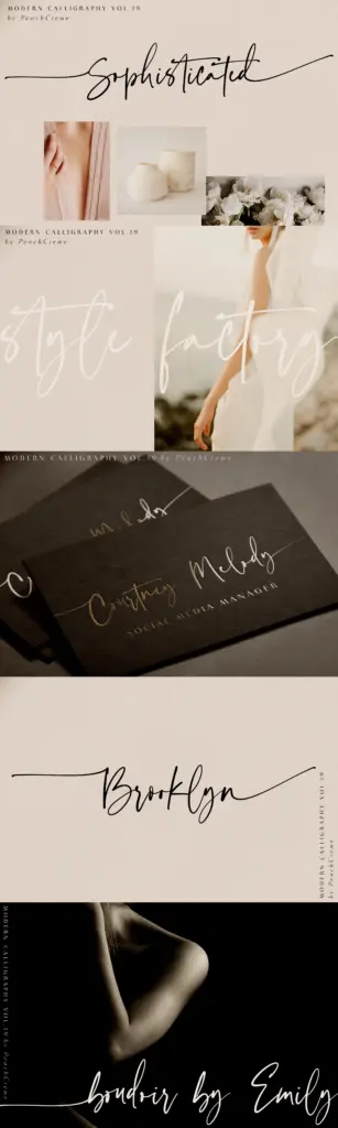
The set covers uppercase and lowercase, numerals, an extended punctuation range, and ligatures, plus separate swash fonts for upper and lowercase that layer on top of the base letters. Every lowercase letter carries a beginning and ending swash option, and every uppercase letter has a beginning swash, which is a genuinely broad swash system for a script at this level — most competitors offer swashes on a handful of letters and call it a day.
The catch is that using them properly requires OpenType-aware software: Illustrator, Photoshop CC, InDesign, CorelDraw. Without that, you’re typing manual prefix/suffix characters (a hyphen before or after a letter) to call up specific swashes, which works but is fiddly and easy to get wrong in a hurry. If your workflow is Canva or a basic web builder with no OpenType support, a good portion of what makes Faustine distinctive becomes inaccessible, and you’re left with the plainer, undecorated base letters.
Use cases
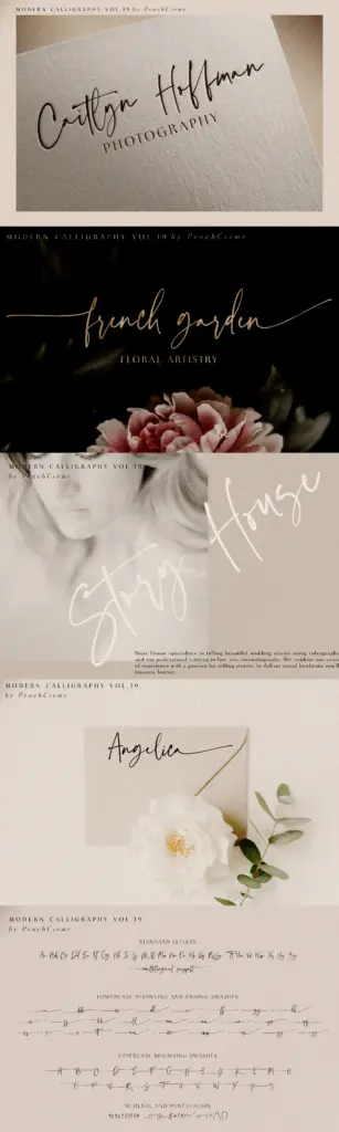
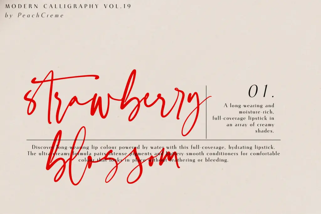
Faustine is built for short-form, decorative settings: wedding invitations, save-the-dates, monograms, logotypes for beauty and lifestyle brands, packaging accents, greeting cards. The swash system rewards single words or short phrases set large, where the eye has time to appreciate the flourish on a capital letter or a trailing lowercase tail. At those sizes it’s genuinely handsome — the imperfections that could read as noise in a paragraph read as warmth in a name or a headline.
It’s not a font for body copy or anything that needs to be read quickly. The swelling strokes and loose joins slow reading down, and at small sizes the delicate hairlines are prone to dropping out in print or looking ragged on low-res screens. Pair it with a plain sans or a clean serif for supporting text rather than asking it to do everything on a page. Anyone doing a lot of custom lettering work will get the most from it, since the swash controls give real room to hand-tune individual words rather than accepting whatever the default connections produce.
What we liked, and what we didn’t
Strengths
- Extensive swash coverage on nearly every letter, upper and lower
- Deliberate handmade irregularity that avoids looking templated
- Works well at large display sizes for logotypes and monograms
Trade-offs
- Full functionality depends on OpenType-aware software; basic tools only show the undecorated base letters
- Delicate hairline strokes lose crispness at small sizes or low resolution
Faustine is a well-drawn modern script whose real strength is its unusually generous swash system, giving designers more control over flourishes than most competitors in this category. It's built for short decorative settings rather than reading text, and it demands OpenType-aware software to show its best side. Buy it for logotypes, monograms and invitation lettering, not for paragraphs.
Verdict

Tantype reviews typefaces in depth — every font is tested in real branding, editorial and screen layouts before a word gets written. 555+ fonts reviewed and counting.