
Lovers in New York: a hand-drawn script for invitations and soft branding
Design style
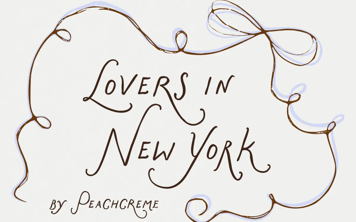
Lovers in New York sits in the crowded field of hand-drawn wedding scripts, but its structure is a little more considered than most. The lowercase letters are built on what is effectively a caps-style skeleton — upright, evenly weighted, with none of the looping ascenders and descenders that make so many scripts collapse into mush at small sizes. The result reads more like handwriting slowed down than handwriting sped up, which gives it a steadier rhythm than the average “romantic” script.
The strokes are fluid without being uniform. You can see the pen’s pressure change through a stroke, and small irregularities — a slightly heavier joint here, a thinner exit stroke there — keep the letters from feeling stamped out. It’s a deliberate kind of imperfection, not a sloppy one. Whether that reads as charming or merely inconsistent will depend on the reader’s tolerance for hand-drawn wobble; some designers will want it, others will find it fights against clean layout grids.
Character set and features
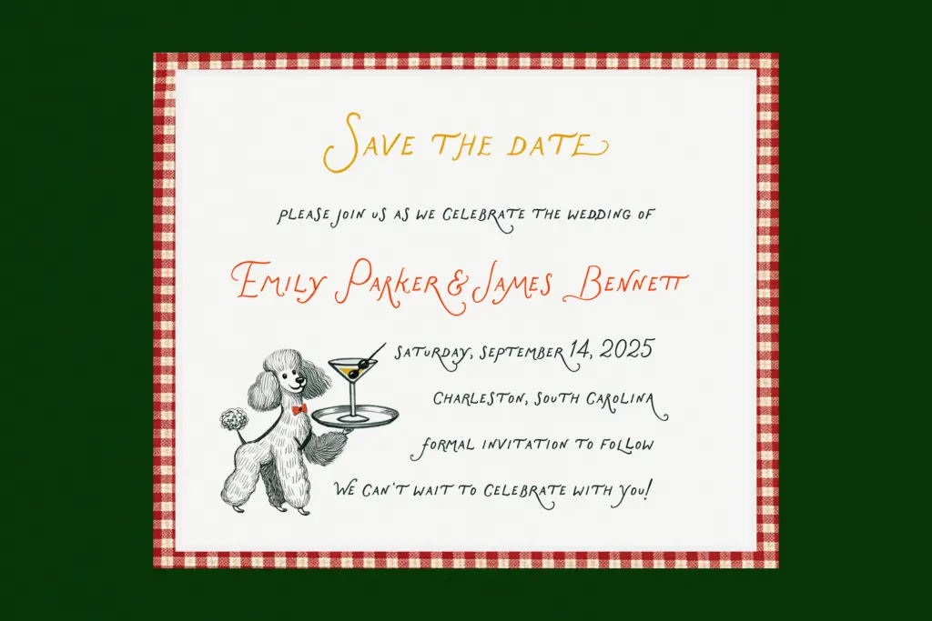
The single most interesting decision here is the uppercase treatment. Rather than giving every capital a flourish, the font leans on one uppercase letterform to carry the decorative weight, while the rest of the alphabet — including the lowercase — stays comparatively restrained. It’s a smart way to avoid the visual noise that swallows a lot of flourish-heavy scripts when they’re set in full sentences: you get a moment of personality without every word turning into a competition of curls.
Spacing is generous enough that words don’t clot together, though scripts like this one still ask for manual kerning on certain letter pairs rather than trusting the default spacing to carry a whole paragraph. There’s no indication of extended language support or a broad glyph set beyond the standard alphabet, so anyone needing accented characters or non-Latin scripts should check before committing a multilingual project to it. Treat it as a single-language display and short-copy tool rather than a body-text workhorse.
Use cases
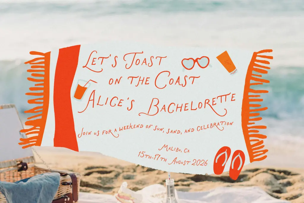
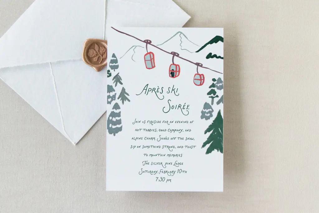
This is a font for the moments where a script needs to sound warm rather than shout. Wedding invitations are the obvious home — save-the-dates, envelope addressing, the couple’s names on a menu card — and it does that job well because the lowercase stays legible even when set smaller than you’d risk with a looser script. Boutique branding is another natural fit: a logotype for a florist, a stationery line, a skincare label, anywhere the brief calls for “feminine” without tipping into overtly girly.
It’s less suited to long-form editorial use — a paragraph of it will tire the eye faster than a well-set serif — and it shouldn’t be asked to do heavy lifting in a UI or anywhere legibility at very small sizes is non-negotiable. Pair it with a plain sans or a quiet serif for supporting text, and let this font handle the headline, the monogram, or the name on the card. That’s the job it’s actually built for.
What we liked, and what we didn’t
Strengths
- The upright, caps-structured lowercase keeps words legible at smaller sizes than typical looped scripts
- Flourish is concentrated in one decorative uppercase letter, avoiding visual overload across a sentence
- Hand-drawn irregularities feel intentional rather than sloppy
Trade-offs
- No indication of extended language or accent support, limiting it for multilingual projects
- Tires the eye in longer paragraphs, so it needs a plain partner for body text
Lovers in New York earns its keep by holding back where most hand-drawn scripts overdo it — the lowercase stays readable, and the flourish is rationed to a single uppercase letter rather than scattered everywhere. It's a solid choice for invitations and soft branding, but it's not built for long text or multilingual work.
Verdict

Tantype reviews typefaces in depth — every font is tested in real branding, editorial and screen layouts before a word gets written. 555+ fonts reviewed and counting.