
Augustine: A Rustic Monospaced Handwriting Duo for Vintage Branding
Design style
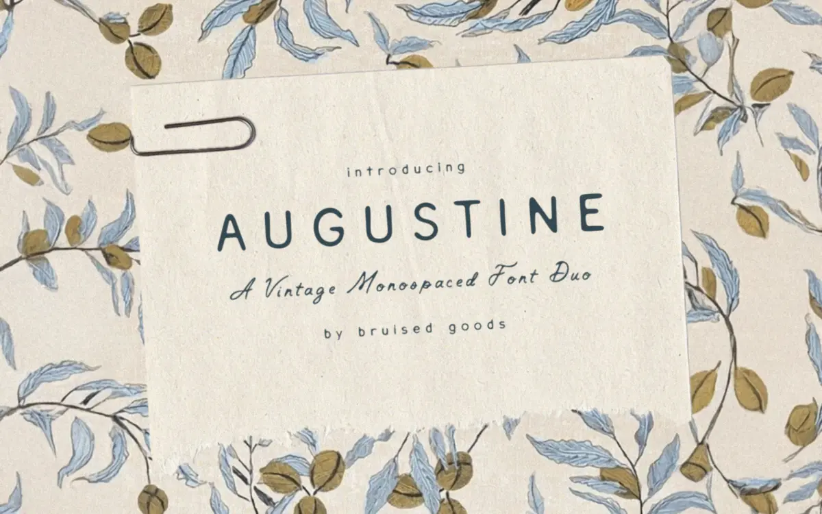
Augustine is a monospaced handwritten font, which is a strange enough combination on its own that it earns some attention. Handwriting is usually loose and irregular; monospacing forces every character into an identical box. The tension between the two is the whole personality of this typeface. Letters lean, wobble, and drag their strokes like a ballpoint pen running out of ink, but they still land on a fixed grid, which gives the face a clipped, typewriter-adjacent cadence even though it reads as informal.
The result feels handmade rather than calligraphic. There’s no swash-heavy flourish here, no attempt at elegance. Strokes are uneven in weight, baselines drift slightly, and terminals look cut rather than tapered. It’s the kind of mark you’d expect from someone writing fast on a postcard, not composing a love letter with care. That rough, unpolished quality is deliberate and it’s the font’s biggest asset — it doesn’t pretend to be anything more refined than it is.
Character set and features
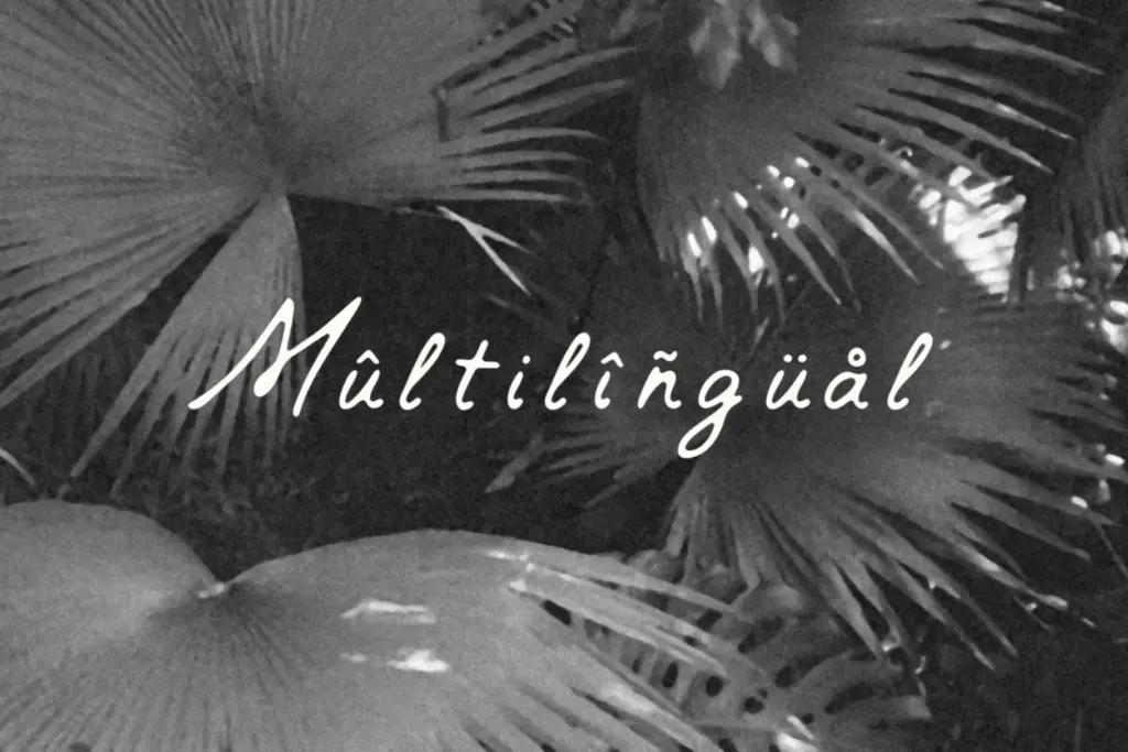
The set covers uppercase and lowercase, numerals, punctuation, and symbols, adding up to 360 glyphs, with support extending across several European languages including French, German, Italian, Spanish, Portuguese, and the Scandinavian languages. That’s a reasonable spread for a display face and means accented characters won’t force a fallback font mid-sentence.
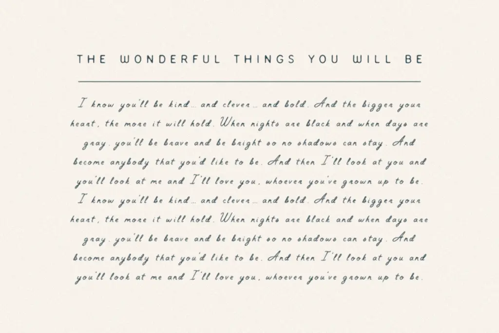
Because it’s monospaced, kerning isn’t really the concern here — spacing is uniform by design, which simplifies layout but also means you lose the natural variability that gives most handwritten fonts their organic rhythm. Tight letter pairs and wide ones get the same width regardless, so words can look slightly gappy or slightly cramped depending on the letters involved. This is the tradeoff of the concept: the monospace grid gives the font its typewriter charm but also its main structural limitation.
At small sizes the irregular strokes start to blur together, particularly in dense paragraphs — this is not a body-copy font and shouldn’t be treated as one. It wants room to breathe: large point sizes, short lines, generous letter spacing where the software allows it.
Use cases
Augustine suits branding work that wants a lived-in, slightly weathered feel — think small-batch packaging, market signage, apparel graphics, or logotypes for businesses trading on authenticity rather than polish. It reads well on merchandise mockups, album art, and flyer headlines where a handwritten mark needs to sit next to bold graphic elements without competing for delicacy.
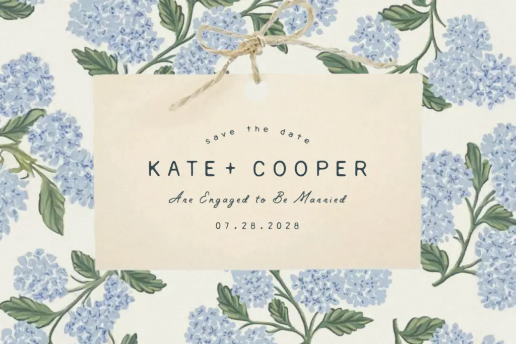
It’s also a reasonable pick for informal invitations or menu headers where ‘rustic’ rather than ‘elegant’ is the intended mood — this is not a wedding-invite script in the traditional cursive sense, and pairing it with anything ornate would fight its rough-edged character. Treat it as a voice for short bursts of text: a headline, a stamp-like logo mark, a single line on a card. Anywhere it needs to carry paragraphs of copy, its unevenness works against readability rather than for it.
What we liked, and what we didn’t
Strengths
- The monospace-meets-handwriting concept gives it a distinct, typewriter-like rhythm you don't see often
- Rough, uneven strokes read as authentically handmade rather than digitally smoothed
- Solid multilingual glyph support for a display-oriented font
Trade-offs
- Uniform spacing from the monospace grid can leave some words looking gappy or cramped
- Legibility drops quickly at small sizes or in dense text blocks
Augustine is a clever, slightly odd idea — handwriting locked to a monospace grid — executed with enough rough-edged charm to work for rustic branding and short display lines. It struggles at small sizes and in longer text, so it's a headline tool, not a workhorse.
Verdict

Tantype reviews typefaces in depth — every font is tested in real branding, editorial and screen layouts before a word gets written. 555+ fonts reviewed and counting.