
Freshly Baked Font Trio & Dings: a handlettered set for cosy branding
Design style
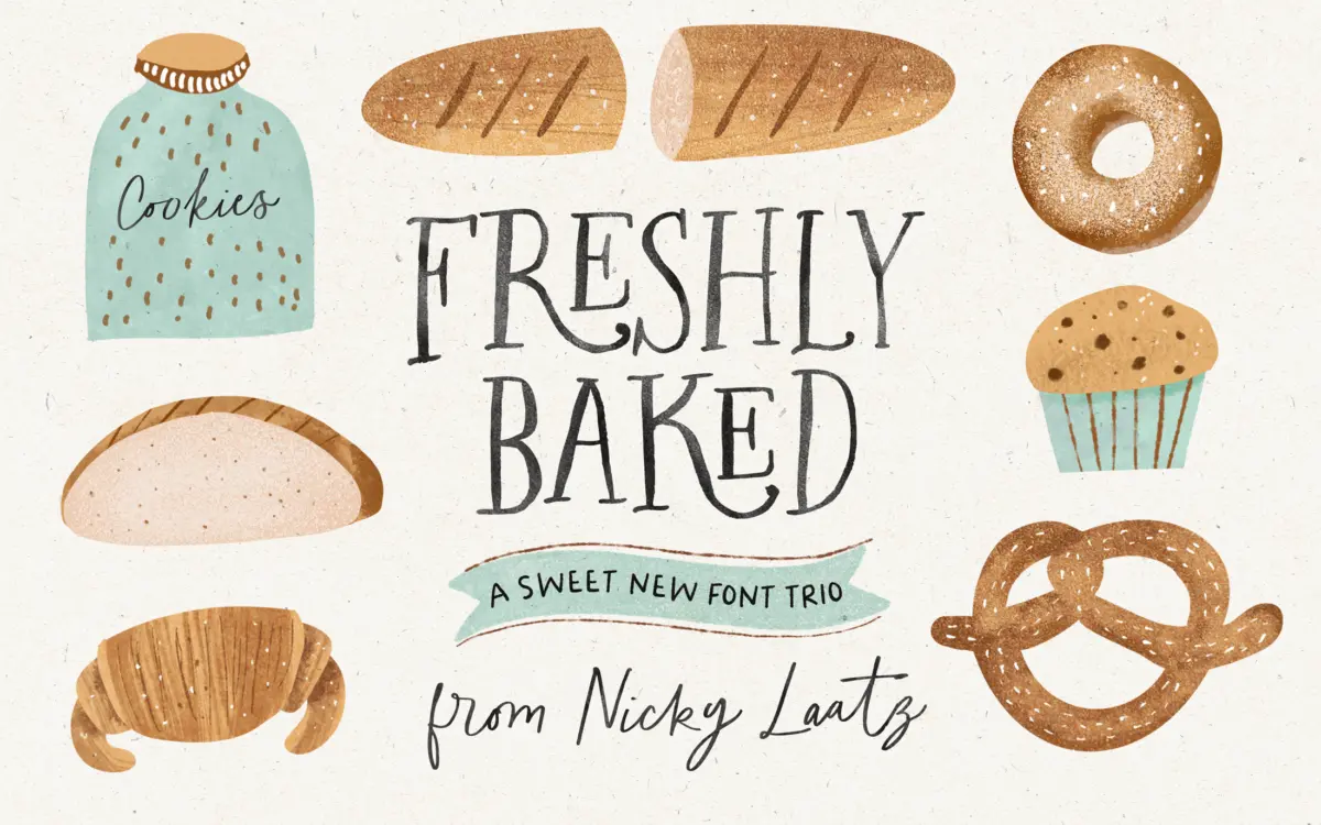
Freshly Baked is a bundle rather than a single voice: a handlettered serif, a handlettered sans, a connecting script, and a dingbat set to go with them, each offered with a slanted companion. The drawing across all three text faces shares the same hand — slightly wobbly baselines, rounded terminals, letters that look drawn with a brush-pen rather than built in outline software. That consistency is the whole point of a trio like this; you can mix the serif for a headline and the sans for a subhead and the join doesn’t feel accidental.
None of the three aims for precision. Strokes vary in weight within a single letter, x-heights bounce a little from glyph to glyph, and the overall effect leans toward warmth over control. That’s a deliberate register — quaint, home-baked, unpolished by design — and it reads best at sizes where you can appreciate the imperfection rather than fight it. It’s not a typeface for anyone chasing crisp, corporate uniformity.
Character set and features
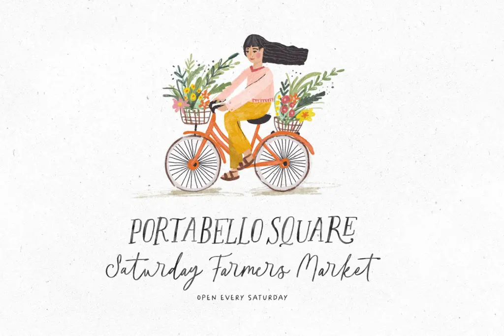
The serif and script both carry OpenType ligatures, which is worth noting because it changes how you should type with them: turn on ligatures in your layout software and repeated or adjoining letter pairs swap in joined alternates automatically, giving the script in particular a more continuous, hand-inked flow instead of a row of separately stamped letters. Skip that step and the script will look flatter and more mechanical than it’s meant to.
The dingbat font is the practical extra here — a set of ornaments mapped to keystrokes, with a cheatsheet included so you’re not hunting blindly through a glyph panel to find the wheat sheaf or the whisk. For a bakery- or kitchen-themed project this is more useful than it sounds, since matching ornament to letterform is normally the fiddliest part of building this kind of look from scratch.
A Photoshop watercolour text style is bundled alongside the fonts. It’s a nice-to-have rather than a typographic feature — useful if you already work in Photoshop and want the soft, bled-edge look seen in the promotional material, irrelevant if you’re setting type anywhere else.
Use cases
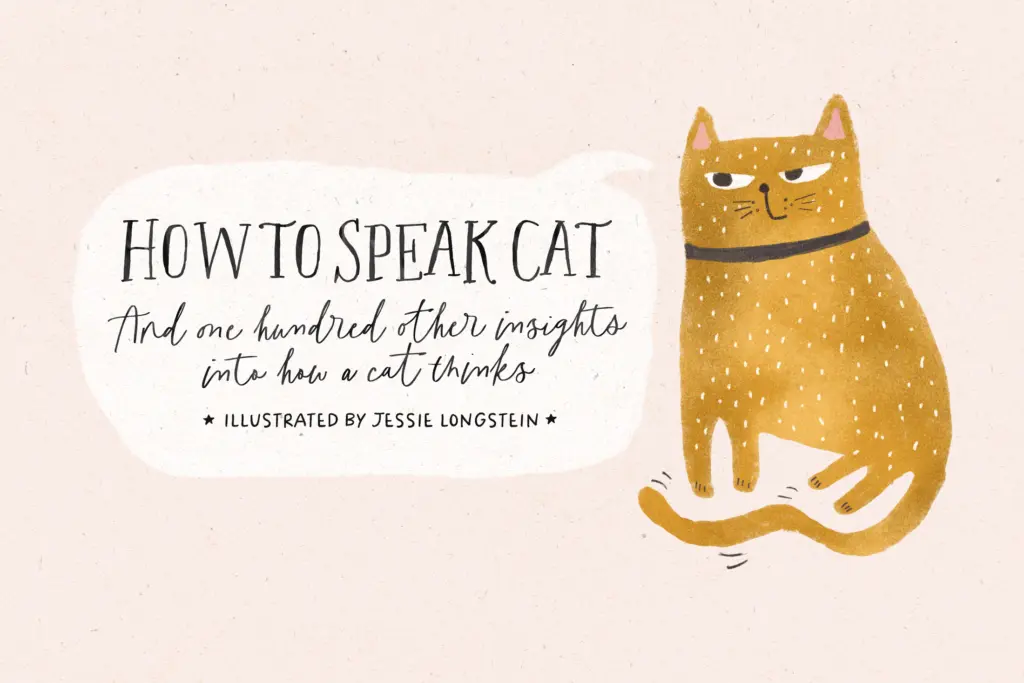
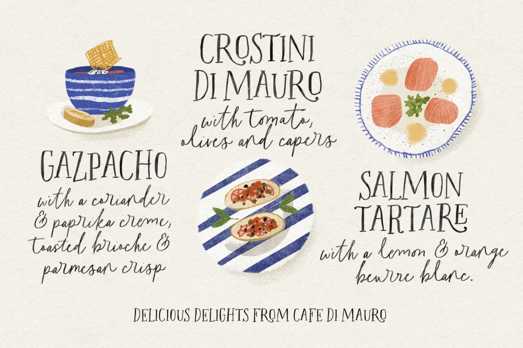
This is a kitchen-table typeface: cookbook covers, recipe cards, bakery packaging and labels, children’s book spreads, greeting cards, and quote graphics where a friendly, unpolished hand suits the subject better than a refined script would. The sans works well for body copy or ingredient lists where the serif or script would get tiring at length, and the slanted variants give you a second gear for emphasis without switching families entirely.
It’s less suited to anything that needs to read as premium or restrained — a script this loose and a serif this hand-drawn will fight against minimal, high-end branding. And because the charm depends on visible irregularity, it doesn’t hold up as well shrunk down to fine print or stretched across a long paragraph of running text. Keep it to headlines, short copy, and illustrative contexts and it earns its keep.
What we liked, and what we didn’t
Strengths
- Three coordinated styles (serif, sans, script) that visibly share one hand, so mixing them in a layout looks intentional.
- OpenType ligatures give the script genuine connected flow instead of static, stamped letters.
- The dingbat set with keystroke cheatsheet solves the usual hassle of hunting for matching ornaments.
Trade-offs
- The deliberate wobble in the drawing limits it at small sizes and in long passages of text.
- The homespun, quaint register won't stretch to premium or minimal branding work.
Freshly Baked is a cohesive, charming trio built for kitchen and craft branding rather than refined typography. The ligatures and dingbat set add real practical value if you take the time to switch them on. It won't suit anything that needs precision or a corporate register, but for cookbooks, packaging and greeting cards it does exactly the job it sets out to do.
Verdict

Tantype reviews typefaces in depth — every font is tested in real branding, editorial and screen layouts before a word gets written. 555+ fonts reviewed and counting.